CommandBar
The CommandBar in Uno is designed to be used the same way you would use the CommandBar on WinUI. In most cases, you should refer to the official CommandBar documentation.
This document exists to highlight some of the differences you might encounter when working with the native mode of CommandBar on either iOS or Android.
Modes
The CommandBar supports 2 different modes:
| Mode | Style |
|---|---|
| Windows | XamlDefaultCommandBar |
| Native | NativeDefaultCommandBar |
Windows
This mode replicates WinUI's CommandBar. It is templatable and supports a template that's almost identical to WinUI's default CommandBar.

Usage Example
<Style TargetType="CommandBar" BasedOn="{StaticResource XamlDefaultCommandBar}" />
Remarks
- This mode hasn't been extensively tested.
- We usually avoid using this mode, and prefer to use the Native one instead.
Native
This mode is the preferred one and is enabled by default. It uses platform-specific controls to ensure a more native user experience.


| Platform | Native control | Benefits |
|---|---|---|
| Android | Toolbar |
Native pressed states (ripple), native overflow menu. |
| iOS | UINavigationBar |
Transitions when navigating between pages. |
The rest of this document will exclusively cover this mode.
Usage Example
<Style TargetType="CommandBar" BasedOn="{StaticResource NativeDefaultCommandBar}" />
Remarks
In this mode, the CommandBar can't be fully customized like other templatable controls would. Additionally, you can't customize the visual states of either the CommandBar or its AppBarButtons.
Padding
You must use VisibleBoundsPadding.PaddingMask="Top" on CommandBar to properly support the notch or punch-holes on iOS/Native and Android/Native.
On Skia-based renderers, you'll need to set the VisibleBoundsPadding or SafeArea on the parent control of the CommandBar.
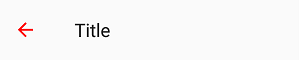
Back button
An important difference with this mode is the presence of a back button. Whenever the CommandBar is part of a Page whose Frame has a non-empty back stack, the back button will be displayed.


On Android, tapping the back button triggers SystemNavigationManager.BackRequested. It's the responsibility of the application's navigation controller to eventually call Frame.GoBack().
On iOS, tapping the back button automatically triggers a back navigation on the native UINavigationController (which is part of the native Frame implementation). The Frame will raise the Navigated event, and its state will automatically be updated to reflect the navigation. The navigation can't be intercepted or canceled. To intercept back navigation, you must replace the native back button with your own custom button using NavigationCommand (see below).
Properties
| Property | Windows | iOS | Android | Comments |
|---|---|---|---|---|
| Background | x | x | x | |
| Content | x | x | x | |
| Foreground | x | x | x | |
| Height | x | - | - | iOS and Android: Fixed and can't be changed. |
| HorizontalAlignment | x | - | x | iOS: Always use HorizontalAlignment.Stretch. |
| Opacity | x | x | x | |
| Padding | x | x | x | iOS, Android and Skia: Please refer to the Padding section. |
| PrimaryCommands | x | x | x | |
| SecondaryCommands | x | - | x | iOS: Not supported. |
| VerticalAlignment | x | - | x | iOS: Always use VerticalAlignment.Top. |
| Visibility | x | x | x | |
| Width | x | - | x | iOS: Always use double.NaN. |
| HorizontalContentAlignment | x | - | x | Android: Stretch and Left are supported. Windows: Set IsDynamicOverflowEnabled="False" for proper behavior. |
| VerticalContentAlignment | x | - | - | Only supported on Windows. Android: Alignment needs to be done through the content itself. |
If it's not listed, assume it's not supported.
Background
Gets or sets a brush that describes the background of a control.


Remarks
- Only supports
SolidColorBrush. - Changing the opacity through
SolidColorBrush.Opacityis supported.
Content
Gets or sets the content of a ContentControl.
Remarks
The Content is processed differently whether it's of type string or FrameworkElement.
When Content is a string, it's displayed using the platform's default font family, font size, font style and text alignment. Only the foreground color can be changed, using Foreground.


| Platform | FontFamily | FontSize | HorizontalAlignment |
|---|---|---|---|
| iOS | San Francisco |
17 | Center |
| Android | Roboto |
20 | Left |
When Content is a FrameworkElement, it's displayed within the available area:


| Platform | Available height |
|---|---|
| iOS | 30px |
| Android | 48px |
Please note that:
HorizontalContentAlignmentandVerticalContentAlignmentare ignored.- On iOS, the Content is automatically centered horizontally unless
HorizontalAlignment.Stretchis used.
Foreground
Gets or sets a brush that describes the foreground color.


Remarks
- This is typically used to change the Content`'s text color.
- Only supports
SolidColorBrush. - Setting this property will not affect any of the
CommandBar'sAppBarButtontint Color. If you need to change theAppBarButtontint, this is possible by setting theShowAsMonochromeproperty to true as well as setting the ForegroundSolidColorBrushon theBitmapIcon. - On
Android, you can also enable a feature that will allow that theSolidColorBrushset on yourCommandBarForegroundto update yourAppBarButtons Tint. To enable this, set on yourApp.xml.cstheFeatureConfiguration.AppBarButton.EnableBitmapIconTintto true.
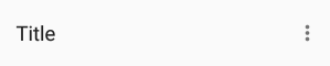
PrimaryCommands
Gets the collection of primary command elements for the CommandBar.


Remarks
- Only supports
AppBarButton.AppBarToggleButtonandAppBarSeparatorare not supported. - Refer to the
AppBarButtonsection for details.
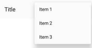
SecondaryCommands
Gets the collection of secondary command elements for the CommandBar.
Remarks
- Only supported on Android.
Height
Gets or sets the suggested height of a FrameworkElement.
Remarks
The height is fixed and cannot be changed.
| Platform | Form factor | Portrait | Landscape |
|---|---|---|---|
| iOS | Phone | 44pt | 44pt |
| iOS | Tablet | 44pt | 44pt |
| Android | Phone | 48dp | 56dp |
| Android | Tablet | 64dp | 64dp |
Extensions
Extensions are attached properties that extend the WinUI APIs to provide platform-specific features.
They can be found in the Uno.UI.Toolkit namespace.
Extensions to extend the functionality of CommandBar can be found in the CommandBarExtensions class.
| Attached Property | Windows | iOS | Android | Comments |
|---|---|---|---|---|
| BackButtonForeground | - | x | x | |
| BackButtonIcon | - | x | x | |
| BackButtonTitle | - | x | x | |
| NavigationCommand | - | x | x | |
| Subtitle | - | - | x |
BackButtonForeground
Gets or sets the back button foreground for the CommandBar.

Remarks
- Only supports
SolidColorBrush.
BackButtonIcon
Gets or sets the back button icon for the CommandBar.


Remarks
- Only supports
BitmapIcon.
BackButtonTitle
Gets or sets the back button title for the CommandBar.

Remarks
Only supported on iOS.
On iOS, the back button displays the title of the previous page (which we usually set as string on Content). When the title of the previous page is too long (over 140px wide on iPhone 5) or isn't set (for example, if we set FrameworkElement instead of string on Content), "Back" will be displayed instead.
To explicitly provide a value to be used by the back button of the next page, use BackButtonTitle.
To remove the back button title from all pages (and only leave the back arrow), set BackButtonTitle to "" in the default CommandBar style.
WARNING: The name of this property can be misleading, and doesn't actually let you change the title of the back button displayed on the given CommandBar. Read above for recommended usage.
Elevation
Gets or sets the elevation of the UIElement.
Remarks
- This is usually only used on Android.
- According to Google's Material Design Guidelines, the recommended elevation for
CommandBaris 8.
NavigationCommand
Gets or sets the navigation command for the CommandBar.


Remarks
Unlike the PrimaryCommands or SecondaryCommands, which appear to the right of the CommandBar, the NavigationCommand appears to the left of the CommandBar.
This is typically used for burger menus.
On iOS, the back gesture can be enabled or disabled using this property.
- When a
CommandBar(visible or collapsed) is in the visual tree, the back gesture is enabled. - When a
CommandBarhas aNavigationCommand, the back gesture is disabled.
On Android, only icons are supported (AppBarButton.Icon). This is due to a platform limitation, which can be explained by the fact that CommandBar.Content is left-aligned.
Subtitle (Android)
Gets or sets the subtitle for the CommandBar.

Remarks
- The subtitle is displayed below the native title (
Contentof typestring). - The color of the subtitle currently can't be changed.
Placement
On iOS, the same UINavigationBar instance is shared throughout all pages. When navigating between two pages, you can see that the UINavigationBar doesn't move, and only its content and the pages have a transition. To get the same effect while still letting you use CommandBar as you would on WinUI (as part of the Page), we have to do some magic. Namely, the CommandBar you define inside your Page is never actually rendered there, and only serves as a placeholder from which to read the information we need to pass to the shared UINavigationBar instance.
To ensure everything works properly, you must follow a few rules:
- The
CommandBarmust stretch horizontally and be aligned with the top of yourPage. - The
CommandBarcan't move (i.e., don't put it inside aScrollViewer) - The
CommandBarmust be accessible as soon as the page is being navigated to (i.e., don't put it inside aDataTemplateor anAsyncValuePresenter). - There can only be one
CommandBarper page.
Extensibility
The CommandBar it automatically managed by the Frame control, however you can still use the "native" mode of the CommandBar with your own navigation mechanism.
On iOS a CommandBarHelper is available for this purpose, you only have to invoke each of the provided method in your own UIViewController implementation.
AppBarButton
The AppBarButton in Uno is designed to be used the same way you would use the AppBarButton on WinUI. In most cases, you should refer to the official CommandBar documentation.
When AppBarButton is used within a native CommandBar, its control template is completely ignored and can't be customized.
Events
| Event | Windows | iOS | Android | Comments |
|---|---|---|---|---|
| Clicked | x | x | x |
Properties
| Property | Windows | iOS | Android | Comments |
|---|---|---|---|---|
| Command | x | x | x | |
| Content | x | x* | x* | Supports string and FrameworkElement. |
| Foreground | x | x | x* | Android: See details below. |
| Icon | x | x* | x* | Only supports BitmapIcon. |
| IsEnabled | x | x | x* | Android: Not supported with Content. |
| Label | x | x* | x* | See details below. |
| Opacity | x | x | x | |
| Visibility | x | x | x |
If it's not listed, assume it's not supported.
Foreground
Gets or sets a brush that describes the foreground color.

Remarks
- This changes the color of the
Content(text) orIcon. - Only supports
SolidColorBrush. - On Android, this only affects the color of
Icon, notContent(text). - On iOS, the default value is blue.
Content
Gets or sets the content of a ContentControl.


Remarks
- When given a
string, its text will be displayed instead of the icon. - When given a
FrameworkElement:- it will be displayed instead of the icon
- the native pressed state and tooltip (Android only) won't work
- Make sure to set
Iconto null, as it takes priority overContent.
Icon
Gets or sets the graphic content of the app bar button.
Remarks
- Only supports
BitmapIcon(with PNG).
Recommended icon sizes (by scale)
| Platform | 100% | 150% | 200% | 300% | 400% |
|---|---|---|---|---|---|
| iOS | 25x25 | - | 50x50 | 75x75 | - |
| Android | 24x24 | 36x36 | 48x48 | 72x72 | 96x96 |
| Windows | 32x32 | 48x48 | 64x64 | 96x96 | 128x128 |
Label
Gets or sets the text description displayed on the app bar button.
Remarks
Unlike on WinUI, the Label will not be displayed below the Icon.
It is only displayed on Android when the AppBarButton is displayed from the overflow (when part of SecondaryCommands)
It is highly recommended to set and localize Label on all AppBarButtons, if only for accessibility.
IsEnabled
Gets or sets a value indicating whether the user can interact with the control.


Remarks
- When set to false, buttons are disabled and grayed out (semi-transparent).
- You can't customize the disabled visual state of buttons.
- On Android, the disabled visual state only works with
Iconand not withContent(text).
Known issues
iOS
- Can't have multiple CommandBars in the same page (e.g., Master/Details, bottom CommandBar).
- Can't change the title of the back button if the previous page doesn't have a CommandBar.
- You must define the title of the back button of the current page's CommandBar in the CommandBar of the previous page.
- Can't have a smooth transition between pages with different CommandBar backgrounds.
- Can't have a smooth transition between pages with and without a CommandBar.
- Can't change the position and size of the CommandBar (always top-aligned, horizontally-stretched, height of 44).
- Can't remove the 1px underline/shadow without making the CommandBar's background transparent.
- Can't change the height of the CommandBar.
- Can't use the back gesture on pages without a CommandBar.
- Can't disable the back gesture without using workarounds (fake back buttons).
- Can't change the Visibility of a CommandBar.
- Can't change the Opacity of a CommandBar.
- Can't superpose views over a CommandBar.
- Can't animate/translate the CommandBar (i.e., when hiding/showing it based on scroll offset).
- Can't put your CommandBar inside a ScrollViewer and make it scroll.
- Can't put your CommandBar inside templates (i.e., AVP).
- Can't cancel a back navigation using BackRequestedEventArgs.Handled.
FAQ: CommandBar
-
Why is my content underneath the
CommandBarfor iOS and theCommandBarunderneath the StatusBar/Notch for Android ?You must use
VisibleBoundsPadding.PaddingMask="Top"onCommandBarto properly support the notch or punch-holes on iOS and Android.xmlns:toolkit="using:Uno.UI.Toolkit" ... <Style Target="CommandBar"> <Setter Property="toolkit:VisibleBoundsPadding.PaddingMask" Value="Top" /> </Style> -
How can I remove the back button title from all pages on iOS?
xmlns:toolkit="using:Uno.UI.Toolkit" ... <Style Target="CommandBar"> <Setter Property="toolkit:CommandBarExtensions.BackButtonTitle" Value="" /> </Style> -
How can I change the back button icon/arrow/chevron in my app?
xmlns:toolkit="using:Uno.UI.Toolkit" ... <Style Target="CommandBar"> <Setter Property="toolkit:CommandBarExtensions.BackButtonIcon"> <Setter.Value> <BitmapIcon UriSource="ms-appx://Assets/back.png" /> </Setter.Value> </Setter> </Style> -
How can I change the color of the back button?
xmlns:toolkit="using:Uno.UI.Toolkit" ... <CommandBar toolkit:CommandBarExtensions.BackButtonForeground="Red" /> -
Why does my back button display "Back" on iOS?
The back button will display "Back" if:
- The previous page doesn't have a
CommandBar. - The previous page's
CommandBardoesn't have aContentof typestring. - The previous page's
CommandBardoesn't have aCommandBarExtensions.BackButtonTitle. - The previous page's
CommandBarhas a title that's too long (more than 140pt).
- The previous page doesn't have a
-
Why can't I overlap content over the CommandBar on iOS?
The
CommandBaris not actually part of thePageon iOS, and you can't overlap content over it like you would on WinUI or Android. Please refer to the Placement section for details. -
Why is my CommandBar going into the status bar on iOS/Android?
You must use
VisibleBoundsPadding.PaddingMask="Top"on the parent control ofCommandBarto properly support the notch or punch-holes on iOS and Android.xmlns:toolkit="using:Uno.UI.Toolkit" ... <Grid toolkit:VisibleBoundsPadding.PaddingMask="Top"> <CommandBar> ... </CommandBar> </Style> -
Why doesn't my CommandBar show a back button?
For a
CommandBarto show a back button, it must first be resolved byFrameas soon as it navigates to aPage. To ensure thatCommandBaris available as soon as the navigation starts, make sure it's directly part of a page, and not part of aDataTemplateorControlTemplate. -
Why don't my AppBarButton visual states work?
You can't customize the
ControlTemplateofAppBarButtonwhen usingCommandBarin native mode. -
How can I change the foreground of the CommandBarExtensions.Subtitle on Android?
You can't currently customize the foreground of the
CommandBarExtensions.Subtitleon Android. -
Why doesn't CommandBarExtensions.Subtitle work on iOS?
CommandBarExtensions.Subtitleis not currently implemented on iOS.You can replicate the same effect by setting a custom
ContentonCommandBar:<CommandBar> <CommandBar.Content> <StackPanel HorizontalAlignment="Center"> <TextBlock Text="Title" HorizontalAlignment="Center" FontSize="15" /> <TextBlock Text="Subtitle" HorizontalAlignment="Center" FontSize="12" Opacity="0.5" /> </StackPanel> </CommandBar.Content> </CommandBar> -
How can I add a badge to an AppBarButton?
You can implement your own badge by setting a custom content on
AppBarButton:<AppBarButton> <AppBarButton.Content> <Grid Height="48" Width="48"> <Image Source="ms-appx:///Assets/Icons/cart.png" VerticalAlignment="Center" HorizontalAlignment="Center" /> <Border x:Name="Badge" VerticalAlignment="Top" HorizontalAlignment="Right" Background="Red" Margin="8,4" Padding="4,0" MinWidth="16" Height="16" CornerRadius="8"> <TextBlock x:Name="Count" HorizontalAlignment="Center" VerticalAlignment="Center" Foreground="White" FontSize="8" Text="0" /> </Border> </Grid> </AppBarButton.Content> </AppBarButton> -
How can I set custom content to an AppBarButton?
You can set a custom content to an
AppBarButtonlike this:<AppBarButton> <AppBarButton.Content> <TextBlock Text="Custom content goes here" /> </AppBarButton.Content> </AppBarButton> -
Why does my CommandBar always appear at the top of the page on iOS?
You can't place your
CommandBaranywhere other than at the top of thePageon iOS. See the Placement section for details. -
How can I change the height of my CommandBar?
You can't currently change the height of the
CommandBar. -
How can I remove the 1px line displayed below the CommandBar on iOS?
To hide the native 1px shadow that's displayed below the
CommandBaron iOS, make its background transparent:<CommandBar Background="Transparent" /> -
How can I add an elevation shadow to the CommandBar on Android?
xmlns:toolkit="using:Uno.UI.Toolkit" ... <CommandBar toolkit:UIElementExtensions.Elevation="4" /> -
How can I use a Path for the AppBarButton Icon?
AppBarButtondoesn't currently supportPathIcon. OnlyBitmapIconwith PNGs is supported. Please refer to the Icon section. -
Why doesn't CommandBarExtensions.BackButtonTitle change the title of my back button?
CommandBarExtensions.BackButtonTitlemust be set on the page to which the back button navigates to. Please refer to the BackButtonTitle section. -
Why doesn't my CommandBarExtensions.NavigationCommand display anything on Android?
CommandBarExtensions.NavigationCommandonly supportsAppBarButtonwithIcon(notContent). Please refer to the NavigationCommand section. -
How can I localize CommandBarExtensions.BackButtonTitle?
For attached properties, you need a special syntax in the Name column of a
.reswfile. Ref: Microsoft documentation.More specifically :
<CommandBar x:Uid="MyCommandBar"
            toolkit:CommandBarExtensions.BackButtonTitle="My Page Title">
        ...
</CommandBar>
And in the
.reswfile, the name would be:MyCommandBar.[using:Uno.UI.Toolkit]CommandBarExtensions.BackButtonTitle -
How can I put a ComboBox in my CommandBar?
<CommandBar> <CommandBar.Content> <ComboBox /> </CommandBar.Content> </CommandBar> -
How can I customize the pressed/disabled visual states of my AppBarButton?
You can't currently customize the visual states of
AppBarButtonwhen usingCommandBarin native mode. -
Why doesn't the disabled state work on my AppBarButton on Android?
AppBarButtondoesn't currently support the disabled state when used withContent(ofstring) on Android. You can use anIconinstead. -
How can I disable the back swipe/gesture on iOS?
To disable the back swipe/gesture on iOS, you must remove the
CommandBaror replace the back button with a custom one:<CommandBar> <toolkit:CommandBarExtensions.NavigationCommand> <AppBarButton Command="{Binding GoBack}"> <AppBarButton.Icon> <BitmapIcon UriSource="ms-appx:///Assets/Icons/back.png" /> </AppBarButton.Icon> </AppBarButton> </toolkit:CommandBarExtensions.NavigationCommand> </CommandBar> -
How can I display two CommandBars side by side on iOS (i.e., master-detail)
Pageonly supports a singleCommandBarat a time. To display twoCommandBars side by side (i.e., master-detail), you should place twoFrames side by side and put aCommandBarin thePageof eachFrame. -
How can I add a burger menu to the left of my CommandBar?
<CommandBar> <toolkit:CommandBarExtensions.NavigationCommand> <AppBarButton Command="{Binding ToggleMenu}"> <AppBarButton.Icon> <BitmapIcon UriSource="ms-appx:///Assets/Icons/menu.png" /> </AppBarButton.Icon> </AppBarButton> </toolkit:CommandBarExtensions.NavigationCommand> </CommandBar> -
Why doesn't Flyout work on my AppBarButton?
AppBarButtondoesn't currently supportFlyoutwhen usingCommandBarin native mode. You can useMenuFlyoutinstead. -
Why can't I change the Foreground of my AppBarButton on Android?
AppBarButtondoesn't currently supportForegroundwhen displaying text (usingContentofstring).However, you can change the color of all textual
AppBarButtons globally using Android styles:Colors.xml
<color name="red">#FFFF0000</color>Styles.xml
<item name="android:actionMenuTextColor">@color/red</item>
<item name="actionMenuTextColor">@color/red</item>
If you need the button to display a different color to reflect being in a disabled state, you can add a selector in its own file, under res/color, like so:
PrimaryTextColorSelector.xml
<?xml version="1.0" encoding="utf-8"?>
<selector xmlns:android="http://schemas.android.com/apk/res/android" >
    <item android:state_enabled="false" android:color="#88888888"/>
    <item android:color="#FF00FFFF"/>
</selector>
Styles.xml
<item name="android:actionMenuTextColor">@color/PrimaryTextColorSelector</item> <item name="actionMenuTextColor">@color/PrimaryTextColorSelector</item> -
How can I customize the font of the CommandBar title/content?
You can't currently customize the font of the native
CommandBartitle (set with astringonContent). Only the color can be changed, using theForegroundproperty.To customize the font of the
CommandBar's title, you must set a customFrameworkElementas theContentof yourCommandBar:<CommandBar> <CommandBar.Content> <TextBlock Text="Title" FontStyle="Italic" FontWeight="Bold" FontSize="30" /> </CommandBar.Content> </CommandBar> -
Why doesn't my CommandBar scroll when placed inside a ScrollViewer on iOS?
CommandBarcan't be placed inside aScrollViewer. It must be anchored to the top of yourPageat all time. Please refer to the Placement section for details. -
How can I change the color of the ripple effect when pressing on AppBarButtons on Android?
You can change the color of the ripple effect globally using Android styles:
Colors.xml
<!-- https://android.googlesource.com/platform/frameworks/support/+/415f740/v7/appcompat/res/values/colors_material.xml -->
<color name="ripple_material_light">#20444444</color>
<color name="ripple_material_dark">#20ffffff</color>
Styles.xml
<item name="colorControlHighlight">@color/ripple_material_dark</item> -
Why doesn't my AppBarToggleButton work?
AppBarToggleButtonis not currently supported.To implement a similar effect, you can bind your
AppBarButton's icon to a state using a converter:<CommandBar> <AppBarButton Command="{Binding ToggleIsFavorite}"> <AppBarButton.Icon> <BitmapIcon UriSource="{Binding IsFavorite, Converter={StaticResource IsFavoriteToStarIcon}}" /> </AppBarButton.Icon> </AppBarButton> </CommandBar> -
How can I show an image under my CommandBar?
You can show an image under a
CommandBarby making its background transparent and superposing it over anImage:<Grid> <Image Source="http://www.example.com/image.png"> <CommandBar Background="Transparent" VerticalAlignment="Top" /> </Grid>
-
What size should my AppBarButton icons be?
Please refer to the Icon section for details.
-
Why does my back button icon change when swiping back on iOS?
This can happen when navigating between two pages with
CommandBars using differentCommandBarExtensions.BackButtonIcons.To avoid this issue, please make sure that all
CommandBars use the sameCommandBarExtensions.BackButtonIconby using a style:<Style Target="CommandBar"> <Setter Property="toolkit:CommandBarExtensions.BackButtonIcon"> <Setter.Value> <BitmapIcon UriSource="ms-appx:///Assets/Icons/back.png" /> </Setter.Value> </Setter> </Style>If the issue still occurs, make sure that both pages have a
CommandBar. If you don't want your page to display aCommandBar, you can simply collapse it:<CommandBar Visibility="Collapsed" />