Button
Note
The Button allows developers and designers to override the background's color via the Selection colors option
Binding: By default, Data set with the Content field in the Properties tab in the plugin will be applied to the Content property for this component.
| Property | Options | Description |
|---|---|---|
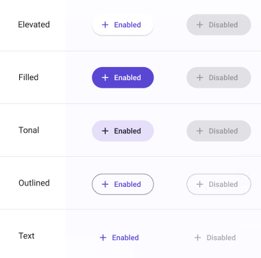
| Type | Elevated, Filled, Text, Outlined, FilledTonal |
Changes the style of the button |
| Icon | True/False |
Adds an icon before the label |
| State | Enabled, Disabled, Hovered, Focused, Pressed |
Alters the current state of the component, although it doesn't affect the plugin |
Extra Customization
To reach the extra customization features, you will need to work your way through the hierarchy of the component to find the specified sub-components.
- icon: Allows you to change the icon of the Button. It will only be displayed if the Icon property is enabled.
- Label: Allows you to change the text of the Button's label.