CheckBox
Binding: By default, Data set with the Content field in the Properties tab in the plugin will be applied to the IsChecked property for this component.
| Property | Options | Description |
|---|---|---|
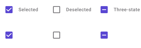
| Property | Three-state, Selected, Deselected |
Displays the combo box as if it is selected, deselected, or indeterminate. This will not be displayed in the plugin |
| Label | True/False |
Adds a label on the right side of the check box |
| State | Enabled, Disabled, Pressed, Focused, Indeterminate |
Alters the current state of the component, although it doesn't affect the plugin |
Extra Customization
To reach the extra customization features, you will need to work your way through the hierarchy of the component to find the specified sub-components.
- Content: Allows you to change the text of the CheckBox's label. It will only be displayed if the Label property is enabled.