Chip
Binding: By default, Data set with the Content field in the Properties tab in the plugin will be applied to the Content property for this component.
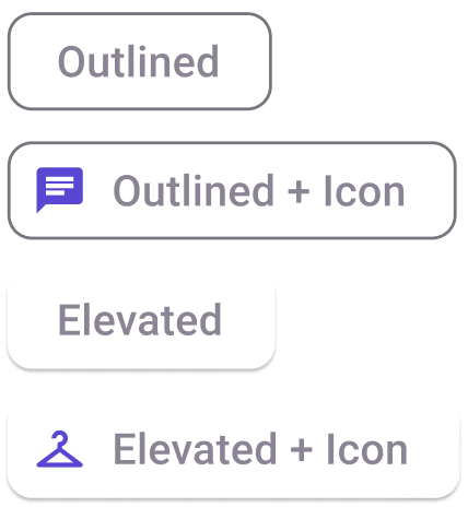
| Property | Options | Description |
|---|---|---|
| Type | Outlined, Elevated |
Displays the button as if it is clicked or not. This will not be displayed in the plugin |
| State | Enabled, Hover, Focus, Pressed, Disabled |
Alters the current state of the component, although it doesn't affect the plugin |
| Leading | True, False |
Alters the visibility of the leading icon of the component |
| Text | Text field |
Changes the text content of the component |
| Trailing | True, False |
Alters the visibility of the trailing icon of the component |
Extra Customization
To reach the extra customization features, you will need to work your way through the hierarchy of the component to find the specified sub-components.