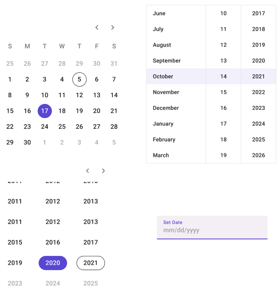
DatePicker
Note
Currently, the only DatePickers that are displayed properly are the ones with the Type property set to Icon. Any other DatePickers will look as if it was also set to Icon.

| Property | Options | Description |
|---|---|---|
| Type | Calendar, Input, List |
Changes the style of the DatePicker. Only Input will be displayed properly in the plugin. |
| Format | Day, Decade, mm/dd/yyyy |
Changes which dates and how they are displayed in the DatePickers. Day and Decade only work for Calendar and mm/dd/yyyy only works for Input and List. This property will not influence the plugin |
| Display | In page, Modal |
Adds a Select Date section to the DatePicker if it is set to Modal. This property doesn't affect the plugin |
Extra Customization
To reach the extra customization features, you will need to work your way through the hierarchy of the component to find the specified sub-components.
- Text: Allows you to change the text of the DatePicker's header.