Floating Action Button (FAB)
Tip
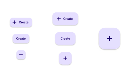
The standard usage of the FAB is to use the default size.
| Property | Options | Description |
|---|---|---|
| Type | Small, Default, Large |
Changes the size of the FAB. A Large FAB cannot have a label |
| Label | True/False |
Adds a label on the right side of the FAB. If it is disabled, Icon will be set to True |
| Icon | Default, True |
Adds an icon on the left side of the FAB. If set to Default, Label will be enabled. The Icon will also be larger if the Type is Large. |
| State | Enabled, Hover, Focus, Press |
Alters the current state of the component, although it doesn't affect the plugin |
Extra Customization
To reach the extra customization features, you will need to work your way through the hierarchy of the component to find the specified sub-components.
- Icon: Allows you to change the icon in front of the FAB. It will only be displayed if the Icon property is set to True.
- Label: Allows you to change the text of the FAB's label. It will only be displayed if the Label property is enabled.