IconToggleButton
Note
The color of the IconToggleButton can be modified via the Selection colors option. The color must be modified for both the checked AND unchecked sub-components in the IconToggleButton's hierarchy
Binding: By default, Data set with the Content field in the Properties tab in the plugin will be applied to the IsChecked property for this component.
| Property | Options | Description |
|---|---|---|
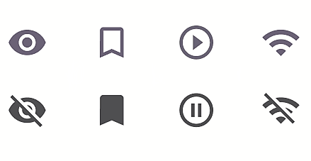
| Type | Wifi, Play/Pause, Bookmark, Visibility |
Changes the icon |
| State | Enabled, Disabled, Hover, Focus, Press |
Alters the current state of the component, although it doesn't affect the plugin |
Extra Customization
To reach the extra customization features, you will need to work your way through the hierarchy of the component to find the specified sub-components.
- Checked > Icon: Allows you to change the icon of the IconToggleButton beyond the options given in Type. This will only affect the icon while it is Checked in the plugin.
- Unchecked > Icon: Allows you to change the icon of the IconToggleButton beyond the options given in Type. This will only affect the icon while it is Unchecked in the plugin.