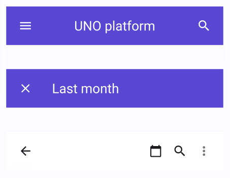
Navigation Bar
Note
Only bitmap icons can be used to modify the buttons of the Navigation Bar to avoid a known issue with iOS and Android apps. The special main command (Leading icon) will be changed automatically depending on the Navigation Bar's usage, specifically if it is used in a popup or not.
| Property | Options | Description |
|---|---|---|
| Fill Style | Primary, Surface |
Changes the colors of the Navigation Bar, it can also be overridden by using the Selection colors property from Figma |
| Content | Title/Image/None |
Changes the main content of the Navigation bar |
| Leading button | True/False |
Adds an icon on the left side of the Navigation bar |
| Trailing buttons | True/False |
Adds icons on the right side of the Navigation bar |
Extra Customization
To reach the extra customization features, you will need to work your way through the hierarchy of the component to find the specified sub-components.
- LeadingIcon > Leading Icon > Icon: Changes the icon on the left of the Navigation Bar, any modifications will not affect the plugin.
- Content: Allows you to change the text of the Navigation Bar's content.
- TrailingIcon > Icon: Changes on of the icons on the right of the Navigation Bar. Hiding a Trailing Icon will stop it from being generated in the plugin.