Navigation View
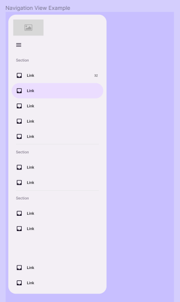
Component Properties
| Property | Options | Description |
|---|---|---|
| Collapse | True/False |
Changes the state of the Navigation View between collapsed and extended |
| Header Content | Toggle/Toggle & FAB/Toggle & Custom/Back & Toggle |
Changes the Navigation View Header style |
| Section #X | True/False |
Shows / Hide the respective Navigation View Section |
| Footer | True/False |
Shows / Hide the Navigation View Footer |
Navigation Section Properties
| Item #X | True/False | Shows / Hide the respective Navigation Item in the Section |
| Divider | True/False | Shows / Hide the divider at the ending of the Section |
Navigation Item Properties
| Property | Options | Description |
|---|---|---|
| Label text | True/False |
Shows / Hide the Item Label |
Extra Customization
To reach the extra customization features, you will need to work your way through the hierarchy of the component to find the specified sub-components.
Leading / Icon: Allows you to change the vector of the Navigation View Item's icon.
Content: Allows you to change the text of the Navigation View Item's label.
Section Label: Allows you to change the text of the Navigation Section's label.