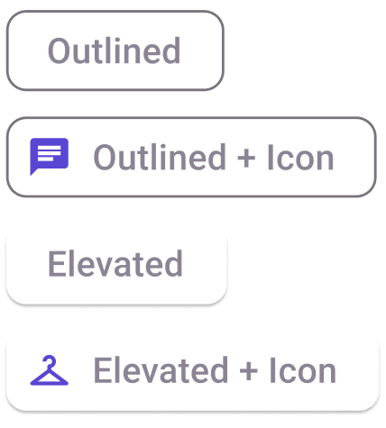
SuggestionChip
Note: For any type of Chips to be displayed properly the type of the Layout in the plugin must be set to Group. You also should put more than one Chip in the same AutoLayout.
Binding: By default, Data set with the Content field in the Properties tab in the plugin will be applied to the Content property for this component.

| Property | Options | Description |
|---|---|---|
| Type | Outlined, Elevated |
Changes the style of the suggestion chip |
| Selected | True/False |
Displays the suggestion chip as if it is selected or not. It will not be displayed in the plugin |
| Leading | True/False |
Adds an icon on the left side of the suggestion chip |
| State | Dragged, Enabled, Disabled, Hover, Focus, Press |
Alters the current state of the component, although it doesn't affect the plugin |
Extra Customization
To reach the extra customization features you will need to work your way through the hierarchy of the component to find the specified sub-components.
- Icon: Allows you to change the left side icon of the Suggestion chip. It will only be displayed if the Leading property is enabled.
- Label: Allows you to change the text of the Suggestion chip's label.