Tab Bar
Binding: By default, Data set with the Content field in the Properties tab in the plugin will be applied to the Content property for the TabBarItem.

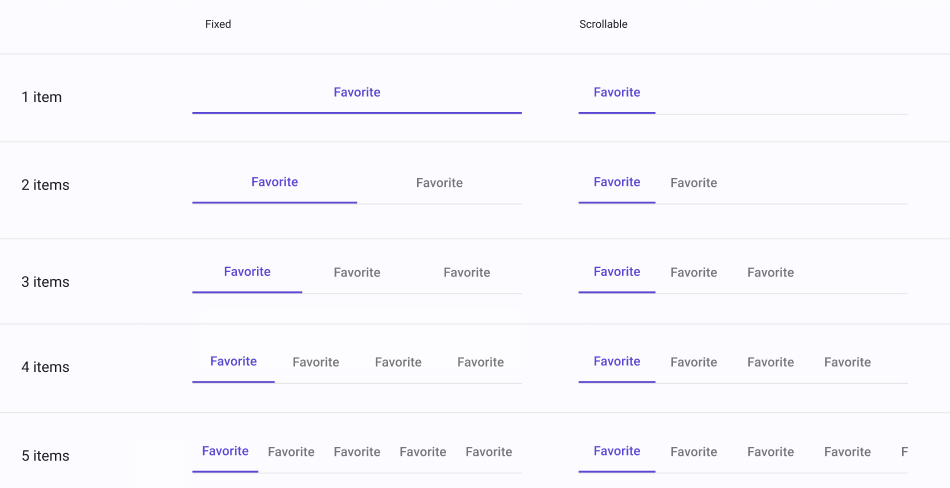
| Property | Options | Description |
|---|---|---|
| Item | 1, 2, 3, 4, 5 |
Changes the amount of icons present in the TabBar |
| Scrollable | True/False |
Changes the alignment of the items in the TabBar as well as the items' width. |
Extra Customization
To reach the extra customization features, you will need to work your way through the hierarchy of the component to find the specified sub-components.
- Icon: Changes the icon for one of the items of the Tab Bar, each item is in its own TabBarItem .
- Content: Allows you to change the text of the items label, each item is in its own TabBarItem .