TextBox
Note
The TrailingIcon of the TextBox will always be the "X" icon whether or not it is changed in Figma.
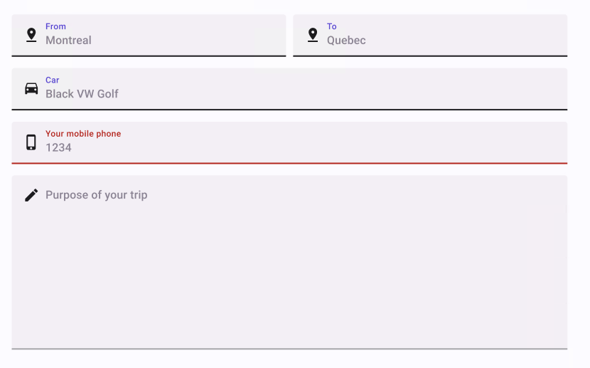
Component Properties
| Property | Options | Description |
|---|---|---|
| Type | Filled, Outlined |
Changes the style of the TextBox |
| State | Enabled, Hovered, Focused, Disabled |
Alters the current state of the component, although it doesn't affect the plugin |
| Multiline | True/False |
Enables or disables the multiline feature for the TextBox |
| Label | True/False |
Show or hide Label |
| Populated | True/False |
Show or hide input text content |
Content Template Properties
| Property | Options | Description |
|---|---|---|
| Leading | True/False |
Adds an icon on the left of the TextBox input |
| Label | True/False |
Show or hide Label |
| Input Text | True/False |
Show or hide input text content |
| Trailing | True/False |
Swap visibility of a clear icon. Doesn't affect Plugin |
Extra Customization
To reach the extra customization features, you will need to work your way through the hierarchy of the component to find the specified sub-components.