Toggle Switch
Binding: By default, Data set with the Content field in the Properties tab in the plugin will be applied to the IsOn property for this component.
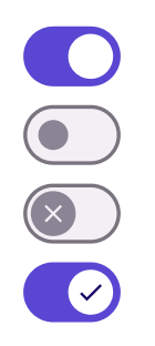
| Property | Options | Description |
|---|---|---|
| Selected | Deselected, Selected |
Displays the toggle switch as if it is selected or not. This will not be displayed in the plugin |
| Icons | Always, Selected Only, None |
Defines how icons will be available accordingly to selection value |
| State | Disabled, Enabled, Hover, Focus, Pressed |
Alters the current state of the component, although it doesn't affect the plugin |
Extra Customization
To reach the extra customization features, you will need to work your way through the hierarchy of the component to find the specified sub-components.