How to Use the Tabs Component
Overview
Tabs help organize content and data sets. The Tabs component can host from 1 to 5 TabBarItems. Tabs can either have a fixed width to display all their items or can scroll their TabBarItems horizontally.
Tabs can be found in the Assets panel under the Navigation group of components.
Steps
- Drag the Tabs component into the
Pagelayer of the design (as tabs aren’t part of the scrollable content of a page). - Select the number of TabBarItems as well as their behavior (Fixed or Scrollable) from the variants panel.
- Text and Icon options can be managed by selecting the
◇ TabBarItemlayers to reveal their distinct variants in the Figma Variants panel.
Styling Tabs
Tabs can be styled as either Top Tabs or Bottom Tabs.
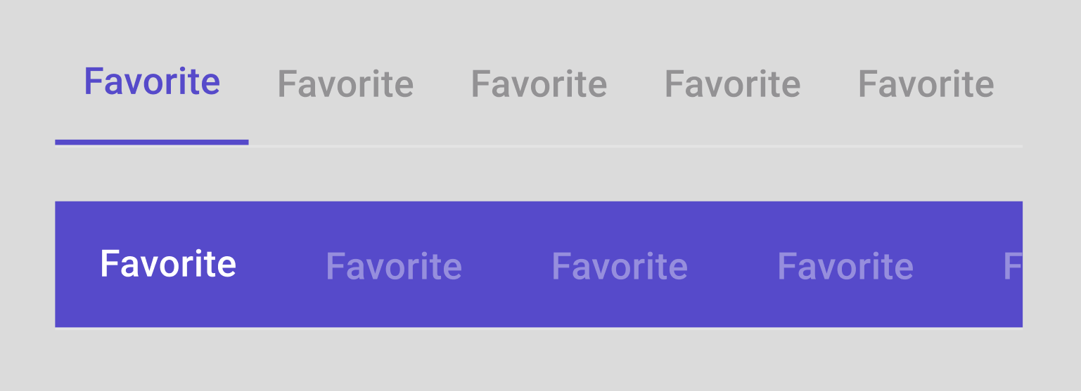
When applying color to tabs, there are 2 patterns that can be used:
- Transparent surface with
PrimaryColorfor the selectedTabBarItemcontent and OnSurface at 38% opacity for unselectedTabBarItemcontent. - Filled surface with
PrimaryColor, withOnPrimaryColorfor the selectedTabBarItemcontent andOnPrimaryColorat 38% opacity for unselectedTabBarItemcontent.
Tab Variants
Item count: 1, 2, 3, 4, 5
Scrollable or Fixed
TabBarItem
Text: True or False Icon: Top, Only, Side, None