How to Use Components
Overview
Components are elements that can be reused across designs. They help create and manage consistent designs across projects and produce optimal XAML output. The Uno toolkit comes with a vast library of ready-to-use components. They can all be seen on the Components page of the Figma Uno Toolkit. Component instances have a ◇ (Diamond icon) before their names in the Layers pane.
Once a component is brought into a design page, it becomes an Instance of its Main Component. Instances can be individually edited without affecting each other, while editing a Main Component will propagate changes across all of its instances.
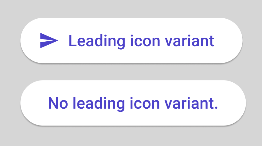
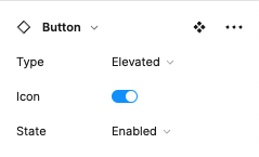
Most Toolkit Components have Variants. Variants are powerful time-savers as they allow a single component to house various states and variations with specific attributes that users may toggle on and off. For example, button components have a Leading Icon variant, so you can use the same element with or without icons throughout the design.

All variants are children of a Main Component, and all of those Main Components are children of an Editable Template. Editing an Editable Template will update all its Main Components and Variants, but none of their instances. Templates have a ❖ (4 Diamonds icon) before their name in the Layers pane.
General Guidelines
- Never detach a component instance from its main component to ensure proper XAML generation from the Uno plugin.
- Avoid editing the Component Templates from the Components Page, as this may have unintended consequences on your design and the XAML output.
Steps to Add Components to a Design
- Click on the page used for the design.
- Open the Assets Tab at the top of the Layers pane.
- Expand Local Components.
- Drag the desired component into the canvas.
- Select the desired variant from the Figma Design panel on the left of your monitor.

Note
Drag, don't click. Clicking on the component will take you to the Components page, and you will have to navigate back to your design page.
Overriding Component Properties
Although the existing component collection has been carefully designed, users are allowed to override the value of visual properties in some components. For instance, a user can choose a different color for the background of an Instance, provided the new value already exists in the design system. The properties that are allowed to be overridden are listed on the description page of each component.
Note
Changing properties not listed as available to be overridden may compromise your design and XAML output.