How to Use Fonts
The Uno Toolkit comes pre-loaded with semantic font styles to ensure your project looks great on any target platform. All Toolkit components use these styles, and the plugin can generate the necessary XAML for all of them effortlessly.
General Guidelines
- Each native platform uses a different default font. Make sure to download the appropriate fonts for your project from their respective providers:
- Material: Roboto
- Cupertino: SF-Pro
- Fluent: SegoeUI-Variable and Static Fonts
Uno will apply the appropriate native fonts, sizings, and spacings based on the Toolkit's semantic text styles used in your design.
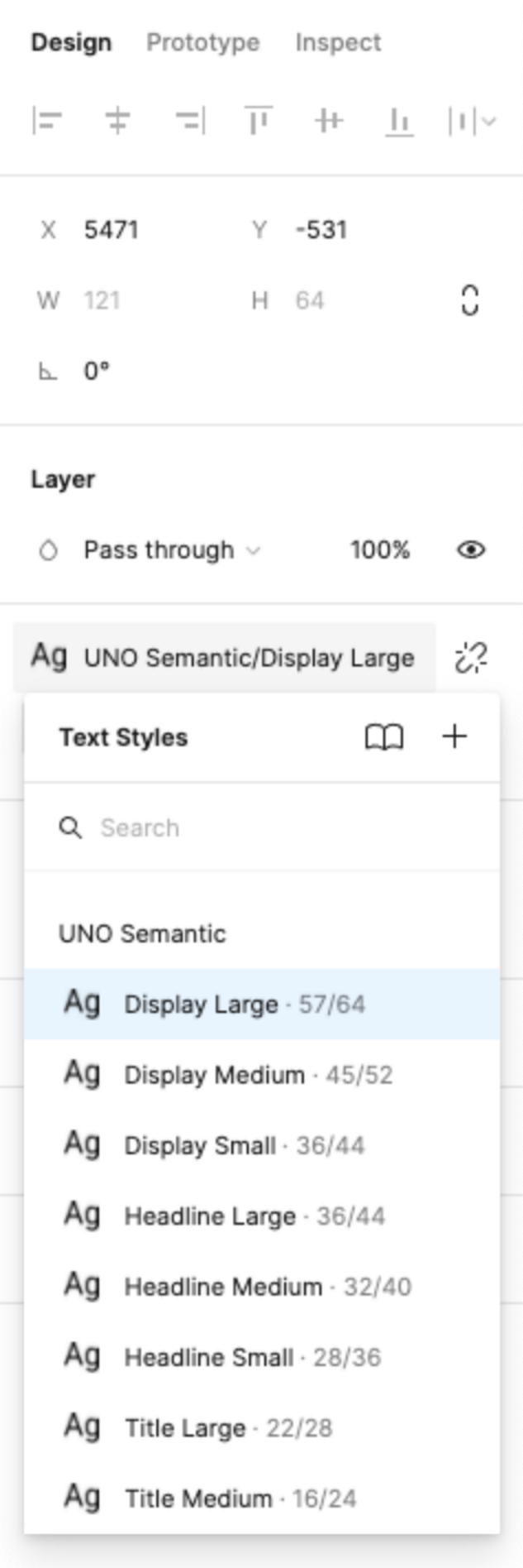
Steps to Apply a Text Style
- Select the text layer.
- If it has no style applied already, go to the Text section of the Figma
Designpanel and click theStylebutton. - Otherwise, proceed to the next step.
- If it has no style applied already, go to the Text section of the Figma
- Choose the desired style from the Text Style Panel.

Toolkit Type Styles
Display Large
Display Medium
Display Small
Headline Large
Headline Medium
Headline Small
Title Large
Title Medium
Title Small
Label Large
Label Medium
Label Small
Label Extra Small
Body Large
Body Medium
Body Small
Caption Large
Caption Medium
Caption Small
Overriding Font Styles
The Uno Plugin allows some modifications to semantic font styles. Changing the following properties will add new entries in the generated XAML resources to override default Toolkit style values:
- Font Height
- Font Weight
Important
Do not rename semantic font styles. The Uno Plugin uses the type styles' names as a reference to match default styles from the Toolkit. Renaming a type style will prevent the plugin from generating the proper XAML code.