How to Build a Simple Login Page with the Uno Figma Plugin for Designers
Follow this step-by-step guide to learn how to build a simple login page.
Prerequisites and Setup
Before starting, review the Get Started guide for the Uno Figma plugin.
Step 1: Setting the Page Template
How to Create a New Page?
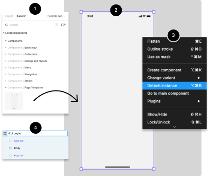
- Drag the Page Template from the Page Templates component library into your Figma project.
- Select the page to see a purple outline around it.
- Detach the page component by right-clicking and choosing 'Detach Instance'.
- Rename the page by double-clicking the layer's name.
Understanding the Layers in a Page Template
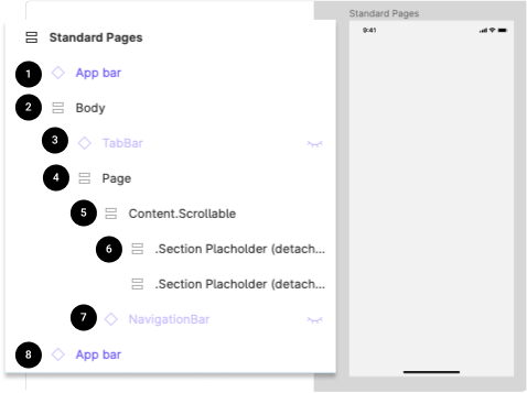
- Status Bar: For iOS or Android, used only for presentation.
- Body: Contains the Bottom Navigation Bar component and Page layers.
- Top App Bar: Contains commands and page title.
- Page: Contains all Content, including Scrollable layers.
- Content.Scrollable: Contains all scrollable content.
- Section Placeholder (2): Added to help insert content faster.
Step 2: Creating a Form
How to Add a Text Box?
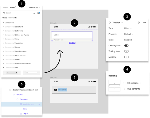
- Drag the Text Box from the Text components library into your project.
- Customize the look and content using the control panel.
- Adjust the width and edit the text as needed.
- Make the Assistive label invisible if not used.
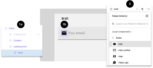
How to Change the Icon of a Text Box?
- Select the icon and choose a new one from the components control panel.
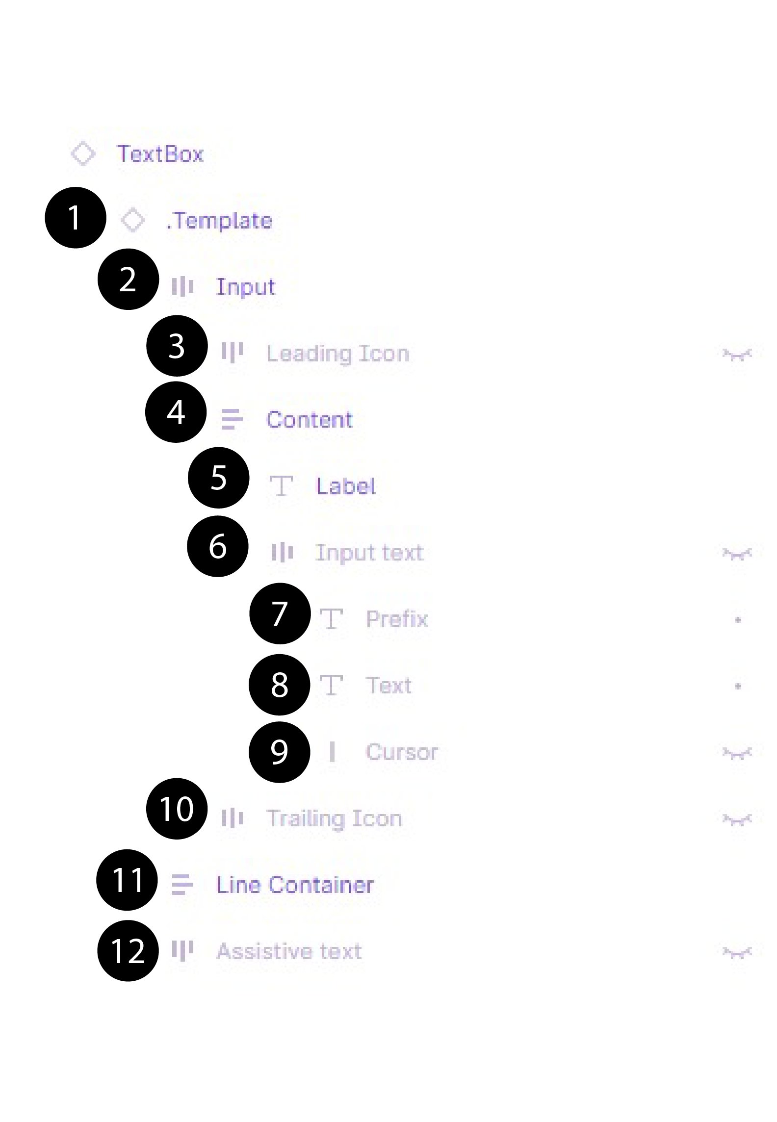
Understanding the Layers in a Text Box
- Template: Main template link.
- Input: Contains Suffix, Icons, and Input text.
- LeadingIcon: Icon on the left.
- Label: Name of the text box.
- Text: User-input text.
- Cursor: Vertical bar for illustrative purposes.
- TrailingIcon: Icon on the right.
- Line Container: Line under the text box.
- Assistive text: Text under the text box.
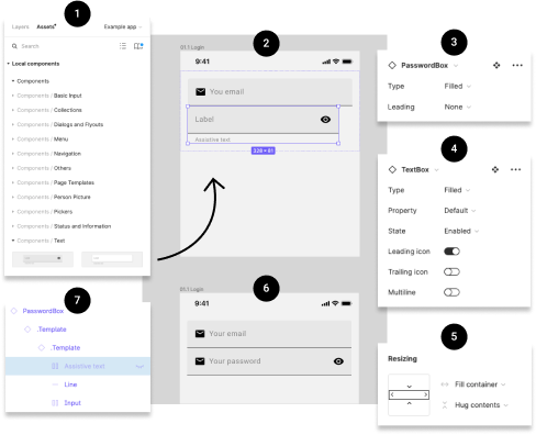
How to Add a Password Box?
- Drag the Password Box from the Text components library.
- Customize and adjust the Password Box as needed.
How to Change the Icon of a Password Box?
- Select the icon and choose a new one from the components control panel.
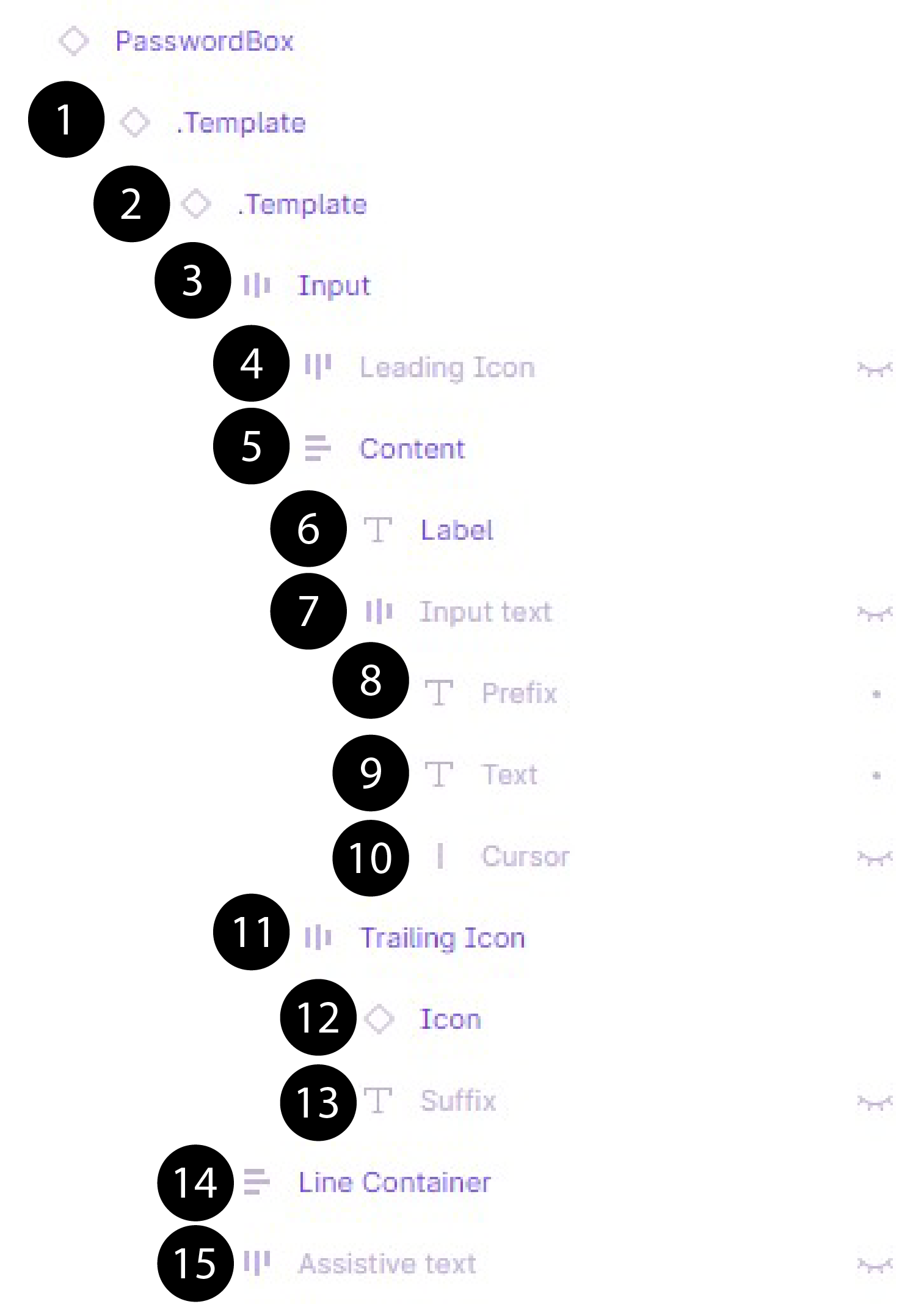
Understanding the Layers in a Password Box
- Template 1 & 2: Main templates for Password Box and Text Box.
- Input: Contains TrailingIcon and content.
- LeadingIcon: Icon on the left.
- Label: Name of the box.
- Input text: Contains Cursor, Text, and Prefix.
- TrailingIcon: Contains Suffix and Icon.
- Line: Horizontal line under the box.
- Assistive text: Text under the box.
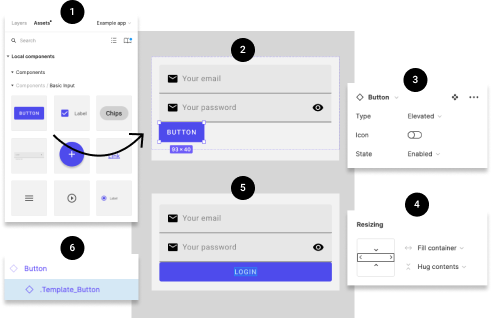
How to Add a Button?
- Drag the Button from the Basic Input components library.
- Customize the look and content as needed.
Step 3: Adjusting the Layout
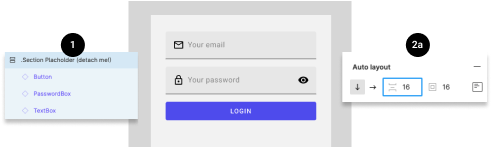
How to Edit the Spacing Between Elements?
- Select the layer group and adjust the spacing in the Auto Layout panel.
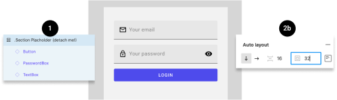
How to Edit the Padding Around Items?
- Select the layer group and adjust the padding in the Auto Layout panel.
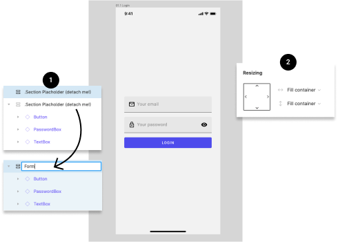
How to Make the Content Centered Vertically?
- Adjust the height of the form section to 'fill container'.
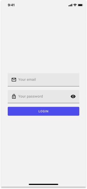
You Did It!
Your page is now complete and should look like this.