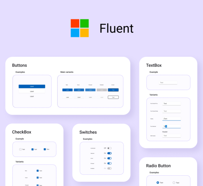
Fluent-styled controls

Uno Platform 3.0 and above supports control styles conforming to the Fluent design system. The details below explain how to use them in your app.
Upgrading existing Uno apps to use Fluent styles
Overall, the Uno Platform uses the same mechanism as WinUI to enable Fluent styles. After installing the Uno.UI NuGet version 3.0 or above, Fluent styles are enabled by specifying the XamlControlsResources within the application's resources (inside App.xaml).
For the UWP head, an additional WinUI 2 NuGet package reference must be added. This is following the same process as UWP because, for the UWP head, the Uno Platform is not used.
The step-by-step process to enable Fluent design styles within an existing Uno Platform solution is as follows:
In all platform head projects except UWP update the
Uno.UINuGet packages to 3.0 or above.In only the
UWPhead project of your solution, if you have one, install the WinUI 2 NuGet package. This step is the same as required for WinUI 2 UWP apps.Add the
XamlControlsResourcesresource dictionary to your application resources insideApp.xaml. This step is the same as required for WinUI 2 UWP apps.<Application> <Application.Resources> <!-- Load WinUI resources --> <XamlControlsResources xmlns="using:Microsoft.UI.Xaml.Controls" /> </Application.Resources> </Application>Or, if you have other existing application-scope resources, add
XamlControlsResourcesat the top (before other resources) as a merged dictionary:<Application.Resources> <ResourceDictionary> <ResourceDictionary.MergedDictionaries> <!-- Load WinUI resources --> <XamlControlsResources xmlns="using:Microsoft.UI.Xaml.Controls" /> <!-- Other merged dictionaries here --> </ResourceDictionary.MergedDictionaries> <!-- Other app resources here --> </ResourceDictionary> </Application.Resources>