Material Control Extensions
Icon
This feature allows for the addition of icon on the supported controls. Those icons could be any of the IconElements: <BitmapIcon />, <FontIcon />, <PathIcon />, or <SymbolIcon />.
Here are supported control with samples:
TextBox:
<TextBox Style="{StaticResource MaterialFilledTextBoxStyle}">
    <um:ControlExtensions.Icon>
        <SymbolIcon Symbol="SolidStar" />
    </um:ControlExtensions.Icon>
</ComboBox>
ComboBox:
<ComboBox Style="{StaticResource MaterialComboBoxStyle}">
    <um:ControlExtensions.Icon>
        <SymbolIcon Symbol="SolidStar" />
    </um:ControlExtensions.Icon>
</ComboBox>
Alternate Content
This feature allows putting different content on a control when the state changes.
It's control specific and for now, you can only use it with the ToggleButton control.
Alternate Content on ToggleButton
<ToggleButton Style="{StaticResource MaterialToggleButtonIconStyle}">
    <!-- This is the default content - which is when the control state is UNCHECKED (the default value of a ToggleButton) -->
    <PathIcon Data="{StaticResource Icon_more_horizontal}" />

    <!-- This is the alternate content - which is when the control state is CHECKED -->
    <um:ControlExtensions.AlternateContent>
        <PathIcon Data="{StaticResource Icon_more_vertical}" />
    </um:ControlExtensions.AlternateContent>
</ToggleButton>
Elevation
This feature allows to set the level of elevation to depict on the supported control.
Setting the elevation on supported controls can result in changes to both the shadow and the surface tint.
Material Design Elevation Guidance
Surface Tint
The surface tint properties allow for customization of how elevation can be depicted on certain controls. While the Background of a control remains static, the surface color can change based on the level of elevation.
TintedBackground
This is a readonly property that will provide a SolidColorBrush depicting the control's current background color overlayed with the surface tint color at a certain opacity based on the elevation of the control.
IsTintEnabled
This feature allows for enabling or disabling the surface tint that may be applied to an elevated control. When IsTintEnabled is false, the TintedBackground property will remain the same value as the control's background color.
Example Usage for Button
The ElevatedButtonStyle in Uno Material supports elevation and surface tints through the use of the TintedBackground, IsTintEnabled, and Elevation attached properties.
ElevatedButtonStyle contains the following Setters:
...

<Setter Property="um:ControlExtensions.Elevation"
        Value="1" />
<Setter Property="um:ControlExtensions.IsTintEnabled"
        Value="True" />
...
Within the ControlTemplate of the ElevatedButtonStyle, instead of performing a TemplateBinding to the Background property of the Button, we instead bind to the TintedBackground attached property:
<Grid x:Name="Root"
      ...
      Background="{Binding Path=(um:ControlExtensions.TintedBackground), RelativeSource={RelativeSource TemplatedParent}}">
      <!-- Remaining content omitted for brevity -->
</Grid>
Applying the surface tint for elevated controls is optional and must be explicitly enabled through the use of the IsTintEnabled attached property. Below is an example of how an elevated control may appear with or without a surface tint:
<StackPanel Spacing="8">
    <Button Content="Elevation 0"
            um:ControlExtensions.Elevation="0"
            Style="{StaticResource MaterialElevatedButtonStyle}" />
    <Button Content="Elevation 1"
            um:ControlExtensions.Elevation="1"
            Style="{StaticResource MaterialElevatedButtonStyle}" />
    <Button Content="Elevation 2"
            um:ControlExtensions.Elevation="2"
            Style="{StaticResource MaterialElevatedButtonStyle}" />
    <Button Content="Elevation 3"
            um:ControlExtensions.Elevation="3"
            Style="{StaticResource MaterialElevatedButtonStyle}" />
    <Button Content="Elevation 4"
            um:ControlExtensions.Elevation="4"
            Style="{StaticResource MaterialElevatedButtonStyle}" />
    <Button Content="Elevation 5"
            um:ControlExtensions.Elevation="5"
            Style="{StaticResource MaterialElevatedButtonStyle}" />
</StackPanel>
The above XAML will produce the following result:
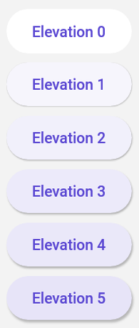
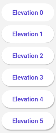
If we were to alter the XAML above and set um:ControlExtensions.IsTintEnabled="False" on each of the buttons, we would see elevated buttons without tints:
Supported Controls
The following control styles have support for surface tint:
| Control | Supporting Styles |
|---|---|
Button |
ElevatedButtonStyle |