Control Extensions
Important
UnoFeatures: Material — add <UnoFeatures>Material</UnoFeatures> to your app's .csproj to include the Uno Material resources referenced in these samples.
Icon
This feature allows for the addition of icon on the supported controls. Those icons could be any of the IconElements: <BitmapIcon />, <FontIcon />, <PathIcon />, or <SymbolIcon />.
Here are supported control with samples:
TextBox:
<TextBox Style="{StaticResource MaterialFilledTextBoxStyle}">
    <ut:ControlExtensions.Icon>
        <SymbolIcon Symbol="SolidStar" />
    </ut:ControlExtensions.Icon>
</ComboBox>
ComboBox:
<ComboBox Style="{StaticResource MaterialComboBoxStyle}">
    <ut:ControlExtensions.Icon>
        <SymbolIcon Symbol="SolidStar" />
    </ut:ControlExtensions.Icon>
</ComboBox>
Alternate Content
This feature allows putting different content on a control when the state changes.
It's control specific and for now, you can only use it with the ToggleButton control.
Alternate Content on ToggleButton
<ToggleButton Style="{StaticResource MaterialToggleButtonIconStyle}">
    <!-- This is the default content - which is when the control state is UNCHECKED (the default value of a ToggleButton) -->
    <PathIcon Data="{StaticResource Icon_more_horizontal}" />

    <!-- This is the alternate content - which is when the control state is CHECKED -->
    <ut:ControlExtensions.AlternateContent>
        <PathIcon Data="{StaticResource Icon_more_vertical}" />
    </ut:ControlExtensions.AlternateContent>
</ToggleButton>
Elevation
This feature allows to set the level of elevation to depict on the supported control.
Setting the elevation on supported controls can result in changes to shadow.
Material Design Elevation Guidance
Example Usage for Button
The ElevatedButtonStyle in Uno Material supports elevation through the use of the Elevation attached property.
ElevatedButtonStyle contains the following Setters:
...

<Setter Property="ut:ControlExtensions.Elevation"
        Value="1" />
...
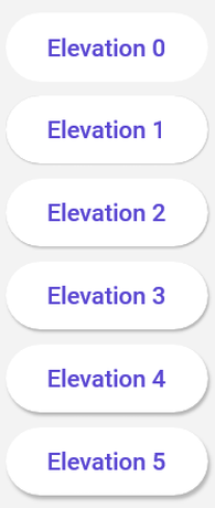
Below is an example of how an elevated control may appear:
<StackPanel Spacing="8">
    <Button Content="Elevation 0"
            ut:ControlExtensions.Elevation="0"
            Style="{StaticResource MaterialElevatedButtonStyle}" />
    <Button Content="Elevation 1"
            ut:ControlExtensions.Elevation="1"
            Style="{StaticResource MaterialElevatedButtonStyle}" />
    <Button Content="Elevation 2"
            ut:ControlExtensions.Elevation="2"
            Style="{StaticResource MaterialElevatedButtonStyle}" />
    <Button Content="Elevation 3"
            ut:ControlExtensions.Elevation="3"
            Style="{StaticResource MaterialElevatedButtonStyle}" />
    <Button Content="Elevation 4"
            ut:ControlExtensions.Elevation="4"
            Style="{StaticResource MaterialElevatedButtonStyle}" />
    <Button Content="Elevation 5"
            ut:ControlExtensions.Elevation="5"
            Style="{StaticResource MaterialElevatedButtonStyle}" />
</StackPanel>
The above XAML will produce the following result:

Supported Controls
The following control styles have support for elevation:
| Control | Supporting Styles |
|---|---|
Button |
ElevatedButtonStyle |