ShadowContainer
Summary
The ShadowContainer provides the ability to layer multiple shadows to its content.
Package Reference
A reference to Uno.Toolkit.Skia.WinUI package must be added to your Uno app so you can access ShadowContainer class and its features.
Remarks
Currently, the control simply mimics the shape of its content by size and by corner radius. Complicated shapes, such as text or pictures with alpha, are not yet supported.
Warning
In order for inset (inner) shadows to be painted on top of the background, the ShadowContainer's child element should not have a .Background or .Fill(for Shapes), it should be omitted or set to transparent. And, the background/fill value should be instead set on the ShadowContainer itself.
<!-- DO -->
<utu:ShadowContainer Background="..." Shadows="...">
    <Grid>...</Grid>
</utu:ShadowContainer>

<!-- DON'T -->
<utu:ShadowContainer Shadows="...">
    <Grid Background="..." >...</Grid>
</utu:ShadowContainer>
XAML
xmlns:utu="using:Uno.Toolkit.UI"
...

<utu:ShadowContainer>
    <utu:ShadowContainer.Shadows>
        <utu:ShadowCollection>
            <utu:Shadow ... />
            <utu:Shadow ... />
        </utu:ShadowCollection>
    </utu:ShadowContainer.Shadows>

    <SomeControl />

</utu:ShadowContainer>
Inheritance
Object → DependencyObject → UIElement → FrameworkElement → Control → ContentControl → ShadowContainer
Properties
| Property | Type | Description |
|---|---|---|
Shadows |
ShadowCollection |
The collection of shadows that will be displayed under your control. A ShadowCollection can be stored in a resource dictionary to have a consistent style throughout your app. The ShadowCollection implements INotifyCollectionChanged. |
Shadow
Dependency object representing a single shadow.
Shadow Properties
| Property | Type | Description |
|---|---|---|
IsInner |
bool |
True if this shadow is an inner shadow (similar to inset of box-shadow in CSS). |
OffsetX |
double |
The X offset of the shadow. |
OffsetY |
double |
The Y offset of the shadow. |
Color |
Color |
The color of the shadow. It will be multiplied by the Opacity property before rendering. |
Opacity |
double |
The opacity of the shadow. |
BlurRadius |
double |
The radius of the blur that will be applied to the shadow [0..100]. |
Spread |
double |
The spread will inflate or deflate (if negative) the control shadow size before applying the blur. |
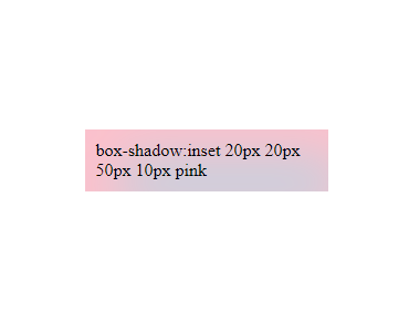
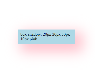
As mentioned IsInner is similar to inset of box-shadow in CSS. See the images below that illustrate its effects:
With inset an Inner Shadow is rendered.
Without inset a Drop (outer) Shadow is rendered.
For more info on how inset works in CSS for box-shadow, see box-shadow values.
Important
Be careful not to confuse the Shadow property with the Shadows property. The singular Shadow property comes from UIElement. To add shadows to the ShadowContainer, use only the Shadows property.
Shadow Order
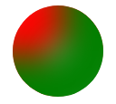
When adding shadows to the ShadowContainer, keep in mind that the order in which you place them matters, as shadows can overlap each other, affecting the final result. Shadows implemented last may overlap shadows added previously. See the examples below:
The following example has a red shadow and a green shadow, respectively. See that the green shadow overlaps the red shadow, since the green one was added last:
xmlns:utu="using:Uno.Toolkit.UI"
...

<Page.Resources>
    <utu:ShadowCollection x:Key="InnerShadows">
        <utu:Shadow BlurRadius="30"
                    OffsetX="50"
                    OffsetY="50"
                    Opacity="1"
                    Spread="-5"
                    Color="Red"
                    IsInner="True" />
        <utu:Shadow BlurRadius="30"
                    OffsetX="-50"
                    OffsetY="-50"
                    Opacity="1"
                    Spread="-5"
                    Color="Green"
                    IsInner="True" />
    </utu:ShadowCollection>
</Page.Resources>

<StackPanel>
    <utu:ShadowContainer Background="LightGray"
                         Shadows="{StaticResource InnerShadows}">
        <Grid Height="100"
              Width="100"
              CornerRadius="50" />
    </utu:ShadowContainer>
</StackPanel>
Result:
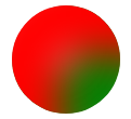
Now, let's change the shadow order and place the red shadow at the end. Note that the red shadow now overlaps the green one:
xmlns:utu="using:Uno.Toolkit.UI"
...

<Page.Resources>
    <utu:ShadowCollection x:Key="InnerShadows">
        <utu:Shadow BlurRadius="30"
                    OffsetX="-50"
                    OffsetY="-50"
                    Opacity="1"
                    Spread="-5"
                    Color="Green"
                    IsInner="True" />
        <utu:Shadow BlurRadius="30"
                    OffsetX="50"
                    OffsetY="50"
                    Opacity="1"
                    Spread="-5"
                    Color="Red"
                    IsInner="True" />
    </utu:ShadowCollection>
</Page.Resources>

<StackPanel>
    <utu:ShadowContainer  Background="LightGray"
                          Shadows="{StaticResource InnerShadows}">
        <Grid Height="100"
              Width="100"
              CornerRadius="50" />
    </utu:ShadowContainer>
</StackPanel>
Result:
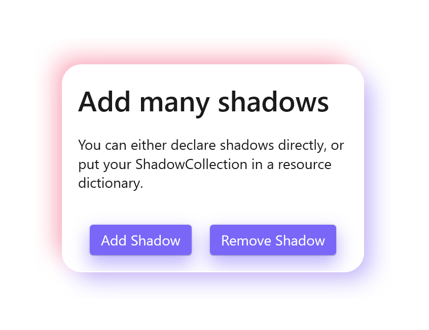
Usage
See how to add shadows to your controls with the following code and the result.
xmlns:utu="using:Uno.Toolkit.UI"
...

<Page.Resources>
    <Color x:Key="UnoColor">#7a67f8</Color>
    <Color x:Key="UnoPink">#f85977</Color>

    <!-- You can define your shadows in the resource dictionary -->
    <utu:ShadowCollection x:Name="ButtonShadows">
        <utu:Shadow BlurRadius="15"
                    OffsetY="8"
                    Opacity="0.5"
                    Color="{StaticResource UnoColor}" />
    </utu:ShadowCollection>
</Page.Resources>

<utu:ShadowContainer Background="White">
    <utu:ShadowContainer.Shadows>
        <!-- You can define your shadows directly -->
        <utu:ShadowCollection x:Name="Shadows">
            <utu:Shadow BlurRadius="20"
                        OffsetX="10"
                        OffsetY="10"
                        Opacity="0.5"
                        Spread="-5"
                        Color="{StaticResource UnoColor}" />
            <utu:Shadow BlurRadius="20"
                        OffsetX="-10"
                        OffsetY="-10"
                        Opacity="0.5"
                        Spread="-5"
                        Color="{StaticResource UnoPink}" />
        </utu:ShadowCollection>
    </utu:ShadowContainer.Shadows>
    <StackPanel Width="300"
                Padding="16"
                BorderThickness="1"
                CornerRadius="20"
                Spacing="16">

        <TextBlock Style="{StaticResource TitleTextBlockStyle}" Text="Add many shadows" />
        <TextBlock Style="{StaticResource BodyTextBlockStyle}" Text="You can either declare shadows directly, or put your ShadowCollection in a resource dictionary." />

        <StackPanel Margin="0,16,0,0"
                    HorizontalAlignment="Center"
                    Orientation="Horizontal"
                    Spacing="16">

            <!-- Reference to the dictionary button shadows -->
            <utu:ShadowContainer Shadows="{StaticResource ButtonShadows}">
                <Button Background="{StaticResource UnoColor}"
                        BorderThickness="1"
                        Content="Add Shadow"
                        Foreground="White" />
            </utu:ShadowContainer>

            <!-- Reference to the dictionary button shadows -->
            <utu:ShadowContainer Shadows="{StaticResource ButtonShadows}">
                <Button Background="{StaticResource UnoColor}"
                        BorderThickness="1"
                        Content="Remove Shadow"
                        Foreground="White" />
            </utu:ShadowContainer>
        </StackPanel>
    </StackPanel>
</utu:ShadowContainer>
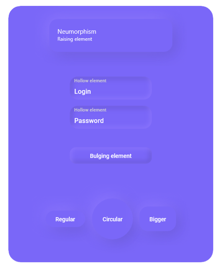
Neumorphism
Following neumorphism rules, choose one background color, 2 shadow colors, and create a cool neumorphism style.
To achieve neumorphic depth effects (instead of having a raised element, it will feel as if it was hollow or bulging), set the IsInner property of a shadow to True.
- The shadow will then be displayed inside the element instead of behind.
- This is equivalent to the
insetproperty of the CSSbox-shadowas mentioned previously.
Usage
See how to integrate neumorphism into your designs with the following code and the result.
xmlns:utu="using:Uno.Toolkit.UI"
...

<Page.Resources>
    <Color x:Key="UnoColor">#7a67f8</Color>

    <utu:ShadowCollection x:Key="NeumorphismRaising">
        <!-- Bottom right darker violet -->
        <utu:Shadow BlurRadius="30"
                    OffsetX="10"
                    OffsetY="10"
                    Opacity="1"
                    Spread="-5"
                    Color="#6858d3" />
        <!-- Top left lighter violet -->
        <utu:Shadow BlurRadius="30"
                    OffsetX="-10"
                    OffsetY="-10"
                    Opacity="1"
                    Spread="-5"
                    Color="#8c76ff" />
    </utu:ShadowCollection>

    <utu:ShadowCollection x:Key="NeumorphismHollow">
        <!-- Inner top and left shadow -->
        <utu:Shadow BlurRadius="10"
                    IsInner="True"
                    OffsetX="5"
                    OffsetY="5"
                    Opacity="1"
                    Spread="0"
                    Color="#6858d3" />
        <!-- Inner bottom and right shadow -->
        <utu:Shadow BlurRadius="10"
                    IsInner="True"
                    OffsetX="-4"
                    OffsetY="-4"
                    Opacity="1"
                    Spread="0"
                    Color="#8c76ff" />
    </utu:ShadowCollection>

    <utu:ShadowCollection x:Key="NeumorphismBulging">
        <utu:Shadow BlurRadius="10"
                    IsInner="True"
                    OffsetX="-5"
                    OffsetY="-5"
                    Opacity="1"
                    Spread="0"
                    Color="#6858d3" />
        <utu:Shadow BlurRadius="10"
                    IsInner="True"
                    OffsetX="4"
                    OffsetY="4"
                    Opacity="1"
                    Spread="0"
                    Color="#8c76ff" />
    </utu:ShadowCollection>
</Page.Resources>

<StackPanel Width="400"
            Margin="0,32"
            Padding="32"
            Background="{StaticResource UnoColor}"
            CornerRadius="30">
    <utu:ShadowContainer Background="{StaticResource UnoColor}"
                         Shadows="{StaticResource NeumorphismRaising}">
        <Grid Width="300"
              Padding="20"
              CornerRadius="20">
            <Grid.RowDefinitions>
                <RowDefinition Height="20" />
                <RowDefinition Height="20" />
            </Grid.RowDefinitions>

            <TextBlock FontSize="15"
                       Foreground="White"
                       Text="Neumorphism" />
            <TextBlock Grid.Row="1"
                       FontSize="12"
                       Foreground="White"
                       Text="Raising element" />
        </Grid>
    </utu:ShadowContainer>

    <utu:ShadowContainer Margin="0,60,0,0"
                         Background="{StaticResource UnoColor}"
                         Shadows="{StaticResource NeumorphismHollow}">
        <TextBox Width="200"
                 Height="40"
                 Padding="15,10,15,0"
                 VerticalAlignment="Center"
                 BorderThickness="0"
                 CornerRadius="20"
                 Foreground="White"
                 PlaceholderForeground="LightGray"
                 PlaceholderText="Hollow element" />
    </utu:ShadowContainer>
    <utu:ShadowContainer Margin="0,15" Shadows="{StaticResource NeumorphismHollow}">
        <TextBox Width="200"
                 Height="40"
                 Padding="15,10,15,0"
                 VerticalContentAlignment="Center"
                 Background="{StaticResource UnoColor}"
                 BorderThickness="0"
                 CornerRadius="20"
                 Foreground="White"
                 PlaceholderForeground="LightGray"
                 PlaceholderText="Hollow element" />
    </utu:ShadowContainer>

    <utu:ShadowContainer Margin="0,30" Shadows="{StaticResource NeumorphismBulging}">
        <Button Width="200"
                Height="40"
                Background="{StaticResource UnoColor}"
                BorderBrush="{StaticResource UnoColor}"
                Content="Bulging element"
                CornerRadius="15"
                Foreground="White" />
    </utu:ShadowContainer>

    <StackPanel Margin="0,30,0,0"
                Padding="24"
                HorizontalAlignment="Center"
                Orientation="Horizontal"
                Spacing="16">

        <utu:ShadowContainer Shadows="{StaticResource NeumorphismRaising}">
            <Button Background="{StaticResource UnoColor}"
                    BorderThickness="0"
                    Content="Regular"
                    Foreground="White" />
        </utu:ShadowContainer>

        <utu:ShadowContainer Shadows="{StaticResource NeumorphismRaising}">
            <Button Width="80"
                    Height="80"
                    Background="{StaticResource UnoColor}"
                    BorderBrush="{StaticResource UnoColor}"
                    Content="Circular"
                    CornerRadius="40"
                    Foreground="White" />
        </utu:ShadowContainer>

        <utu:ShadowContainer Shadows="{StaticResource NeumorphismRaising}">
            <Button Height="60"
                    Background="{StaticResource UnoColor}"
                    BorderThickness="0"
                    Content="Bigger"
                    CornerRadius="20"
                    Foreground="White" />
        </utu:ShadowContainer>
    </StackPanel>
</StackPanel>
Theme Switching support
To ensure that the Shadows feature seamlessly integrates with Theme Switching, it's essential to include the shadow collection within the theme dictionary.
Here's a snippet demonstrating how to structure your theme dictionary for proper shadow support:
xmlns:utu="using:Uno.Toolkit.UI"
...

<ResourceDictionary>
    <ResourceDictionary.ThemeDictionaries>
        <ResourceDictionary x:Key="Dark">
            <Color x:Key="LightShadowColor">Pink</Color>
            <Color x:Key="ShadeShadowColor">SkyBlue</Color>

            <utu:ShadowCollection x:Key="ButtonShadows">
                <utu:Shadow BlurRadius="10"
                            IsInner="True"
                            OffsetX="-5"
                            OffsetY="-5"
                            Opacity="1"
                            Spread="0"
                            Color="{StaticResource LightShadowColor}" />
                <utu:Shadow BlurRadius="10"
                            IsInner="True"
                            OffsetX="4"
                            OffsetY="4"
                            Opacity="1"
                            Spread="0"
                            Color="{StaticResource ShadeShadowColor}" />
            </utu:ShadowCollection>
        </ResourceDictionary>
        <ResourceDictionary x:Key="Light">
            <Color x:Key="LightShadowColor">Orange</Color>
            <Color x:Key="ShadeShadowColor">Green</Color>

            <utu:ShadowCollection x:Key="ButtonShadows">
                <utu:Shadow BlurRadius="10"
                            IsInner="True"
                            OffsetX="-5"
                            OffsetY="-5"
                            Opacity="1"
                            Spread="0"
                            Color="{StaticResource LightShadowColor}" />
                <utu:Shadow BlurRadius="10"
                            IsInner="True"
                            OffsetX="4"
                            OffsetY="4"
                            Opacity="1"
                            Spread="0"
                            Color="{StaticResource ShadeShadowColor}" />
            </utu:ShadowCollection>
        </ResourceDictionary>
    </ResourceDictionary.ThemeDictionaries>
</ResourceDictionary>
...

<utu:ShadowContainer Background="{StaticResource UnoColor}"
                     Shadows="{ThemeResource ButtonShadows}">
    <Button Width="200"
            Height="40"
            BorderBrush="{StaticResource UnoColor}"
            Content="Save"
            CornerRadius="15"
            Foreground="White" />
</utu:ShadowContainer>