Migrating the home page XAML and styles
The general approach for migrating a Silverlight page to UWP is to start by creating a new UWP page (as demonstrated earlier) and then copying the content XAML and associated styles from the Silverlight page to UWP. The approach would then be:
- Fix namespaces
- Migrate/updates styles
- Controls updates:
- For those that map directly (such as Button or TextBlock), update any syntax differences
- For those with an alternate UWP control (such as Silverlight DataGrid and the Windows Community Toolkit DataGrid), update the XAML as needed
- For those with no alternatives, consider a custom control
- Databinding - consider migrating to x:Bind
- Convertors - convert or consider migrating to function bindings
In the sample Silverlight app, the home page uses 3 HyperlinkButton controls containing images as alternate means to navigate to the primary capabilities of the application and looks like the following:
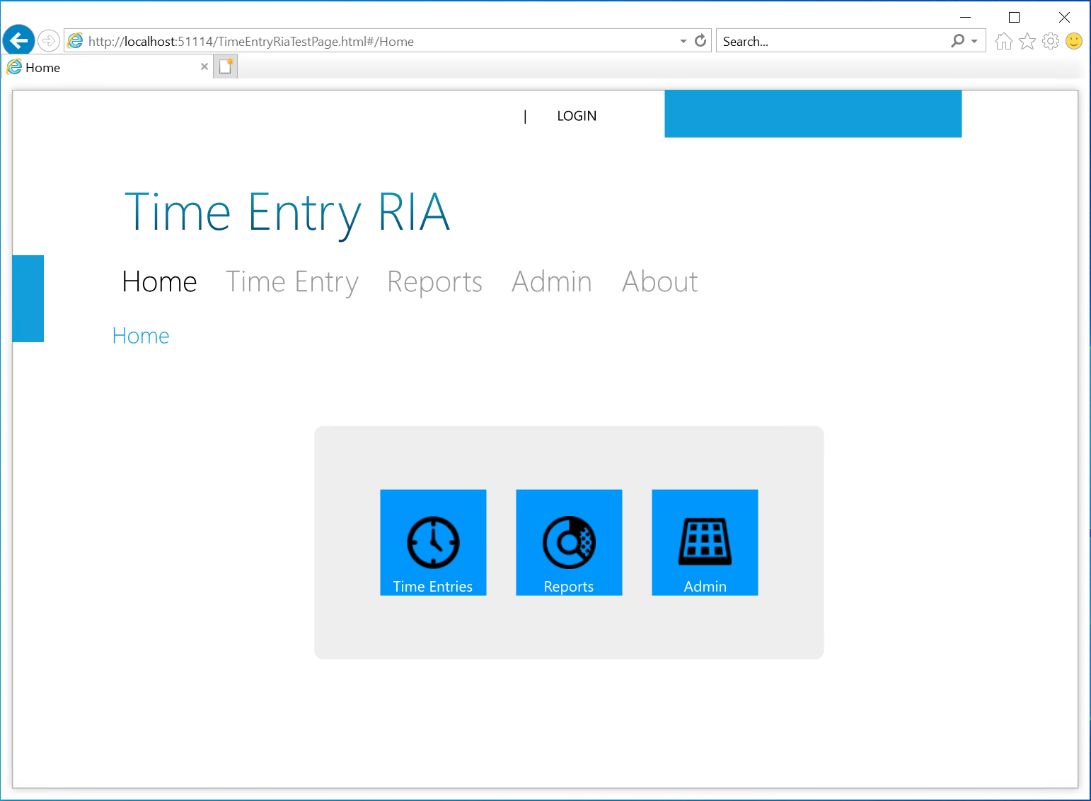
The next task will review the similarities and differences between the Silverlight version and UWP.
Compare the Silverlight Home XAML to the UWP XAML
If the Silverlight home page XAML is compared with the UWP XAML, it is apparent that there is much in common. Reviewing the page and namespace declarations will show that the basic controls used for layout, such as Grid and StackPanel, content controls such as Image and TextBlock, as well as the simpler interaction controls such as TextBox, Button and HyperlinkButton are virtually identical.
<navigation:Page
  x:Class="TimeEntryRia.Home"
  xmlns="http://schemas.microsoft.com/winfx/2006/xaml/presentation"
  xmlns:x="http://schemas.microsoft.com/winfx/2006/xaml"
  xmlns:d="http://schemas.microsoft.com/expression/blend/2008"
  xmlns:mc="http://schemas.openxmlformats.org/markup-compatibility/2006"
  xmlns:navigation="clr-namespace:System.Windows.Controls;assembly=System.Windows.Controls.Navigation"
  mc:Ignorable="d" d:DesignWidth="640" d:DesignHeight="480"
  Style="{StaticResource PageStyle}">

  <Grid x:Name="LayoutRoot">

        <TextBlock x:Name="HeaderText" Style="{StaticResource HeaderTextStyle}"
                           Text="{Binding Path=ApplicationStrings.HomePageTitle, Source={StaticResource ResourceWrapper}}"/>
        <Grid VerticalAlignment="Center" HorizontalAlignment="Center">
            <Rectangle Style="{StaticResource ContentPanelBackground}" />
            <StackPanel Orientation="Horizontal" VerticalAlignment="Center" HorizontalAlignment="Center" Margin="48">
                <HyperlinkButton Margin="12" NavigateUri="/TimeEntryPage">
                    <Grid>
                        <Rectangle Style="{StaticResource HomeNavButtonsBackground}"/>
                        <Image Source="../Assets/Images/icons8-watch-50.png" Stretch="None" />
                        <TextBlock Style="{StaticResource HomeNavButtonsText}"
                               Text="Time Entries" />
                    </Grid>
                </HyperlinkButton>
                <HyperlinkButton Margin="12" NavigateUri="/ReportsPage">
                    <Grid>
                        <Rectangle Style="{StaticResource HomeNavButtonsBackground}"/>
                        <Image Source="../Assets/Images/icons8-doughnut-chart-50.png" Stretch="None" />
                        <TextBlock Style="{StaticResource HomeNavButtonsText}"
                               Text="Reports" />
                    </Grid>
                </HyperlinkButton>
                <HyperlinkButton Margin="12" NavigateUri="/AdminPage">
                    <Grid>
                        <Rectangle Style="{StaticResource HomeNavButtonsBackground}"/>
                        <Image Source="../Assets/Images/icons8-control-panel-50.png" Stretch="None" />
                        <TextBlock Style="{StaticResource HomeNavButtonsText}"
                               Text="Admin" />
                    </Grid>
                </HyperlinkButton>
            </StackPanel>
        </Grid>
    </Grid>
</navigation:Page>
Compare the above Silverlight XAML to the current UWP XAML definition of the HomePage:
<Page
    x:Class="TimeEntryUno.Shared.Views.HomePage"
    xmlns="http://schemas.microsoft.com/winfx/2006/xaml/presentation"
    xmlns:x="http://schemas.microsoft.com/winfx/2006/xaml"
    xmlns:d="http://schemas.microsoft.com/expression/blend/2008"
    xmlns:mc="http://schemas.openxmlformats.org/markup-compatibility/2006"
    xmlns:local="using:TimeEntryUno.Shared.Views"
    mc:Ignorable="d"
    Background="{ThemeResource ApplicationPageBackgroundThemeBrush}">

    <Grid>
        <TextBlock Text="Home" Style="{StaticResource HeaderTextBlockStyle}"/>
    </Grid>
</Page>
First, it can be seen that UWP uses the Page class as the base for a page, however the attributes are very similar - both share the x:Class attribute that specifies the code-behind partial class that is joined with the XAML during compilation. The next four namespace declarations are identical between the two, clearly demonstrating the commonality. Next, the Silverlight page defines a namespace for navigation, as this was added to Silverlight in version 3 and was not part of the original namespaces. A key thing to note here is how the reference to assemblies has been refined:
- Silverlight:
xmlns:navigation="clr-namespace:System.Windows.Controls;assembly=System.Windows.Controls.Navigation" - UWP:
xmlns:local="using:TimeEntryUno.Shared.Views"
The UWP approach is similar to that used in C#.
In the next task the Silverlight XAML will be copied over and updated to work in the Uno app.
Tip
The approach for migrating a Silverlight namespace prefix definition to a UWP definition would be as follows:
- Change "clr-namespace" to "using"
- Delete any assembly token and semi-colon
Example:
xmlns:TimeEntryModels="clr-namespace:TimeEntry.Models;assembly=TimeEntry"
Becomes:
xmlns:TimeEntryModels="using:TimeEntry.Models"
Convert the content XAML
In the Shared project, open the Home.xaml file and locate the TextBlock. Insert the following XAML beneath it:
<Grid VerticalAlignment="Center" HorizontalAlignment="Center">
    <Rectangle Style="{StaticResource ContentPanelBackground}" />
    <StackPanel Orientation="Horizontal" VerticalAlignment="Center" HorizontalAlignment="Center" Margin="48">
        <HyperlinkButton Margin="12" NavigateUri="/TimeEntryPage">
            <Grid>
                <Rectangle Style="{StaticResource HomeNavButtonsBackground}"/>
                <Image Source="../Assets/Images/icons8-watch-50.png" Stretch="None" />
                <TextBlock Style="{StaticResource HomeNavButtonsText}"
                        Text="Time Entries" />
            </Grid>
        </HyperlinkButton>
        <HyperlinkButton Margin="12" NavigateUri="/ReportsPage">
            <Grid>
                <Rectangle Style="{StaticResource HomeNavButtonsBackground}"/>
                <Image Source="../Assets/Images/icons8-doughnut-chart-50.png" Stretch="None" />
                <TextBlock Style="{StaticResource HomeNavButtonsText}"
                        Text="Reports" />
            </Grid>
        </HyperlinkButton>
        <HyperlinkButton Margin="12" NavigateUri="/AdminPage">
            <Grid>
                <Rectangle Style="{StaticResource HomeNavButtonsBackground}"/>
                <Image Source="../Assets/Images/icons8-control-panel-50.png" Stretch="None" />
                <TextBlock Style="{StaticResource HomeNavButtonsText}"
                        Text="Admin" />
            </Grid>
        </HyperlinkButton>
    </StackPanel>
</Grid>
There are a number of obvious and less obvious issues:
- Missing styles:
- ContentPanelBackground
- HomeNavButtonsBackground
- HomeNavButtonsText
- HyperlinkButton controls - in Silverlight, NavigateUri integrates with the navigation system, whereas in UWP the click event will be used to run code-behind.
- Image controls - the assets are missing and will be in different locations
- Missing styles:
Migrating the styles
The next steps will show how migrate the Silverlight styles to work in the Uno app.
In the Shared project, add a new folder named Resources.
Right-click the new Resources folder, select Add > New Item, select Resource Dictionary and name it Styles.xaml.
To ensure the resource dictionary is loaded, it must be added to App.xaml.
Open App.xaml and the reference to the Styles.xaml as shown below:
<Application.Resources>
    <ResourceDictionary>
        <ResourceDictionary.MergedDictionaries>
            <XamlControlsResources xmlns="using:Microsoft.UI.Xaml.Controls" />
            <!-- Other merged dictionaries here -->

            <ResourceDictionary Source="/Resources/Styles.xaml" />
        </ResourceDictionary.MergedDictionaries>
        <!-- Other app resources here -->
    </ResourceDictionary>
</Application.Resources>
The first style that is missing is ContentPanelBackground, so review the style and any associated resources as defined in the Silverlight app. ContentPanelBackground is defined in the Silverlight file Styles.xaml:
<Style x:Key="ContentPanelBackground" TargetType="Rectangle">
    <Setter Property="RadiusX" Value="{StaticResource Radius}"/>
    <Setter Property="RadiusY" Value="{StaticResource Radius}"/>
    <Setter Property="Fill" Value="{StaticResource ContentPanelBackgroundBrush}"/>
</Style>
This style has a dependency on other resources, the first Radius is also defined in Styles.xaml:
<my:Double x:Key="Radius">8</my:Double>Note
This resource includes a custom namespace my: - this is defined as
xmlns:my="clr-namespace:System;assembly=mscorlib". This namespace definition will not be required in the Uno project - the x: namespace incorporates the primitives such as Double.The second dependency ContentPanelBackgroundBrush, is defined in the Brushes.xaml (in the sample a single resource file will be used):
<SolidColorBrush x:Key="ContentPanelBackgroundBrush" Color="{StaticResource Gray1}"/>The brush resource is dependent on a color resource, also defined in Brushes.xaml:
<Color x:Key="Gray1">#FFCCCCCC</Color>These styles are 100% compatible, so may be copied directly into the Styles.xaml that was just created.
To add the ContentPanelBackground style and related resources, update the Uno Styles.xaml as follows:
<ResourceDictionary
    xmlns="http://schemas.microsoft.com/winfx/2006/xaml/presentation"
    xmlns:x="http://schemas.microsoft.com/winfx/2006/xaml">

    <!-- Primitives -->
    <x:Double x:Key="Radius">8</x:Double>

    <!-- Colors -->
    <Color x:Key="Gray1">#FFCCCCCC</Color>

    <!-- Brushes -->
    <SolidColorBrush x:Key="ContentPanelBackgroundBrush" Color="{StaticResource Gray1}"/>

    <!-- Styles -->
    <Style x:Key="ContentPanelBackground" TargetType="Rectangle">
        <Setter Property="RadiusX" Value="{StaticResource Radius}"/>
        <Setter Property="RadiusY" Value="{StaticResource Radius}"/>
        <Setter Property="Fill" Value="{StaticResource ContentPanelBackgroundBrush}"/>
    </Style>

</ResourceDictionary>
If you compile the application and open the HomePage.xaml file, you should now see the gray rectangle rendered.
The next resource to be added is HomeNavButtonsBackground. In the Silverlight app it is defined as:
<Style x:Key="HomeNavButtonsBackground" TargetType="Rectangle">
    <Setter Property="Width" Value="100"/>
    <Setter Property="Height" Value="100"/>
    <Setter Property="Fill" Value="{StaticResource HighLightColorBrush}"/>
</Style>
This has a dependency on HighLightColorBrush which is defined in the same resource dictionary:
<SolidColorBrush x:Key="HighLightColorBrush" Color="#FF0097FC"/>In Windows 10, the system provides an accent color that the user can customize, so instead of hard coding the value above, we could instead use SystemAccentColor.
To add the HomeNavButtonsBackground style using the SystemAccentColor resource, insert the following below the ContentPanelBackground definition:
<Style x:Key="HomeNavButtonsBackground" TargetType="Rectangle">
    <Setter Property="Width" Value="100"/>
    <Setter Property="Height" Value="100"/>
    <Setter Property="Fill" Value="{StaticResource SystemAccentColor}"/>
</Style>
Save the resource and the designer view should update and show the rectangle backgrounds using the system accent color (default value is blue).
The last resource required is the HomeNavButtonsText resource. In the Silverlight app it is defined as:
<Style x:Key="HomeNavButtonsText" TargetType="TextBlock">
    <Setter Property="VerticalAlignment" Value="Bottom"/>
    <Setter Property="HorizontalAlignment" Value="Center"/>
    <Setter Property="Foreground" Value="White"/>
</Style>
In the Uno app, we will use the SystemColorHighlightTextBrush instead of hard-coding White.
To add the HomeNavButtonsBackground resource, , insert the following below the ContentPanelBackground definition:
<Style x:Key="HomeNavButtonsText" TargetType="TextBlock">
    <Setter Property="VerticalAlignment" Value="Bottom"/>
    <Setter Property="HorizontalAlignment" Value="Center"/>
    <Setter Property="Foreground" Value="{StaticResource SystemColorHighlightTextBrush}"/>
</Style>
Save the resource and the designer should now display the rectangle background and the appropriate foreground text color.
Adding the images
In the next few steps, the images will be copied to the Uno app.
In the Shared project, right-click the Assets folder and Add > New Folder and name the folder Images.
Download the image assets via the following link: Download icons.zip
Important
The app uses image assets from Icons8.com - the free use license can be reviewed here:
Unzip the icons, open the output folder, select all of the images and copy them to the clipboard.
In Visual Studio, right-click the Images folder created above and select Paste - the images should be added to the project (as well as copied to the folder in the file system).
Note
Once the images have been copied to the folder, select an image in Visual Studio and note that the Build Action is sent to Content.
Recompile the app - the images should appear in the designer view for Home.xaml
Updating the navigation links
As mentioned earlier, the navigation implementation differs between Silverlight and UWP - Silverlight utilizes a URI-based approach, whereas UWP navigates by type. In the next few steps, the navigation will be updated to use a code-behind approach. This is just one way that navigation can be added to a Button control and it's variants (including the HyperlinkButton control):
- Code-behind via Click event
- Binding to the Click event (can be used with code-behind or a view-model)
- Binding to the Command property (can be used with code-behind or a view-model)
Note
The binding implementations will be discussed with View-Models later in the article.
In the Shared project, open the Home.xaml file.
Find the first HyperlinkButton declaration:
<HyperlinkButton Margin="12" NavigateUri="/TimeEntryPage">And update it to invoke a method on the Click event:
<HyperlinkButton Margin="12" Click="TimeEntryClicked">To add the implementation for TimeEntryClicked, open Home.xaml.cs and add the following code:
private void TimeEntryClicked(object sender, RoutedEventArgs e)
{
    this.Frame.Navigate(typeof(TimeEntryPage));
}
The code above utilizes the Frame property of the Page class to access navigation. Anytime a page is navigated to, the Frame property is set to the Frame instance that controls the navigation. This makes it very convenient to navigate via the code-behind.
Update the remaining two HyperlinkButton declarations to use Click events and add the methods to the code-behind:
Event Method Name Navigation Call Click="ReportsClicked"ReportsClickedthis.Frame.Navigate(typeof(ReportsPage));Click="AdminClicked"AdminClickedthis.Frame.Navigate(typeof(AdminPage));Compile and run both the UWP and WASM heads - notice that clicking each of the hyperlinks on the home page will navigate to desired destination page and that the back navigation works as expected.
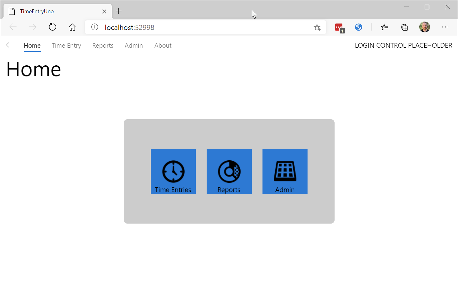
The WASM version of the application will look similar to:
Next unit: String resources