Migrating the authentication UI
The Silverlight Business App template includes the user login and registration UI:
- LoginForm - uses a customized Silverlight DataForm control to render a login UI
- RegistrationForm - uses a customized Silverlight DataForm control to render a registration UI (unused in the TimeEntryRia sample)
- LoginRegistrationWindow - a ChildWindow that displays either the LoginForm or the RegistrationForm
- LoginStatus - a UserControl that uses the VisualStateManager to display one of three layouts:
- If using Windows authentication, the current Windows user
- The login UI - essentially a button that displays the LoginRegistrationWindow and the LoginForm
- The logout UI - a button to logout the current user
When looking to migrate these UI elements, an immediate challenge presents - the Silverlight Toolkit DataForm is used in the LoginForm and RegistrationForm and there is no direct replacement in either UWP, the Windows Community Toolkit or WinUI. The Silverlight DataForm control is part of the Silverlight Toolkit and dynamically generates a data entry form when bound to an object. The generated form supports data annotation attributes that influence display names, validation and displays data errors. Unfortunately, although data annotations exist in UWP, UWP is lacking support for data validation and error display.
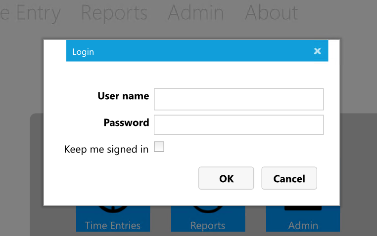
Here is an example of a DataForm:
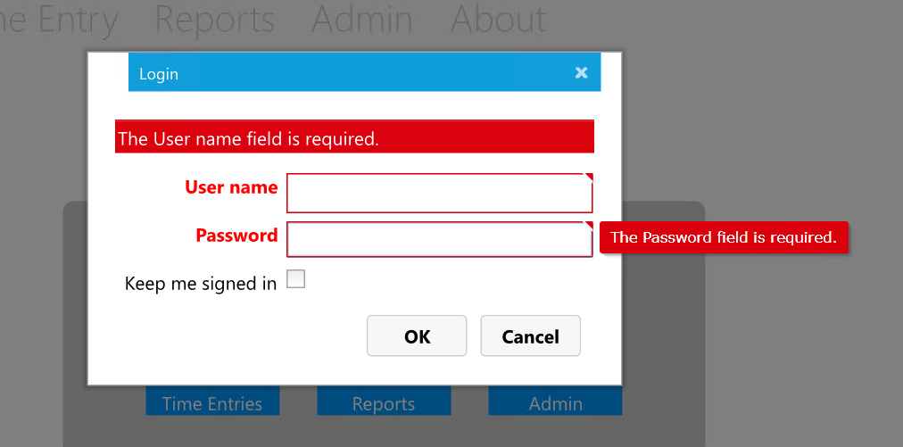
And here is the same data form with errors displayed:
And here is the associated Silverlight XAML:
<Grid>
    <Grid.RowDefinitions>
        <RowDefinition Height="Auto"/>
        <RowDefinition/>
    </Grid.RowDefinitions>

    <local:BusyIndicator x:Name="busyIndicator" BusyContent="{Binding Path=ApplicationStrings.BusyIndicatorLoggingIn, Source={StaticResource ResourceWrapper}}"
                            IsBusy="{Binding IsLoggingIn}">
        <StackPanel Orientation="Vertical">
            <local:CustomDataForm x:Name="loginForm"
                                    Padding="10,10,20,0"
                                    CurrentItem="{Binding}"
                                    IsEnabled="{Binding IsLoggingIn, Converter={StaticResource NotOperatorValueConverter}}"
                                    AutoEdit="True" CommandButtonsVisibility="None" HeaderVisibility="Collapsed"
                                    AutoGeneratingField="LoginForm_AutoGeneratingField"
                                    Style="{StaticResource LoginDataFormStyle}" />
        </StackPanel>
    </local:BusyIndicator>

    <StackPanel Grid.Row="1" Grid.Column="1" Orientation="Horizontal" HorizontalAlignment="Right" Margin="0,0,10,0">
        <Button x:Name="loginButton" Content="{Binding Path=ApplicationStrings.OKButton, Source={StaticResource ResourceWrapper}}" Click="LoginButton_Click" Style="{StaticResource RegisterLoginButtonStyle}" IsEnabled="{Binding Path=CanLogIn}" />
        <Button x:Name="loginCancel" Content="{Binding Path=ApplicationStrings.CancelButton, Source={StaticResource ResourceWrapper}}" Click="CancelButton_Click" Style="{StaticResource RegisterLoginButtonStyle}" />
    </StackPanel>
</Grid>
By examining the <local:CustomDataForm x:Name="loginForm" control we can see that there is no list of data fields, etc. - it is doing all of the heavy lifting when it comes to displaying fields, tips, errors, etc. Unfortunately, unless the DataForm is migrated to UWP/Uno, the only option for migration is to build the XAML for the headers, fields and data-binding explicitly.
Tip
The source code for the Silverlight Toolkit has been archived on GitHub and some of the controls have been migrated to Uno (unfortunately, this does not include the DataForm):
The Uno team also published a blog post on migrating the Silverlight Toolkit TreeView control:
The TimeEntryRIA app does not utilize the RegistrationForm, only the LoginForm.
Implementing the LoginForm
The next task will take a look at creating the LoginForm. As discussed above, there is no migration path for the Silverlight versions of the LoginRegistrationWindow, RegistrationForm and the LoginForm. As the RegistrationForm is unused in the TimeEntryRIA app, there is no need to create a version of it and, therefore, no need to create the host control LoginRegistrationWindow. Instead, the UWP ContentDialog control will be used.
Tip
To learn more about the ContentDialog control, review the following resources: *
Create the LoginForm
The following steps will create the LoginForm.
In the Shared project, within the Views folder, create a new folder Login.
Within the Views\Login folder, add a new ContentDialog and name it LoginForm.
Open the LoginForm.xaml file and add the following property to the ContentDialog control:
x:Uid="LoginDialog"
Important
Do not delete the Title, PrimaryButtonText and SecondaryButtonText properties. Due to an open Uno issue #921, unless these properties are defined in XAML, the x:Uid resources won't be applied.
To add the login form string resources, open the
Strings\en\Resources.reswfile and add the following strings:Name Value LoginDialog.Title Login LoginDialog.PrimaryButtonText OK LoginDialog.SecondaryButtonClick Cancel Return to the LoginForm.xaml file and replace the empty Grid with the following XAML:
<Grid>
    <StackPanel>
        <Border Background="Red" Margin="4" Padding="4"
                Visibility="{x:Bind IsErrorMessageVisible(), Mode=OneWay}">
            <TextBlock Foreground="White"
                       Text="{x:Bind ErrorMessage, Mode=TwoWay}"/>
        </Border>
        <TextBox x:Uid="UserName" Margin="4"
                 Text="{x:Bind UserName, Mode=TwoWay}"/>
        <PasswordBox x:Uid="Password" Margin="4"
                     Password="{x:Bind Password, Mode=TwoWay}"/>
        <CheckBox x:Uid="StaySignedIn" Margin="4" IsThreeState="False"
                  IsChecked="{x:Bind StaySignedIn, Mode=TwoWay}"/>
    </StackPanel>
    <ProgressRing IsActive="{x:Bind IsBusy, Mode=TwoWay}"
                  Visibility="{x:Bind IsBusyVisible(), Mode=OneWay}"
                  VerticalAlignment="Center" HorizontalAlignment="Center" />
</Grid>
Examine the XAML - the outer Grid contains a StackPanel to layout the form controls, and the ProgressRing which will appear above the input controls. Within the StackPanel, there is a Border surrounding a TextBlock that will display error messages (this could easily be a separate UserControl for re-use), as well as the expected input controls.
Tip
The code is using the modern version of binding with the
x:Bindsyntax. This approach is faster than the reflection based binding used in Silverlight and also provides improved compile time error reporting.x:Bindalso allows the use of functions, such as IsErrorMessageVisible() above, which reduces the need for custom value convertors. The properties and functions referenced in the bindings will be implemented in the code-behind shortly. You can learn more about binding from the resources below:To add the input controls string resources, open the
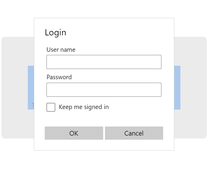
Strings\en\Resources.reswfile and add the following strings:Name Value UserName.Header User name Password.Header Password StaySignedIn.Content Keep me signed in This completes the XAML. The LoginForm look likes this when displayed in WASM:
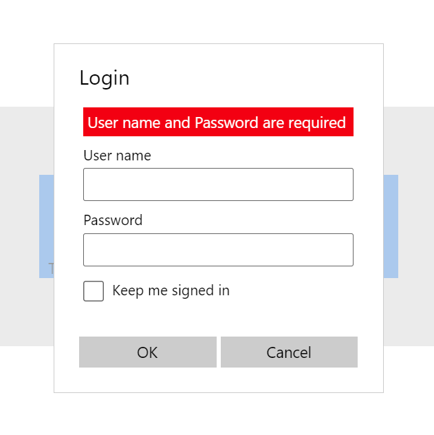
When an error is present, the Border and TextBlock are visible:
Implement the LoginForm code-behind
The business logic for the LoginForm is implemented in the code-behind. Of course, an MVVM approach could also be used. In principal, the login form must perform the following:
- Ensure a user name and password are entered before starting the login
- Call AuthenticationService.LoginUser
- Respond to AuthenticationService events regarding login success or failure
- Display any error messages
Let's walk through the implementation.
Open the LoginForm.xaml.cs file.
Update the
usingstatements as follows:using System; using TimeEntryUno.Shared.Helpers; using TimeEntryUno.Shared.Services; using Windows.UI.Xaml; using Windows.UI.Xaml.Controls;Note
Remember to up date the TimeEntryUno.Shared.Helpers and TimeEntryUno.Shared.Services to suit your project.
Examine the class definition
public sealed partial class LoginForm : ContentDialog- LoginForm inherits from ContentDialog but does not implement INotifyPropertyChanged.Tip
The INotifyPropertyChanged interface implementation is a key part of data-binding and is commonly used to enable view models to inform data-bound UI elements that related data has changed and the UI element must refresh. However, as the code-behind is part of the LoginForm, another mechanism exists to refresh the data bindings, which will be used below. INotifyPropertyChanged will be addressed later in the article.
To expose data to the UI for binding, add the following properties:
public string ErrorMessage { get; set; }
public string UserName { get; set; }
public string Password { get; set; }
public bool? StaySignedIn { get; set; } = false;
public bool IsBusy { get; set; }
These properties were referenced in the XAML bindings earlier - i.e.:
<PasswordBox x:Uid="Password" Margin="4"
                     Password="{x:Bind Password, Mode=TwoWay}"/>
Locate the LoginForm constructor and update it as follows:
public LoginForm()
{
    this.InitializeComponent();
    AuthenticationService.Instance.LoggedIn += Instance_LoggedIn;
    AuthenticationService.Instance.LoginFailed += Instance_LoginFailed;
    this.Closing += LoginForm_Closing;
}
Notice the use of the AuthenticationService service created earlier. The LoggedIn and LoginFailed are used to update the login form based upon the success state of the authentication process.
The ContentDialog.Closing event is discussed next.
To add the implementation for ContentDialog.Closing event handler, add the following code:
private void LoginForm_Closing(ContentDialog sender, ContentDialogClosingEventArgs args)
{
    if (IsBusy)
    {
        args.Cancel = true;
    }
    else
    {
        AuthenticationService.Instance.LoggedIn -= Instance_LoggedIn;
        AuthenticationService.Instance.LoginFailed -= Instance_LoginFailed;
    }
}
The ContentDialog.Closing event is used to ensure that the LoginForm can only be closed when it is not busy, and to release any event subscriptions for the AuthenticationService. If the
args.Cancel = true;is executed, the act of closing the form is cancelled, meaning it will remain displayed.To implement the handler for the AuthenticationService.LoggedIn event, add the following code:
private void Instance_LoggedIn(object sender, EventArgs e)
{
    IsBusy = false;
    Hide();
}
This simple method is executed if the login attempt is successful. It changes the value of the IsBusy property to false, which controls the display of the ProgressRing on the UI, as well as blocks the form from closing. The ContentDialog.Hide method is then called. This will cause the ContentDialog.Closing event to be raised, which will result in the LoginForm_Closing method above being executed.
To handle the AuthenticationService.LoginFailed event, add the following code:
private void Instance_LoginFailed(object sender, EventArgs e)
{
    ErrorMessage = ErrorMessageHelper.GetErrorMessageResource("LoginDialogLoginFailed");
    IsEnabled = true;
    IsBusy = false;
    Bindings.Update();
}
This is called whenever a login attempt fails. The ErrorMessage property is updated to display an error message from the string resources, using the helper created earlier. The LoginForm is the enabled, allowing interaction with the controls, the busy state is set to false and then the Bindings.Update method is called. As the form is not using INotifyPropertyChanged, this is an approach that forces the bound elements on the UI to refresh and react to the changes to the properties.
Tip
As noted in the Microsoft documentation: If your data does not undergo fine-grained changes, and if it's likely to be updated as part of a specific action, then you can make your bindings one-time, and force a manual update at any time with a call to Update.
To add support for the login when the OK (or Primary) button is clicked, update the ContentDialog_PrimaryButtonClick method as follows:
private void ContentDialog_PrimaryButtonClick(ContentDialog sender, ContentDialogButtonClickEventArgs args)
{
    if (string.IsNullOrWhiteSpace(UserName) || string.IsNullOrWhiteSpace(Password))
    {
        ErrorMessage = ErrorMessageHelper.GetErrorMessageResource("LoginDialogUserNameRequired");
    }
    else
    {
        ErrorMessage = string.Empty;
        IsEnabled = false;
        IsBusy = true;

        _ = AuthenticationService.Instance.LoginUser(UserName, Password);
    }

    Bindings.Update();

    // We only close if we log in successfully or cancel
    args.Cancel = true;
}
The first part of this code ensures that the user has entered a username and password - if not, an error message from the string resources is displayed. Otherwise, any existing error is removed, the form is disabled (meaning the textboxes cannot be edited nor any buttons clicked), the busy flag is set to true and then the AuthenticationService.LoginUser service is called.
Tip
Although the AuthenticationService.LoginUser service is asynchronous, the code does not need to wait for it here - the AuthenticationService.LoggedIn and AuthenticationService.LoginFailed will communicate the state of the login. The
_ = AuthenticationService...code uses a C# 7 feature called Discards to show the intention to ignore the result. You can learn more about Discards below:Once again, Bindings.Update method is called to update the UI. Finally,
args.Cancel = true;is used to ensure the dialog does not close.To implement the function used by the UI to control the visibility of the BusyIndicator, add the following code:
public Visibility IsBusyVisible()
{
    return IsBusy ? Visibility.Visible : Visibility.Collapsed;
}
This simple ternary expression converts the IsBusy property to a Visibility enum and is used in the binding:
<ProgressRing IsActive="{x:Bind IsBusy, Mode=TwoWay}"
              Visibility="{x:Bind IsBusyVisible(), Mode=OneWay}"
              VerticalAlignment="Center" HorizontalAlignment="Center" />
Notice how the IsActive value is controlled directly by the IsBusy property and is a boolean, whereas the Visibility is controlled by the value returned by the IsBusyVisible function. Calls to the Bindings.Update method result in both of these bindings being reevaluated.
To control the display of the error message, add the following code:
public Visibility IsErrorMessageVisible()
{
    return string.IsNullOrWhiteSpace(ErrorMessage) ? Visibility.Collapsed : Visibility.Visible;
}
Similar to IsBusyVisible, this code determines whether there is an error message to display, and returns a Visibility enum value accordingly. This time, the value is used to toggle the visibility of the Border element and its children:
<Border Background="Red" Margin="4" Padding="4"
        Visibility="{x:Bind IsErrorMessageVisible(), Mode=OneWay}">
    <TextBlock Foreground="White"
                Text="{x:Bind ErrorMessage, Mode=TwoWay}"/>
</Border>
Next, the LoginStatus control is considered.
Migrating the LoginStatus User Control
The LoginStatus control appears at the top of the UI (element 1 in the image below)
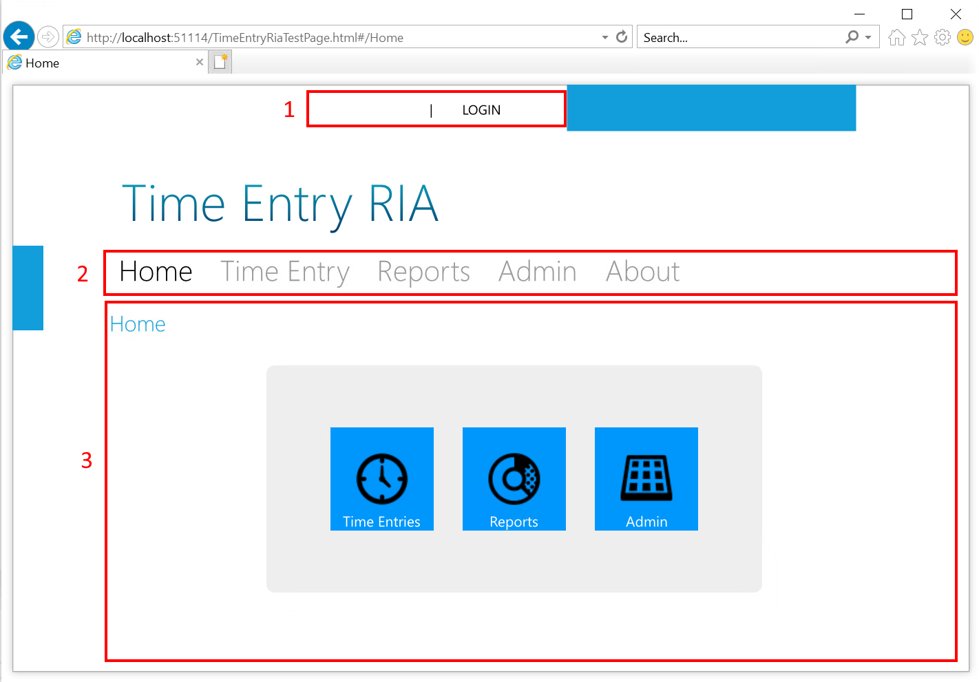
In the TimeEntryRIA app, the status control displays in two states - logged out which provides a button to initiate the login process:

And logged in, which displays the logged-in user and a button to logout:

The control makes use of the VisualStateManager to switch between the various layouts, several custom styles, and code-behind - the vast majority of which can be migrated to UWP without change. The following steps will walk through the process of migrating the UserControl - an approach that can be used for migrating any UserControl or custom control.
Note
The following steps will focus on the process of migrating the UserControl - i.e. the changes to XAML, styles, and code-behind, to support the controls' behavior. As there are many lines of XAML, the emphasis will be on the changes that must be made, rather than showing every line of code.
Migrating the LoginStatus visual states
In the following steps, a UWP version of the LoginStatus control will be created and the XAML copied over. The VisualStateManager and associated states will be migrated.
In the Shared project, within the Views folder, create a new folder Login.
Within the Shared project, locate the Views\Login folder, add a new UserControl and name it LoginStatus.
Switch to the Silverlight project and copy the Grid control named LayoutRoot and all of its content.
Return to the Shared project, open the LoginStatus.xaml file and replace the empty Grid control with the XAML copied from the Silverlight project.
Take a moment to examine the XAML. The first child control of the grid defines the 3 loginStates visual states that control the visibility of two StackPanel controls - loginControls and logoutControls.
To migrate the VisualStateManager XAML, delete all instances of the vsm: namespace prefix - the VisualStateManager is already in scope.
The remainder of the visual state XAML requires no changes.
Beneath the visual state XAML are the two StackPanel controls - loginControls and logoutControls and their associated controls, many that use custom styles.
Migrating the LoginStatus styles
In the following steps, the Silverlight styles used by the LoginStatus control will be migrated.
Reviewing the XAML, the following styles are referenced:
- LoginPanelStyle
- LoginRegisterLinkStyle
- WelcomeTextStyle
- SpacerStyle
Switch to the Silverlight project and open the \Assets\Resources\Styles.xaml file.
Locate each of the styles listed above, and copy them to the Shared project \Resources\Styles.xaml file.
Review the \Resources\Styles.xaml file. The purpose is to identify any issues with the XAML, such as properties that are not found. Issues are usually indicated by a blue "squiggle" underline - the image below indicates that the TargetType of Button lacks a TextOptions.TextHintingMode property:
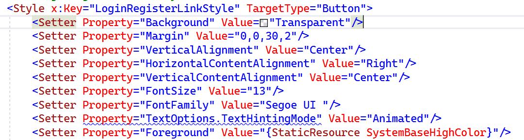
The LoginPanelStyle and SpacerStyle styles require no changes.
The WelcomeTextStyle requires two minor changes, the first being the Foreground setter.
Locate the WelcomeTextStyle Foreground setter - this is using a static resource called TextColor as the value, however, this resource is actually undefined.
Important
Notice that the editor does not show an error or warning for missing resources. Unfortunately, missing resources are often only identified by runtime exceptions - it can be quite painful to find all such missing resources as the exception will be thrown and the application will stop on the first missing resource.
To correct this, the missing resource could be copied over from the Silverlight project, however in this case, update the value to
{StaticResource SystemBaseHighColor}- this is the typical foreground color.Tip
You can review the XAML theme resources that are available such as SystemBaseHighColor below:
Next, locate the WelcomeTextStyle Margin setter and comment out the entire setter - the offset is not required.
LoginPanelStyle, SpacerStyle and WelcomeTextStyle are simple styles. The LoginRegisterLinkStyle style is more complex as it re-templates the control.
Tip
You can learn more about control templates, how they relate to styles, and how to view the template for a control in the resource below:
The LoginRegisterLinkStyle requires a number of changes to property setters:
Locate the TextOptions.TextHintingMode setter and comment out the entire setter - this property does not exist in UWP.
Locate the Cursor setter and comment out the entire setter - this property does not exist in UWP.
Note
Microsoft recommends the use of hover effects in the UWP Design guidelines instead of custom cursors over interactive elements. However, custom cursors can be useful in some specific scenarios, such as drag and drop, etc. If they are a must have, the Windows Community Toolkit has the Mouse.Cursor attached property that can be used.
The LoginRegisterLinkStyle also completely customizes the look of a Button control by replacing the template with a much simpler layout. Fortunately, the basic structure of the Button template in UWP closely matches the template in Silverlight. However, one issue that must be addressed relates to the CommonStates group. As UWP has been designed to support multiple input devices, such as touch, pen, etc., Silverlight visual states such as MouseOver have been renamed to PointerOver. The visual states toggle the visibility of the three controls withing the template.
Locate the VisualState element where the x:Name is MouseOver and rename it to PointerOver.
This is the only change required for the visual states of this simple template. However, the colors for the controls should to be adjusted to leverage the platform resources.
Locate the TextBlock control named Mouseover_Pressed and update the Foreground property to
{StaticResource SystemColorHighlightColor}.Locate the TextBlock control named DisabledOverlay and update the Foreground property to
{StaticResource SystemBaseMediumLowColor}.
The styles have now been migrated - time to consider string resources.
Migrating the LoginStatus string resources
The Silverlight controls are using string resources - these need to be migrated to x:uid.
Return to the Shared LoginStatus.xaml file.
Examine the Button and TextBlock controls - they are using string resources. Use the steps described in Binding to string resources in UWP to update the controls to use x:Uid:
x:Name x:Uid Resource Name Resource Value loginButton LoginButton LoginButton.Content \| LOGINlogoutButton LogoutButton LogoutButton.Content \| LOGOUTWelcomeText Welcome {0}Note
Some clarifications:
- There is no associated control for the WelcomeText resource as it will be accessed from code.
- The spacer text is not defined as a string resource as there is no need for language variations. You can, of course, make it a string resource if you want.
The control XAML should end up similar to:
<StackPanel x:Name="loginControls" Style="{StaticResource LoginPanelStyle}">
    <Button x:Name="loginButton" x:Uid="LoginButton"
            Style="{StaticResource LoginRegisterLinkStyle}"
            Click="LoginButton_Click" />
</StackPanel>

<StackPanel x:Name="logoutControls" Style="{StaticResource LoginPanelStyle}">
    <!-- welcomeText.Text property's binding is setup in code-behind -->
    <TextBlock x:Name="welcomeText" Style="{StaticResource WelcomeTextStyle}"/>
    <TextBlock Text="  |  " Style="{StaticResource SpacerStyle}"/>
    <Button x:Name="logoutButton"
            x:Uid="LogoutButton"
            Style="{StaticResource LoginRegisterLinkStyle}"
            Click="LogoutButton_Click" />
</StackPanel>
Now that the string resources have been migrated, it is time to implement the logic in the code-behind.
Migrating the code-behind
As discussed earlier, the login status control has two primary states - logged out and logged in. When logged out, the control displays a button that will display the LoginForm. When logged in, the current user is displayed, as well as button that logs out the current user. To switch between the states, the LoginStatus control must monitor the AuthenticationService events.
Let's review the implementation.
Open the LoginStatus.xaml.cs code-behind file.
Update the
usingstatements as follows:using System; using TimeEntryUno.Shared.Helpers; using TimeEntryUno.Shared.Models; using TimeEntryUno.Shared.Services; using Windows.ApplicationModel.Resources; using Windows.UI.Xaml; using Windows.UI.Xaml.Controls;Note
Remember to up date the TimeEntryUno.Shared.Helpers and TimeEntryUno.Shared.Services to suit your project.
To store the string value for the welcome message for the logged in user, add the following member variable:
private string _welcomeText;To subscribe to the AuthenticationService events and initialize the display, locate the constructor and update it as follows:
public LoginStatus()
{
    this.InitializeComponent();
    AuthenticationService.Instance.LoggedIn += Instance_LoggedIn;
    AuthenticationService.Instance.LoggedOut += Instance_LoggedOut;
    var resourceLoader = ResourceLoader.GetForCurrentView();
    _welcomeText = resourceLoader.GetString("WelcomeText");
    this.UpdateLoginState();
}
This adds the subscription to the AuthenticationService events and uses the ResourceLoader to retrieve the WelcomeText string.
The UpdateLoginState method ensures the correct visual state is displayed.
To implement the event handlers for the AuthenticationService events, add the following code:
private void Instance_LoggedOut(object sender, EventArgs e)
{
    this.UpdateLoginState();
}

private void Instance_LoggedIn(object sender, EventArgs e)
{
    this.UpdateLoginState();
}
Notice that both merely call the UpdateLoginState method.
To respond to the LoginButton click and initiate the login, add the following code:
private void LoginButton_Click(object sender, RoutedEventArgs e)
{
    var loginForm = new LoginForm();
    _ = loginForm.ShowOneAtATimeAsync();
}
Notice the use of the ShowOneAtATimeAsync from DialogExtensions created earlier to ensure that the app is not displaying more than one dialog at a time. The login form show Task is discarded as the result is not awaited - the AuthenticationService events are used to update the control status.
To add support for the LogoutButton click, add the following code:
private void LogoutButton_Click(object sender, RoutedEventArgs e)
{
    AuthenticationService.Instance.Logout();
}
This code merely calls the AuthenticationService.Logout method and relies on the events to update the UI as required.
Finally, to implement the code that responds to the authentication state of the application, add the following code:
private void UpdateLoginState()
{
    if (AuthenticationService.Instance.CurrentPrincipal != null && AuthenticationService.Instance.CurrentPrincipal.Identity.IsAuthenticated)
    {
        VisualStateManager.GoToState(this, "loggedIn", true);
            welcomeText.Text = string.Format(
                _welcomeText,
                ((User)AuthenticationService.Instance.CurrentPrincipal.Identity).FriendlyName);

    }
    else
    {
        VisualStateManager.GoToState(this, "loggedOut", true);
        welcomeText.Text = string.Empty;
    }
}
This code checks the AuthenticationService to see if a user is logged in - if so, the VisualStateManager is used to switch to the loggedIn visual state defined in the XAML and the welcomeText is updated. Otherwise, the VisualStateManager is used to switch to the loggedOut state and the welcomeText is blanked.
Notice the use of the string Format method - as the _welcomeText variable is assigned the value of
Welcome, {0}, this code will inject the FriendlyName into the string for display.
Running the code
In order to test this code, the web services must be running.
Consult the TimeEntry Samples article for details on how to configure these services and associated database.
Once the server side is running, ensure the URIs configured in the AuthenticationService and TokenService services match the running services (they should):
AuthenticationService
var api = new IdentityApi(
    "https://localhost:6001",
    await TokenService.Instance.GetAccessTokenAsync());
TokenService
_identityServerClient = new IdentityServerClient(
    identityServerBaseAddress: "https://localhost:5001",
    clientId: "TimeEntryUno",
    clientSecret: "A2W7aQVFQWRX",
    scope: "TimeEntryApi");
Ensure the desired head is configured as the startup - UWP or WASM and launch the client app.
You should now be able to exercise the login. Try logging in with no user and/or password. Try random credentials. Finally, try the following account:
- Username:
tylerr - Password:
Pa$$W0rd!
Query the database to find other logins and their roles (whenever you login a user for the first time, the user is automatically given the password
Pa$$W0rd!):select teu.UserName, r.Name from TimeEntryUsers teu inner join Roles r on teu.RoleId = r.IdNote
During the first run, additional sample data for time entries is generated. If you experience a timeout, leave the server projects running, wait a few minutes and then retry the login.
- Username:
In the next task, authentication will be integrated with navigation to ensure a user can only view resources to which they have access.
Next unit: Integrating authentication and navigation