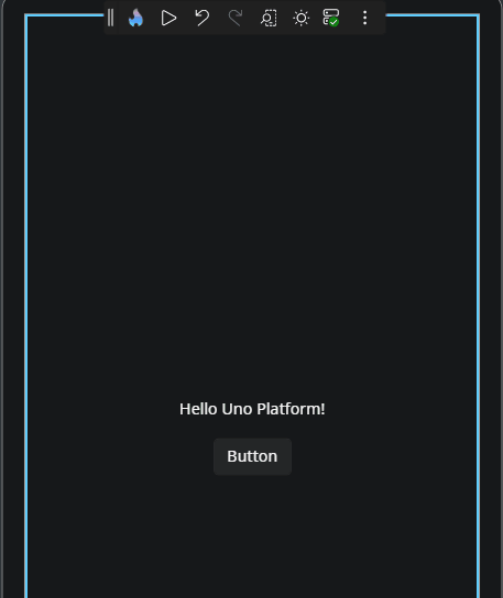
Canvas
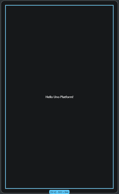
The Canvas is the central design surface where you build and interact with your running app's user interface. It reflects the live visual output of your XAML page and allows you to select, move, edit, and organize controls directly. Actions you take on the Canvas are reflected in real time, making it the most visual and interactive part of Hot Design.
Whether you're adjusting layout, editing a UserControl, or testing structure with live feedback, the Canvas helps you work faster and more intuitively.
Zoom and Scroll
Zoom
To zoom in or out of the Canvas:
- Mouse: Hold
Ctrl(orCmdon macOS) and scroll with your mouse wheel. - Keyboard: Press
Ctrl +/Ctrl -(orCmd +/Cmd -on macOS) to zoom in or out.
Scroll
To scroll the Canvas area:
- Scroll vertically using your mouse wheel.
- Scroll horizontally by holding
Shiftwhile using the mouse wheel.
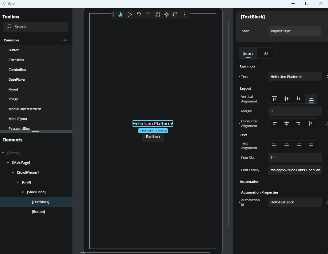
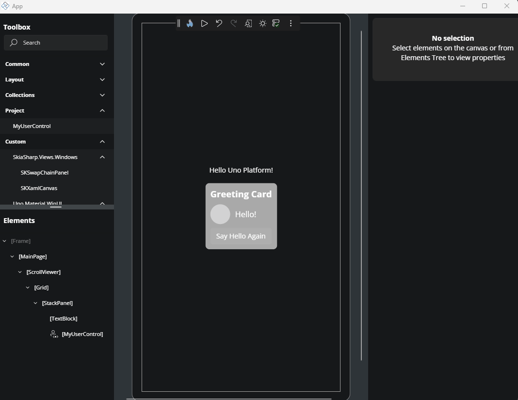
Select Elements on the Canvas
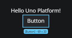
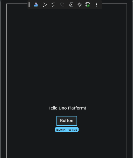
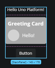
To select a control or layout element, click it directly on the Canvas. The selected element is highlighted with a blue border, known as a visual adorner.
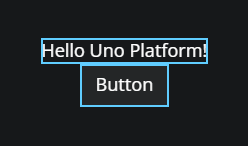
Select Multiple Elements
Hold Ctrl (or Cmd on macOS) and click additional elements to select them together. This is useful for applying shared properties or moving groups of elements.
Visual Adorner Details
When an element is selected, a blue border (called a visual adorner) appears around it. It includes:
- The control’s name (e.g.,
Button,TextBlock) - The control’s size in pixels (width × height)
Rearranging Elements with Drag and Drop
You can reposition controls directly in the layout:
- Click and hold an element.
- Drag it to a new location on the Canvas.
- Release to drop it.
If the layout allows it, the element will be moved and the structure updated accordingly.
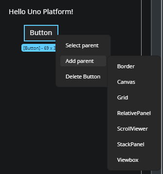
Wrap an Element with a Parent Container
To surround an existing element with a new layout container:
- Right-click the element.
- Choose Add parent.
- Select a parent control such as
GridorStackPanel.
The new parent will be added to the visual tree and reflected on the Canvas.
Select an Element’s Parent
If you're trying to select a layout container of a specific control:
- Right-click the child element.
- Choose Select parent from the context menu.
This selects the parent element on both the Canvas and in the Elements panel.
Delete an Element
To remove a control from the Canvas:
- Right-click the element.
- Choose Delete [ControlName] from the menu (e.g., Delete Button).
The element will be removed from both the Canvas and the Elements panel.
Edit a UserControl from the Canvas
A UserControl is a reusable component that encapsulates a set of UI elements and their associated behavior. It's commonly used to organize parts of your interface into self-contained, maintainable units that can be reused across different parts of your application.
If your layout includes a UserControl, you can open it directly from the Canvas for editing:
- Right-click the
UserControl. - Choose Edit [UserControlName].
This opens the editor for the UserControl, allowing you to modify its internal structure or layout. To return to your previous page edition, click the ../ back icon in the top-left corner of the interface or the Elements panel.
Edit Flyouts from the Canvas
You can edit flyouts in Hot Design in two main ways.
Using the Property Window
You can locate the Flyout property in the Property Window and edit it using the Complex Type Editor. To learn more about how the Complex Type Editor works, refer to the Complex Type Editor documentation.
Using the Flyout Editor
The Flyout Editor allows you to edit the contents of the flyout directly. You can add, remove, or modify individual elements inside the flyout. To open the Flyout Editor, follow these steps:
- In the Toolbar, click the More Options button (three dots).
- Hover over the Window menu and uncheck the option Show tools in-app. This will move the Toolbox, Elements window, and Property window to external windows, leaving only the Canvas in the main window.
- Enable Interactive Mode by clicking the Play button in the toolbar.
- Perform the action that opens the flyout (e.g., click the button that has a flyout).
- With the flyout still opened, disable Interactive Mode by clicking the Pause button in the Toolbar. This will activate the Flyout Editor.
Now you can freely make any changes to the flyout.
To exit the Flyout Editor, you can:
- Click the Enter Interactive Mode button in the Toolbar (Play icon)
- Or click the Back icon in the top-left corner of the Canvas or Tree window
Note
In external tool windows, zoom features are disabled. This means you won’t be able to adjust form factor, zoom, or scroll while editing a Flyout.
Tip
UserControl and DataTemplate editors are fully supported inside the Flyout Editor, so you can edit them directly within the Flyout context.
Important
Editing nested flyouts is not supported at the moment.
Layout Separators
When working with layout containers like Grid or StackPanel, pink dashed lines appear to show row and column boundaries. These visual separators help you understand the layout structure and spacing.
Helpful Notifications
While designing on the Canvas, notifications may appear:
- When changes are applied, a loading indicator may display briefly.
- If an error occurs (e.g., invalid XAML), an error notification appears in the bottom-right corner.
These notifications help you track changes and issues in real time.