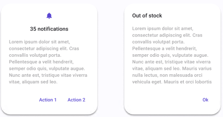
Dialog

| Property | Options | Description |
|---|---|---|
| Title | True/False |
Adds a title and some extra text |
| Icon | True/False |
Adds an extra icon at the top and centers the icon and the title. If enabled, it will also enable Title. |
| Button | 1, 2 |
Adds the selected number of Buttons at the bottom right of the Dialog |
Extra Customization
To reach the extra customization features, you will need to work your way through the hierarchy of the component to find the specified sub-components.
Icon: Changes the icon at the top of the dialog. To see the modifications, the Icon property must be enabled.
Title: Changes the text of the Dialog's title. It will be displayed if the Title property is enabled. It also can be removed if hidden.
Body: Changes the text of the Dialog's body. It will be displayed if the Title property is enabled. It also can be removed if hidden.
Button: Changes the buttons that are in the Dialog. See Button for all the possible customizations.