Properties Tab in Uno Figma Plugin
Overview
The Properties tab in the Uno Figma Plugin is a crucial feature for developers, allowing you to set metadata on Figma components. This metadata is instrumental in driving the generation of XAML code and can be used to establish bindings when the Bindings toggle is enabled in the settings tab.
Key Features of the Properties Tab
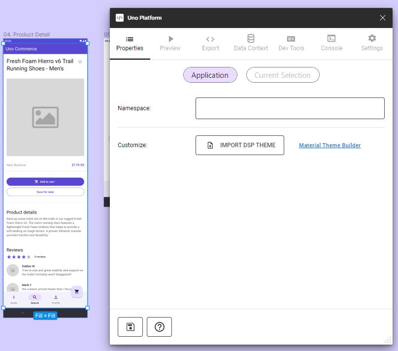
Application
- Namespaces Configuration: Set application, views, and styles sub-namespaces. You can prevent the reformatting to PascalCase by prefixing it with '@'.
Example:
myNamespacewill becomeMyNamespace, but@myNamespacewill remainmyNamespace. - Theme Customization: Import and override theme packages. (See DSP Import)
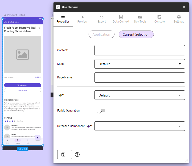
Selection (current selection)
- Content: Define bindings for the selected component instance.
- Mode: Choose between Static and Reactive modes for data handling.
- Page Name: Assign a custom name to the exported page.
- Type: Set behaviors like Page, UserControl, ListView, and Items Repeater to a frame. (only enabled when a frame is selected)
- Custom Component Settings: Manage properties for custom components.
Note
The saving to document is automatic. It's done when the focus is changing from one field to the other.
Detailed Explanation of Properties
Content Field and Binding
- Format for binding:
{BindingExpression}. Example:{Name}in a Text Element translates to<TextBlock Text="{Binding Name}" />in XAML. Binding Expressions will reference data located in DataContext Tab. Please, refer to Bindings to have more details about how Content Expressions work in the plugin.
Mode Selection
Static Mode: Data is present directly in the DataContext of the generated page.
Reactive Mode: Utilizes
Feedsof Uno.Extensions.Reactive to manage content availability.Note
In Reactive mode,
<FeedView>is included in the exported XAML (not in preview) when the corresponding setting is enabled.
Type Assignment for Frames
Assigning User Control, ListView, or Items Repeater behaviors affects both preview and exported XAML.
AutoLayout orientation determines the layout type for ItemsRepeater.
Note
Scrolling features for frames are set in the Prototype tab of Figma.
Custom Component Integration
- For detailed guidance on custom components, see Custom Components.
Namespace and Theme Management
- Define application-specific namespaces for organized code structuring.
- Override theme packages for tailored UI designs.
Using the Properties Tab
- Select a Page or Component: Choose the element for property assignment.
- Open Uno Plugin: From Figma's Plugins menu, select Uno Platform.
- Access Properties Tab: Jus select the Properties Tab at the tab bar.
- Enter Property Changes: Modify the properties as needed.
- Save Changes: Click the Save button at the bottom of the tab.
- Preview Changes: Optionally, review the changes in Preview or Export tabs.
Note
For specific component properties, refer to the individual component documentation within the plugin.
By leveraging the Properties tab effectively, developers can ensure that their Figma designs translate accurately into XAML code, maintaining design integrity, and simplifying the development process.