Adding Custom Icons to Controls
UnoFeatures:
Material(add to<UnoFeatures>in your.csproj).
Problem
Some controls do not offer support for custom icons, and would normally require a custom style to edit the control's template to support IconElements.
Solution
The Uno Themes library provides a set of attached properties grouped under the ControlExtensions class. One of these attached properties is the Icon property, which allows you to add custom icons to certain controls. Specific styles are provided for each control to support the Icon property.
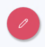
Button Icon
Given the following XAML:
<Page ...
      xmlns:ut="using:Uno.Themes">

    <Button Style="{StaticResource FabStyle}">
        <ut:ControlExtensions.Icon>
            <SymbolIcon Symbol="Edit" />
        </ut:ControlExtensions.Icon>
    </Button>

</Page>
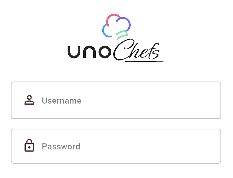
TextBox Icon
<TextBox PlaceholderText="Username"
         x:Name="LoginUsername"
         AutomationProperties.AutomationId="LoginUsername"
         Style="{StaticResource ChefsPrimaryTextBoxStyle}"
         utu:InputExtensions.ReturnType="Next"
         utu:InputExtensions.AutoFocusNextElement="{Binding ElementName=LoginPassword}"
         IsSpellCheckEnabled="False"
         Text="{Binding UserCredentials.Username, Mode=TwoWay, UpdateSourceTrigger=PropertyChanged}">
    <ut:ControlExtensions.Icon>
        <PathIcon Data="{StaticResource Icon_Person_Outline}" />
    </ut:ControlExtensions.Icon>
</TextBox>
PasswordBox Icon
<PasswordBox PlaceholderText="Password"
            Style="{StaticResource OutlinedPasswordBoxStyle}">
    <ut:ControlExtensions.Icon>
        <FontIcon Glyph="{StaticResource Icon_Lock}" />
    </ut:ControlExtensions.Icon>
</PasswordBox>
Source Code
- Login Page (TextBox)
- Login Page (PasswordBox)
- Settings Page (TextBox)
- Favorite Recipes Page (Button)
- Profile Page (Button)
- Live Cooking Page (Button)