Card & CardContentControl
Tip
This guide covers details for Card and CardContentControl specifically. If you are just getting started with the Uno Material Toolkit Library, please see our general getting started page to make sure you have the correct setup in place.
Summary
Card and CardContentControl represent controls identifiable as a single, contained unit used to visually group related child content and actions that relate information about a subject.
A card's layout and dimensions depend on its contents.
Remarks
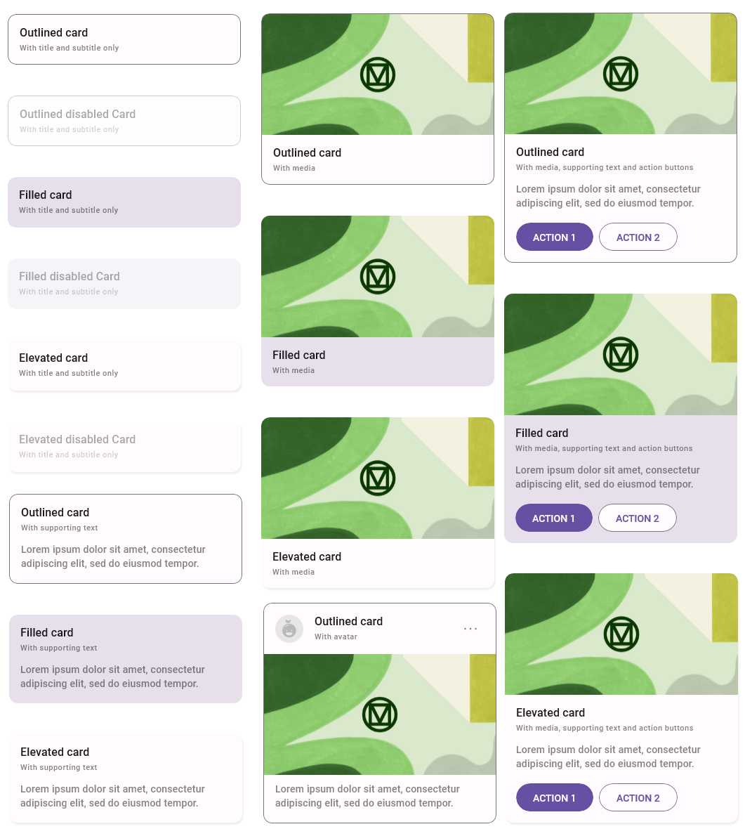
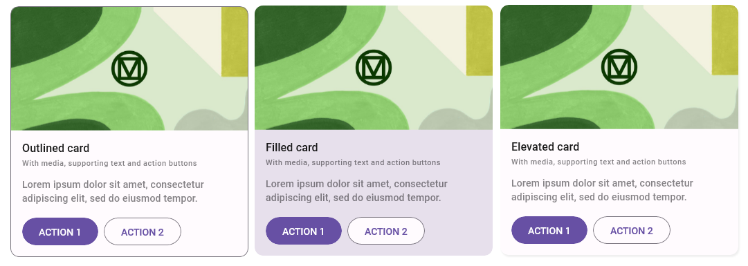
Currently, there are three Material styles for Card and CardContentControl that you can use.
Depending on the amount of user attention you want to draw to the content you can use:
ElevatedCardStyleorElevatedCardContentControlStyleto add a subtle z-axis elevation.FilledCardStyleorFilledCardContentControlStyleto display a simple background color without any elevation or border for the card.OutlinedCardStyleorOutlinedCardContentControlStyleto display a simple solid stroke along the border of the card.
Card
The Card control is based on Control and allows you to customize the control's content through additional properties to fit your needs.
C#
public partial class Card : Control
XAML
xmlns:utu="using:Uno.Toolkit.UI"
...

<utu:Card .../>
Inheritance
Object → DependencyObject → UIElement → FrameworkElement → Control → Card
Constructors
| Constructor | Description |
|---|---|
Card() |
Initializes a new instance of the Card class. |
Properties
The Card control comes with all the built-in properties of a Control, and also a few additional properties listed below that let you tailor the content to be displayed:
| Property | Type | Description |
|---|---|---|
HeaderContent |
object |
Gets or sets the content for the control's header. |
HeaderContentTemplate |
DataTemplate |
Gets or sets the data template used to display the content of the control's header. |
SubHeaderContent |
object |
Gets or sets the content for the control's subheader. |
SubHeaderContentTemplate |
DataTemplate |
Gets or sets the data template used to display the content of the control's subheader. |
AvatarContent |
object |
Gets or sets the content for the control's avatar. |
AvatarContentTemplate |
DataTemplate |
Gets or sets the data template used to display the content of the control's avatar. |
MediaContent |
object |
Gets or sets the content for the control's media area. |
MediaContentTemplate |
DataTemplate |
Gets or sets the data template used to display the content of the control's media area. |
SupportingContent |
object |
Gets or sets the content for the control's supporting area. |
SupportingContentTemplate |
DataTemplate |
Gets or sets the data template used to display the content of the control's supporting area. |
IconsContent |
object |
Gets or sets the content for the control's icons. |
IconsContentTemplate |
DataTemplate |
Gets or sets the data template used to display the content of the control's icons. |
Elevation |
double |
Gets or sets the elevation of the control. |
ShadowColor |
Color |
Gets or sets the color to use for the shadow of the control. |
IsClickable |
bool |
Gets or sets a value indicating whether the control will respond to pointer and focus events. |
Tip
Consider using CardContentControl if you need full control over the content layout.
Usage
xmlns:utu="using:Uno.Toolkit.UI"
...

<!-- ElevatedCardStyle -->
<utu:Card HeaderContent="Elevated card"
          SubHeaderContent="With title and subtitle"
          Style="{StaticResource ElevatedCardStyle}" />

<!-- FilledCardStyle -->
<utu:Card HeaderContent="Filled card"
          SubHeaderContent="With title and subtitle"
          Style="{StaticResource FilledCardStyle}" />

<!-- OutlinedCardStyle -->
<utu:Card HeaderContent="Outlined card"
          SubHeaderContent="With title and subtitle"
          Style="{StaticResource OutlinedCardStyle}" />
Examples
Lightweight Styling
| Key | Type | Value |
|---|---|---|
ContentTemplateForeground |
SolidColorBrush |
OnSurfaceMediumBrush |
ContentTemplateBorderBrush |
SolidColorBrush |
OnSurfaceMediumBrush |
FilledCardBackground |
SolidColorBrush |
SurfaceBrush |
FilledCardBorderBrush |
SolidColorBrush |
SystemControlTransparentBrush |
FilledCardBorderBrushPointerOver |
SolidColorBrush |
OnSurfaceHoverBrush |
FilledCardBorderBrushFocused |
SolidColorBrush |
OnSurfaceFocusedBrush |
AvatarFilledCardBackground |
SolidColorBrush |
SurfaceBrush |
AvatarFilledCardBorderBrush |
SolidColorBrush |
SystemControlTransparentBrush |
AvatarFilledCardBorderBrushPointerOver |
SolidColorBrush |
OnSurfaceHoverBrush |
AvatarFilledCardBorderBrushFocused |
SolidColorBrush |
OnSurfaceFocusedBrush |
SmallMediaFilledCardBackground |
SolidColorBrush |
SurfaceBrush |
SmallMediaFilledCardBorderBrush |
SolidColorBrush |
SystemControlTransparentBrush |
SmallMediaFilledCardBorderBrushPointerOver |
SolidColorBrush |
OnSurfaceHoverBrush |
SmallMediaFilledCardBorderBrushFocused |
SolidColorBrush |
OnSurfaceFocusedBrush |
OutlinedCardBackground |
SolidColorBrush |
SurfaceBrush |
OutlinedCardBorderBrush |
SolidColorBrush |
OutlineBrush |
AvatarOutlinedCardBackground |
SolidColorBrush |
SurfaceBrush |
AvatarOutlinedCardBorderBrush |
SolidColorBrush |
OutlineBrush |
SmallMediaOutlinedCardBackground |
SolidColorBrush |
SurfaceBrush |
SmallMediaOutlinedCardBorderBrush |
SolidColorBrush |
OutlineBrush |
ElevatedCardBackground |
SolidColorBrush |
SurfaceBrush |
ElevatedCardBorderBrush |
SolidColorBrush |
SystemControlTransparentBrush |
ElevatedCardBorderBrushPointerOver |
SolidColorBrush |
OnSurfaceHoverBrush |
ElevatedCardBorderBrushFocused |
SolidColorBrush |
OnSurfaceFocusedBrush |
AvatarElevatedCardBackground |
SolidColorBrush |
SurfaceBrush |
AvatarElevatedCardBorderBrush |
SolidColorBrush |
SystemControlTransparentBrush |
AvatarElevatedCardBorderBrushPointerOver |
SolidColorBrush |
OnSurfaceHoverBrush |
AvatarElevatedCardBorderBrushFocused |
SolidColorBrush |
OnSurfaceFocusedBrush |
SmallMediaElevatedCardBackground |
SolidColorBrush |
SurfaceBrush |
SmallMediaElevatedCardBorderBrush |
SolidColorBrush |
SystemControlTransparentBrush |
SmallMediaElevatedCardBorderBrushPointerOver |
SolidColorBrush |
OnSurfaceHoverBrush |
SmallMediaElevatedCardBorderBrushFocused |
SolidColorBrush |
OnSurfaceFocusedBrush |
CardContentControl
Important
Use CardContentControl instead of Border for card-like UI elements.
Do not use Border with CornerRadius and ThemeShadow when you need a card — CardContentControl provides proper elevation, theming, interaction states, and accessibility out of the box.
The CardContentControl is based on ContentControl and allows you to customize the entire content through DataTemplate to fit your needs.
C#
public partial class CardContentControl : ContentControl
XAML
xmlns:utu="using:Uno.Toolkit.UI"
...

<utu:CardContentControl .../>
-or-
<utu:CardContentControl>
    <utu:CardContentControl.ContentTemplate>
        <DataTemplate>
            content
        </DataTemplate>
    </utu:CardContentControl.ContentTemplate>
</utu:CardContentControl>
Inheritance
Object → DependencyObject → UIElement → FrameworkElement → Control → ContentControl → CardContentControl
Constructors
| Constructor | Description |
|---|---|
CardContentControl() |
Initializes a new instance of the CardContentControl class. |
Properties
The Card control comes with all the built-in properties of a ContentControl, and also a few additional properties listed below:
| Property | Type | Description |
|---|---|---|
Elevation |
double |
Gets or sets the elevation of the control. |
ShadowColor |
Color |
Gets or sets the color to use for the shadow of the control. |
IsClickable |
bool |
Gets or sets a value indicating whether the control will respond to pointer and focus events. |
Usage
xmlns:utu="using:Uno.Toolkit.UI"
...

<!-- ElevatedCardContentControlStyle -->
<utu:CardContentControl Style="{StaticResource ElevatedCardContentControlStyle}">
    <utu:CardContentControl.ContentTemplate>
        <DataTemplate>
            <Grid>
                <TextBlock Text="Elevated card" MaxLines="1" Style="{StaticResource HeadlineMedium}" />
            </Grid>
        </DataTemplate>
    </utu:CardContentControl.ContentTemplate>
</utu:CardContentControl>

<!-- FilledCardContentControlStyle -->
<utu:CardContentControl Style="{StaticResource FilledCardContentControlStyle}">
    <utu:CardContentControl.ContentTemplate>
        <DataTemplate>
            <Grid>
                <TextBlock Text="Filled card" MaxLines="1" Style="{StaticResource HeadlineMedium}" />
            </Grid>
        </DataTemplate>
    </utu:CardContentControl.ContentTemplate>
</utu:CardContentControl>

<!-- OutlinedCardContentControlStyle -->
<utu:CardContentControl Style="{StaticResource OutlinedCardContentControlStyle}">
    <utu:CardContentControl.ContentTemplate>
        <DataTemplate>
            <Grid>
                <TextBlock Text="Outlined card" MaxLines="1" Style="{StaticResource HeadlineMedium}" />
            </Grid>
        </DataTemplate>
    </utu:CardContentControl.ContentTemplate>
</utu:CardContentControl>
Examples
Lightweight Styling
| Key | Type | Value |
|---|---|---|
FilledCardContentBackground |
SolidColorBrush |
SurfaceBrush |
FilledCardContentBorderBrush |
SolidColorBrush |
SystemControlTransparentBrush |
FilledCardContentBorderBrushPointerOver |
SolidColorBrush |
OnSurfaceHoverBrush |
FilledCardContentBorderBrushFocused |
SolidColorBrush |
OnSurfaceFocusedBrush |
FilledCardContentBorderBrushPressed |
SolidColorBrush |
OnSurfacePressedBrush |
OutlinedCardContentBackground |
SolidColorBrush |
SurfaceBrush |
OutlinedCardContentBorderBrush |
SolidColorBrush |
OutlineBrush |
ElevatedCardContentBackground |
SolidColorBrush |
SurfaceBrush |
ElevatedCardContentBorderBrush |
SolidColorBrush |
SystemControlTransparentBrush |
ElevatedCardContentBorderBrushPointerOver |
SolidColorBrush |
OnSurfaceHoverBrush |
ElevatedCardContentBorderBrushFocused |
SolidColorBrush |
OnSurfaceFocusedBrush |
ElevatedCardContentBorderBrushPressed |
SolidColorBrush |
OnSurfacePressedBrush |