Customizing the Color Palette
So far we have the default Uno Material color palette from Uno.Material with some overrides from the new app template. We can further customize the color palette by updating the color overrides in the Styles folder of our SimpleCalculator project.
ColorPaletteOverride.cs code contents (collapsed for brevity)
using Uno.Themes.Markup;

namespace SimpleCalculator.Styles;

public sealed class ColorPaletteOverride : ResourceDictionary
{
    public ColorPaletteOverride()
    {
        this.Build(r => r
            // Background
            .Add<Color>(Theme.Colors.Background.Default.Key, "#FCFCFF", "#1A1C1E")
            // OnBackground
            .Add<Color>(Theme.Colors.OnBackground.Default.Key, "#1A1C1E", "#E2E2E5")
            // Primary
            .Add<Color>(Theme.Colors.Primary.Default.Key, "#006399", "#95CCFF")
            .Add<Color>(Theme.Colors.Primary.Container.Key, "#CDE5FF", "#004A75")
            .Add<Color>(Theme.Colors.Primary.Inverse.Key, "#95CCFF", "#006399")
            // OnPrimary
            .Add<Color>(Theme.Colors.OnPrimary.Default.Key, "#FFFFFF", "#003352")
            .Add<Color>(Theme.Colors.OnPrimary.Container.Key, "#001D32", "#CDE5FF")
            // Secondary
            .Add<Color>(Theme.Colors.Secondary.Default.Key, "#51606F", "#B9C8DA")
            .Add<Color>(Theme.Colors.Secondary.Container.Key, "#D5E4F6", "#3A4857")
            // OnSecondary
            .Add<Color>(Theme.Colors.OnSecondary.Default.Key, "#FFFFFF", "#233240")
            .Add<Color>(Theme.Colors.OnSecondary.Container.Key, "#0E1D2A", "#D5E4F6")
            // Tertiary
            .Add<Color>(Theme.Colors.Tertiary.Default.Key, "#00658D", "#83CFFF")
            .Add<Color>(Theme.Colors.Tertiary.Container.Key, "#C6E7FF", "#004C6B")
            // OnTertiary
            .Add<Color>(Theme.Colors.OnTertiary.Default.Key, "#FFFFFF", "#00344B")
            .Add<Color>(Theme.Colors.OnTertiary.Container.Key, "#001E2D", "#C6E7FF")
            // Surface
            .Add<Color>(Theme.Colors.Surface.Default.Key, "#FCFCFF", "#335476")
            .Add<Color>(Theme.Colors.Surface.Variant.Key, "#DEE3EB", "#42474E")
            .Add<Color>(Theme.Colors.Surface.Inverse.Key, "#2F3033", "#E2E2E5")
            .Add<Color>(Theme.Colors.Surface.Tint.Key, "#006399", "#95CCFF")
            // OnSurface
            .Add<Color>(Theme.Colors.OnSurface.Default.Key, "#1A1C1E", "#E2E2E5")
            .Add<Color>(Theme.Colors.OnSurface.Variant.Key, "#42474E", "#C2C7CF")
            .Add<Color>(Theme.Colors.OnSurface.Inverse.Key, "#F0F0F4", "#1A1C1E")
            // Outline
            .Add<Color>(Theme.Colors.Outline.Default.Key, "#72777F", "#8C9198")
            .Add<Color>(Theme.Colors.Outline.Variant.Key, "#C2C7CF", "#42474E")
            // Error
            .Add<Color>(Theme.Colors.Error.Default.Key, "#BA1A1A", "#FFB4AB")
            .Add<Color>(Theme.Colors.Error.Container.Key, "#FFDAD6", "#93000A")
            // OnError
            .Add<Color>(Theme.Colors.OnError.Default.Key, "#FFFFFF", "#690005")
            .Add<Color>(Theme.Colors.OnError.Container.Key, "#410002", "#FFDAD6"));
    }
}
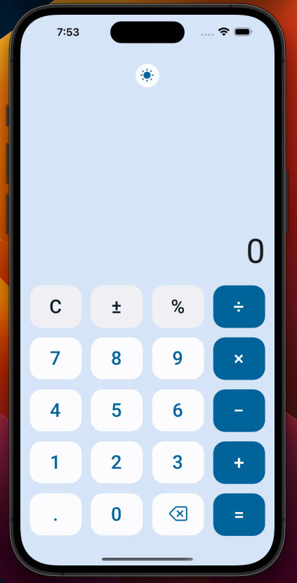
With the color palette updated, we can now run the app again to see the updated look for our calculator. The final result will be similar to the image below:
Next Steps
Congratulations you have now created your first Uno app! The four permutations of the SimpleCalculator can be found within our Uno.Samples GitHub Repository.
To continue to learn more about Uno Platform be sure to check out the Uno Platform documentation and the Uno Platform samples.