Card
Note
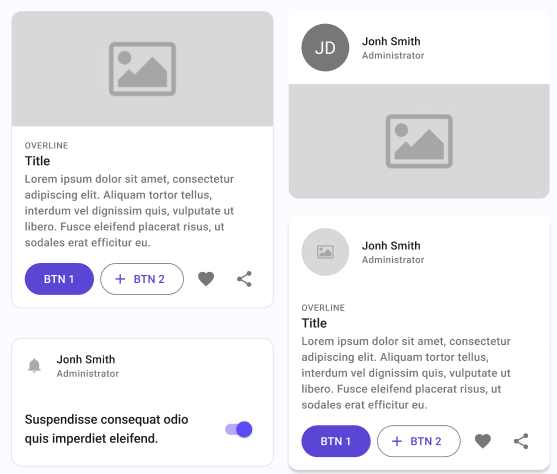
By default, the PersonPicture located in the Header will have the Type Icon.
| Property | Options | Description |
|---|---|---|
| Type | Elevated, Outlined |
Changes the style of the card |
| Header | True/False |
Adds a header that includes a ProfilePicture and some text at the top of the card |
| Media | True/False |
Adds an Image in the middle of the card |
| Body | True/False |
Adds some text and Buttons at the bottom of the card |
Extra Customization
To reach the extra customization features, you will need to work your way through the hierarchy of the component to find the specified sub-components.
- ListItem: Allows you to change the content of the Header. It will only be displayed if the Header property is enabled. See ListItem for all the possible customizations.
- Image: Allows you to change the image present in the Media section. It will only be displayed if the Media property is enabled. See Image for all the possible customizations.
- ListItem: Allows you to change the content of the Body. It will only be displayed if the Body property is enabled. See ListItem for all the possible customizations.
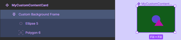
Card Container
Containers are components that contain only a swappable placeholder. The placeholder is a dummy component you can swap with your own component or even with another component from the library.
If you want a completely different content from the existent Card component, you can use a Card Container. Here are the steps:
Steps to create your own Custom Content Card
Part 1:
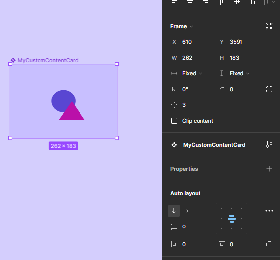
- Create a new frame;
- Edit its content with the look and feel you want for your Card;
- Convert it to a component, choose a name for it. Important: the name must be different from "Card";
Part 2:
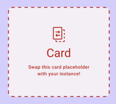
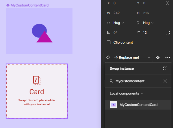
Add an instance of a Card Container component in the place you desire, this is how it looks like:
In the "Layers" tree, select its first content node usually named as -> Replace me!.
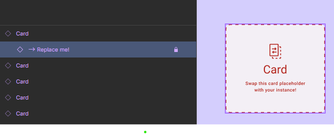
Go to the "Design" tab and swap this instance to your recent created component.
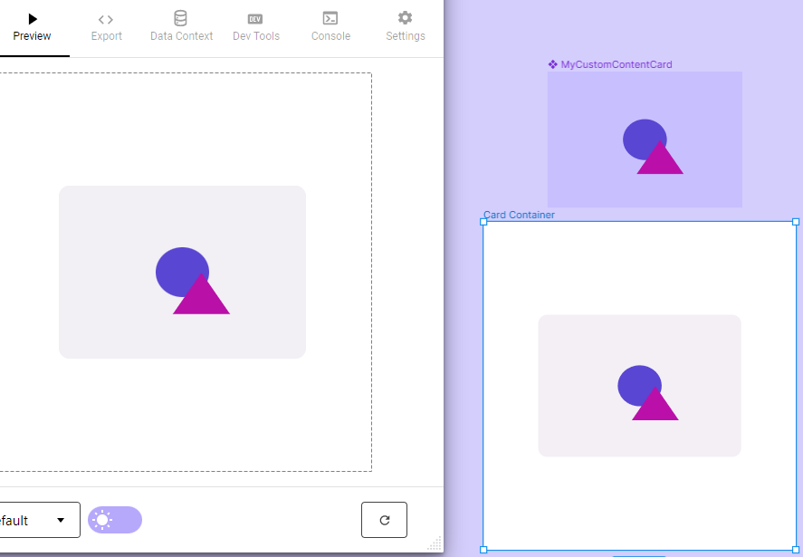
At this moment, the Card visual will be changed, showing the component you have created in its content.
You will probably need to resize the Card Instance and its container to better reproduce your design.
That's it! Now, you can run the plugin to generate the screen you created.
Note
For custom content Cards, Plugin will not be able to detect Overrides.
Note
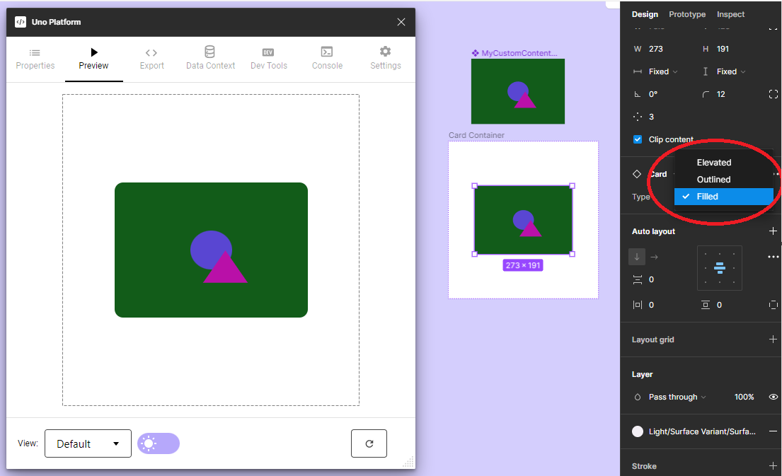
The Card's background is managed by the variant properties defined in the main component, in this case, the Type property - Elevated, Outlined, or Filled. The variant background option will override the background color of the Content node, as you can see in the previous picture. In case you want to preserve the color you have selected in your Custom Content component, just add a second frame inside of it and choose the Fill color you desire. The result will be like:
Note
You will find more detailed information about Cards and other components at Components Page in the Uno Platform Material Toolkit.