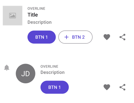
ListItem
Note
If you want to use horizontal swiping features, you should use SwipeControl instead.
Note
To know more about how plugin can handle lists, please see Properties Tab.

| Property | Options | Description |
|---|---|---|
| Leading | True/False |
Adds one or multiple components at the top left of the ListItem. By default, it will be an Image. |
| Primary Commands | True/False |
Adds 2 Buttons at the bottom of the ListItem |
| Secondary Commands | True/False |
Adds 2 IconButtons at the bottom right of the ListItem. By default, they will be a "Like" and a "Share" icons. |
| Trailing | True/False |
Doesn't affect the plugin or the component. |
| State | Enabled, Disabled |
Alters the current state of the component, although it doesn't affect the plugin |
Extra Customization
To reach the extra customization features, you will need to work your way through the hierarchy of the component to find the specified sub-components. You can remove those components from the plugin by hiding them in Figma. You can add them by doing the opposite.
Leading: Allows you to change the components that will be displayed at the top left of the ListItem. It will only be displayed if the Leading property is enabled. The possible components are :
Icon: By default it is a "Bell", but it can be modified
CheckBox: See CheckBox for all the possible customizations.
PersonPicture: See PersonPicture for all the possible customizations.
Image: The default option. See Image for all the possible customizations.
OVERLINE: Changes the first line of text.
Subtitle: Changes the second line of text.
Secondary Text: Changes the last line of text.
Primary Commands > Button x2: Changes the two Buttons at the bottom, see Button for all the possible customizations. It will only be displayed if the Primary Commands property is enabled.
Secondary Commands > IconButton x2: Changes the two IconButtons at the bottom right, see IconButton for all the possible customizations. It will only be displayed if the Secondary Commands property is enabled.