

Most people assume AI-generated UI tops out at generic Material Design: competent, safe, forgettable. That assumption is the ceiling, not the tool.
The difference is language. Describing what using an interface feels like is almost always more powerful than describing what it looks like. When you compress real design intent into descriptive, almost sensory vocabulary (the kind that's philosophical before it's technical), you stop getting default output and start getting output with a point of view. That's the lever. And it means you can build genuinely beautiful, opinionated user experiences with Uno Platform, as long as you're willing to think past the defaults.
This post is the proof. Below are 11 interaction patterns designed for the Meridian Capital Terminal, a financial dashboard sample built with Uno Platform, Studio and Claude Code. Each one is rooted in Naoto Fukasawa's "without thought" philosophy: design that dissolves into behavior, where the object feels aware of its own content.
Every pattern here is constrained by a hard technical reality: Uno Platform only GPU-accelerates Opacity and RenderTransform (Translate, Rotate, Scale, Composite). Everything else runs on the UI thread. That constraint shaped every decision.
The 11 Motions at a Glance
Before the breakdowns, here's the full vocabulary. Each line is a design decision, not a feature description:
- Market Breathing: Card borders pulse with a barely-visible glow during market hours, then go completely still after close.
- Chart Data Settle: The chart line overshoots by ~2-4% on the Y axis when it finishes drawing, then springs back like an analog gauge needle.
- Ink Spread: Timeframe button fill radiates outward from the exact click point instead of appearing uniformly.
- Weight Whisper: Hovering a holding subtly shifts the main chart's gradient density proportional to that stock's portfolio weight.
- Silence on Leave: Card content dips to 92% opacity for 600ms when the cursor exits, as if the chart exhales when you stop looking.
- Empty State Gravity: When search returns no results, the container gains an inward shadow and the border desaturates. Emptiness has physical weight.
- Data-Driven Braille: Braille activity indicators are tethered to actual percentage change. Volatile stocks pulse fast, calm ones are nearly still.
- Tooltip Magnetism: The chart crosshair snaps to the nearest data point with acceleration, and eases lazily between points.
- Scroll Anticipation: Accent-colored edge bars and fade masks appear at scroll boundaries.
- Weighted Paper: Hover lift uses spring physics. Cards press down slightly before rising, giving every motion a sense of mass.
- Session Warmth: Ambient background orbs drift warmer in hue the longer you sit on the dashboard, capping at 25 degrees after ~20 minutes.
Notice the language. Not "animate card border" but "the chart exhales when you stop looking." That's the gap between AI output that feels templated and AI output that feels designed. The vocabulary is the design tool.
The Principles
| Principle | Interactions |
|---|---|
| The object knows what time it is | Market Breathing, Session Warmth |
| Confirm without congratulating | Chart Data Settle |
| Reduce, then reduce again | Weight Whisper, Data-Driven Braille |
| The absence teaches you what was there | Silence on Leave, Empty State Gravity |
| The hand knows before the eye | Ink Spread, Tooltip Magnetism, Scroll Anticipation |
| One material, one gesture | Weighted Paper |
Card borders pulse with a barely-visible glow during market hours, then go completely still after close. A 5-second sinusoidal shadow pulse at 3-4% opacity. You never notice it running. You feel something is off when it stops.
Implementation: ShadowContainer with animated BlurRadius (0-6) and Opacity (0-0.04), RepeatBehavior="Forever". A DispatcherTimer at 1-minute intervals gates the animation based on market hours (9:30 AM - 4:00 PM ET, weekdays).
The dashboard becomes time-aware without adding a single visible UI element.
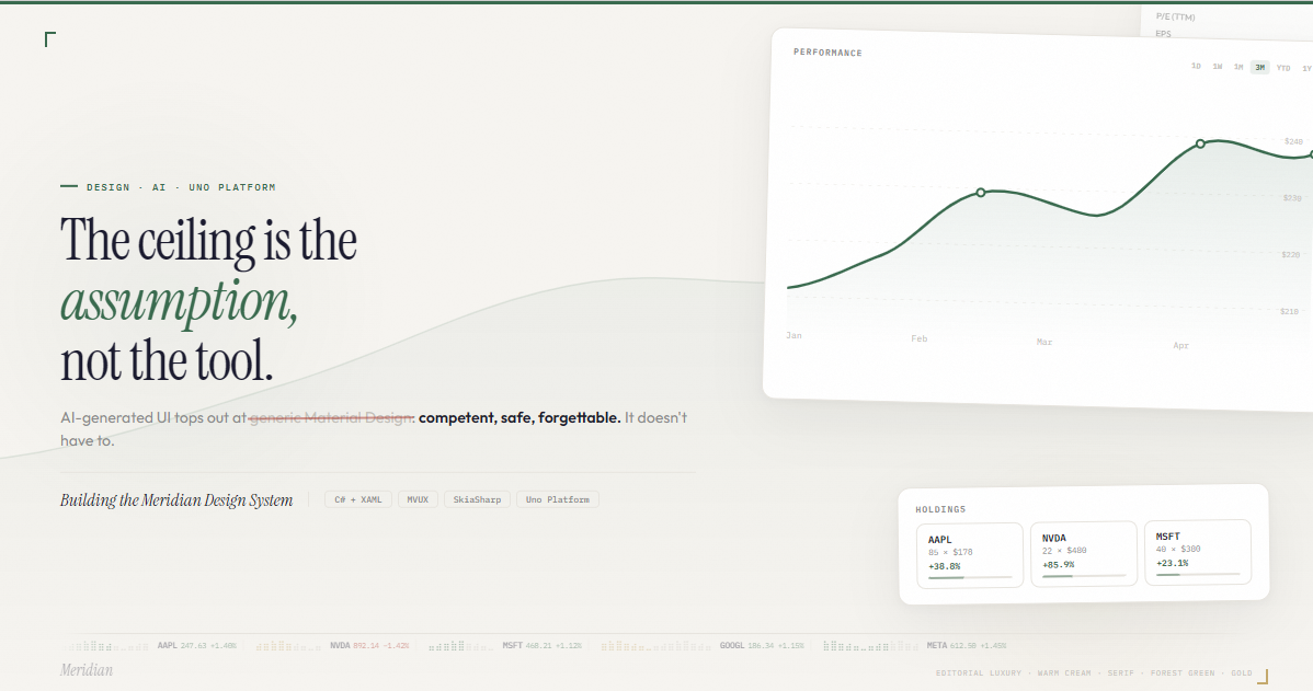
When the chart finishes drawing, the line overshoots by ~2-4% on the Y axis, then springs back to its final position. The same behavior as an analog gauge needle overshooting before it settles.
<Storyboard x:Name="ChartSettleStoryboard">
  <DoubleAnimationUsingKeyFrames
      Storyboard.TargetName="ChartTransform"
      Storyboard.TargetProperty="ScaleY">
    <!-- Overshoot -->
    <LinearDoubleKeyFrame KeyTime="0:0:0.1" Value="1.04"/>
    <!-- Settle back through undershoot -->
    <EasingDoubleKeyFrame KeyTime="0:0:0.45" Value="0.99">
      <EasingDoubleKeyFrame.EasingFunction>
        <BackEase EasingMode="EaseOut"/>
      </EasingDoubleKeyFrame.EasingFunction>
    </EasingDoubleKeyFrame>
    <!-- Rest -->
    <EasingDoubleKeyFrame KeyTime="0:0:0.7" Value="1.0">
      <EasingDoubleKeyFrame.EasingFunction>
        <CubicEase EasingMode="EaseInOut"/>
      </EasingDoubleKeyFrame.EasingFunction>
    </EasingDoubleKeyFrame>
  </DoubleAnimationUsingKeyFrames>
</Storyboard>
Implementation: DoubleAnimationUsingKeyFrames on CompositeTransform.ScaleY with three phases: snap to 1.04 (100ms), ease through 0.99 to 1.0 (600ms) with BackEase EaseOut. Transform origin at bottom-center. Fully GPU-bound.
Every data load gets a quiet material acknowledgment, like the satisfying click of a well-made switch.
The timeframe button fill radiates outward from the exact click point, like pressing a thumb into wet paper. Not from center. From where you touched.
Implementation: On PointerPressed, read e.GetCurrentPoint(button).Position. Spawn an Ellipse at that coordinate inside a Canvas overlay with ClipToBounds. Animate ScaleX/Y from 0 to 3 over 300ms with CubicEase, Opacity from 1 to 0 over 400ms. Remove on Storyboard.Completed.
The feedback originates from the user's action point, not the control's geometry. Tactile without being flashy.
Hovering a holding card subtly shifts the main chart's gradient fill opacity proportional to that stock's portfolio weight. AAPL at 24% produces a dense gradient. JPM at 8% is faint. No explicit UI links them.
Implementation: PointerEntered on holdings feeds a HoveredWeight property to the ViewModel. A code-driven spring (DispatcherTimer at 16ms with custom SpringAnimator) interpolates the gradient alpha inside SKXamlCanvas.OnPaintSurface. Not a Storyboard; the gradient lives inside SkiaSharp, below the XAML layer.
A subliminal connection between what you're looking at and what the chart is showing. You feel it without identifying it.
When the cursor leaves the chart card, the card's content dips to 92% opacity for 600ms then recovers. A brief dimming, just enough to register that something changed.
Implementation: PointerExited fires a DoubleAnimationUsingKeyFrames on an inner Grid's Opacity: hold at 1.0 for 200ms (the delay), dip to 0.92 with CubicEase EaseOut, recover to 1.0 over 400ms with CubicEase EaseInOut. GPU-bound.
One Storyboard, one event handler, maximum subtlety. The card is aware of your attention.
When the watchlist search returns zero results, the container gains an inward shadow and the border desaturates. Emptiness has physical weight. When results return, the weight lifts.
Implementation: ShadowContainer with IsInner="True". VisualStateManager toggles between HasResults and Empty states. Shadow BlurRadius 0 to 16, Opacity 0 to 0.06. VisualTransition with GeneratedDuration="0:0:0.5" auto-generates the interpolation.
Fukasawa said the best design is noticed only when removed. Here, the addition of shadow communicates the absence of content.
The braille activity indicators next to each ticker are tethered to actual percentage change instead of decorative sine waves. TSLA at -1.84% is agitated. JPM at +0.78% is calm.
Implementation: intensity = min(1.0, |pctChange| / 2.0 + 0.15). A shared DispatcherTimer at 60fps increments a global frame counter. Each SKXamlCanvas draws 6-12 braille characters using SKPaint with alpha mapped from sin(frame * 0.2 * intensity + seed). Only visible rows redraw (ListView virtualization).
This transforms decoration into information. The braille texture was already there. Now it means something.
Within 18px of a data point, the chart crosshair accelerates toward it and locks. Between points, it moves with a slight lag. The data points have physical weight that pulls the cursor in.
// Snap radius = 18px around each data point
float snapRadius = 18f;
float distToNearest = GetDistanceToNearestPoint(rawX, dataPoints);

// Decisive near data points, lazy in open space
float lerpFactor = distToNearest < snapRadius ? 0.7f : 0.4f;
currentX = Lerp(currentX, targetX, lerpFactor);
Implementation: PointerMoved feeds raw X into a render loop. All drawn inside SKXamlCanvas.OnPaintSurface: tooltip pill, crosshair line, and glow ring in one Skia draw call.
Snap = decisive (0.7). Free = lazy (0.4). The user feels the data points as physical detents without any visible snapping indicator.
When the user scrolls to the edge of the watchlist, accent-colored bars and fade masks appear at the boundary. The list communicates its own boundaries. You know you've hit the edge before you see the content stop.
Implementation: ScrollViewer.ViewChanged checks VerticalOffset against bounds. Four overlay Border elements (top/bottom edge bars + top/bottom fade masks) toggle via VisualStateManager. All transitions are GPU-bound Opacity at 400ms.
Zero visual footprint when not needed. It only appears at the moment it's informative.
Every hover lift has mass. The card presses down 3px before rising to -6px. A press, then a spring. This unifies the entire motion vocabulary under one material metaphor.
<Storyboard x:Name="CardLiftStoryboard">
  <DoubleAnimationUsingKeyFrames
      Storyboard.TargetName="CardTransform"
      Storyboard.TargetProperty="TranslateY">
    <!-- Press down -->
    <LinearDoubleKeyFrame KeyTime="0:0:0.08" Value="3"/>
    <!-- Spring lift -->
    <EasingDoubleKeyFrame KeyTime="0:0:0.58" Value="-6">
      <EasingDoubleKeyFrame.EasingFunction>
        <ElasticEase EasingMode="EaseOut" Oscillations="1"/>
      </EasingDoubleKeyFrame.EasingFunction>
    </EasingDoubleKeyFrame>
  </DoubleAnimationUsingKeyFrames>
</Storyboard>
Implementation: PointerEntered fires the storyboard. PointerExited returns to 0 over 400ms with CubicEase.
Every card now moves with the same physics. The user learns one material and everything feels coherent.
The longer someone sits on the dashboard, the ambient background orbs drift warmer in hue. Not enough to consciously perceive in the moment, but screenshot at minute 1 vs minute 20 and the greens have shifted toward teal. A patina of use.
Implementation: Composition API HueRotationEffect applied to the orb container's Visual (Skia backends). DispatcherTimer at 10-second intervals: hueShift = min(elapsedSeconds * 0.02, 25.0). Runs on the compositor thread. Zero UI thread cost.
The most Fukasawa interaction in the set. It mirrors his principle that an object should feel more comfortable the longer you use it. You can't see it changing, but you'd feel something was wrong if it weren't there.
The Shared Constraint
Every interaction in this system respects the same GPU boundary: Opacity and RenderTransform are hardware-accelerated, everything else is UI-thread. When an interaction needs per-frame control that Storyboards can't express (variable lerp factors, intensity-mapped oscillation, snap radius logic), it drops into SKXamlCanvas with a shared DispatcherTimer at 16ms.
You can find my full implementation brief, interactive demos, and slide deck available on GitHub.
Built with C#, WinUI 3, XAML, and Uno Platform. Design system: Instrument Serif, Outfit, IBM Plex Mono. Palette: parchment (#f6f4f0), forest green (#2d6a4f), old gold (#c9a96e).