Ask a coding agent to "build a settings page" and you'll get a settings page. It will compile, it will run, and it will feel like every other generated settings page you've ever seen. The difference isn't a better prompt. It's direction.
Now tell the agent: "build a settings page for a field service app used on ruggedized Android tablets, high density, large touch targets, grouped by task frequency, with offline state indicators." You'll get something different. Something that feels like a product decision was made.
There's a misconception in AI-assisted development that the skill is in prompt engineering. Write more precise instructions, get better code. That's true up to a point. But it mistakes the instrument for the thing that actually matters: knowing what to ask for in the first place.
You're Not a Prompter. You're the Tech Lead.
When you sit down with a coding agent to build a cross-platform .NET app, your job isn't to describe features. It's to provide the architectural and experiential direction that the agent can't infer on its own.
An agent with no direction produces competent defaults. It will scaffold a page, pick a navigation pattern, wire up data binding, and the result will compile and run. But competent defaults don't ship products. Direction does. And direction has layers.
1 Empathy
Before architecture, before code, before the first prompt: who is using this and what do they need?
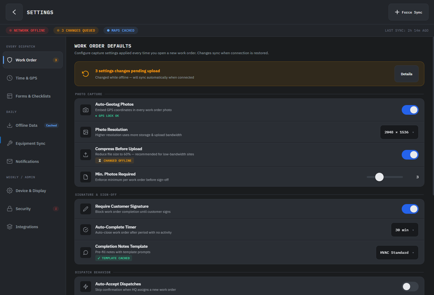
A field technician on a ruggedized Android tablet and a knowledge worker on a desktop monitor aren't the same user. One needs dense information with large touch targets and offline capability. The other needs keyboard shortcuts, multi-pane layouts, and high data throughput. An agent will happily build a desktop-optimized data grid that's unusable at 5 inches. That's not the agent failing. That's you not setting the constraint.
Start every agent session by writing down who the user is and what platform realities they live with. Hand that to the agent as context. The output shifts immediately.
"The primary user is a warehouse supervisor checking inventory on a shared 8-inch Android tablet, often one-handed. They scan 40-60 items per shift. They need to see discrepancies at a glance, not drill into detail. Connectivity is spotty; the app needs to queue updates and sync when back online."
That's not a prompt. That's a design constraint. The agent now knows to use large list items, visual diff indicators, and an offline-first data pattern before you ask for any of it.
2 Specific Aesthetic and Architectural Direction
"Make it look good" produces generic Material Design. Every time. Structurally correct, emotionally empty.
The same applies to code. "Add navigation" gets you whatever pattern the model defaults to. But "use region-based navigation with a single ContentControl host because this is a linear task flow, not a dashboard" gets you something that fits your app's actual structure.
Vague direction produces valid output. Specific direction produces authored output. The gap between those two is the gap between a demo and a product.
Instead of "create a dashboard page," try: "This is a daily ops dashboard. Use a two-column layout: left column is a live ListView of flagged items sorted by severity, right column is a detail pane that updates on selection. Use NavigationView with a flat top bar, not a sidebar; there are only four sections and the user switches between them constantly. Use BodyMedium for list items, TitleLarge for the detail header. The feel is utilitarian, not decorative."
Here's what the agent produces from the vague prompt:
<!-- "Create a dashboard page" -->
<Page>
  <NavigationView PaneDisplayMode="Left">
    <NavigationView.MenuItems>
      <NavigationViewItem Content="Dashboard" Icon="Home" />
      <NavigationViewItem Content="Analytics" Icon="View" />
      <NavigationViewItem Content="Users" Icon="People" />
      <NavigationViewItem Content="Settings" Icon="Setting" />
    </NavigationView.MenuItems>
    <ScrollViewer>
      <StackPanel Spacing="16" Padding="24">
        <TextBlock Text="Dashboard" Style="{StaticResource HeadlineMedium}" />
        <Grid ColumnDefinitions="*,*,*,*">
          <!-- Four vanity-metric cards -->
          <Border><!-- "Total Users: 12,453" --></Border>
          <Border><!-- "Revenue: $84,230" --></Border>
          <Border><!-- "Orders: 1,893" --></Border>
          <Border><!-- "Growth: +12.5%" --></Border>
        </Grid>
        <!-- Hardcoded activity list -->
        <ListView SelectionMode="None">
          <ListViewItem Content="New user registered" />
          <ListViewItem Content="Order #1234 completed" />
        </ListView>
      </StackPanel>
    </ScrollViewer>
  </NavigationView>
</Page>
Sidebar nav, four vanity-metric cards, a hardcoded activity list. It compiles. It runs. You've seen it a thousand times.
Now the same agent with the specific prompt:
<!-- Daily ops dashboard with architectural direction -->
<Page>
  <NavigationView PaneDisplayMode="Top"
                  IsSettingsVisible="False">
    <NavigationView.MenuItems>
      <NavigationViewItem Content="Operations" IsSelected="True" />
      <NavigationViewItem Content="Alerts" />
      <NavigationViewItem Content="Inventory" />
      <NavigationViewItem Content="Reports" />
    </NavigationView.MenuItems>
    <Grid ColumnDefinitions="360,*">
      <!-- Left: Flagged items, sorted by severity -->
      <Grid RowDefinitions="Auto,*">
        <StackPanel Orientation="Horizontal" Padding="16,12">
          <TextBlock Text="Flagged Items" Style="{StaticResource TitleSmall}" />
          <Border Background="{ThemeResource ErrorBrush}" CornerRadius="10">
            <TextBlock Text="{x:Bind ViewModel.FlaggedItems.Count}" />
          </Border>
        </StackPanel>
        <ListView Grid.Row="1"
                  ItemsSource="{x:Bind ViewModel.FlaggedItems}"
                  SelectedItem="{x:Bind ViewModel.SelectedItem, Mode=TwoWay}">
          <!-- Severity-encoded list items with
               color bar, title, source, and time -->
        </ListView>
      </Grid>
      <!-- Right: Detail pane, updates on selection -->
      <Grid Grid.Column="1"
            Visibility="{x:Bind ViewModel.HasSelection}">
        <TextBlock Text="{x:Bind ViewModel.SelectedItem.Title}"
                   Style="{StaticResource TitleLarge}" />
        <!-- Severity, Source, Timestamp metadata -->
        <!-- Detail content with scroll -->
      </Grid>
      <!-- Empty state -->
      <Grid Grid.Column="1"
            Visibility="{x:Bind ViewModel.HasNoSelection}">
        <TextBlock Text="Select an item to view details" />
      </Grid>
    </Grid>
  </NavigationView>
</Page>
Top nav because there are only four sections and the user switches constantly. A master-detail split with severity-encoded list items and selection binding. An empty state. Typography chosen for function, not decoration.
The vague prompt produced a screenshot. The specific prompt produced a working architecture.
3 Structural Metaphors
This is the one most developer-focused AI guidance misses: physical metaphors give layout a logic that cascades into every decision the agent makes.
A dashboard built around the metaphor of a control room (status panels, alert indicators, a central focus area) produces a fundamentally different layout than "show me the data." In Uno Platform terms, an AutoLayout with card grouping and ShadowContainer elevation says "these are distinct items with weight." A plain ItemsRepeater with no visual hierarchy says "here's a list."
These aren't interchangeable. The structure is the direction. Name the metaphor and the agent's layout decisions start to cohere.
For a project management app, telling the agent "think of each project as a folder on a desk, and tasks as sticky notes inside it" produces a completely different layout than "show projects and tasks." The first gives you expandable card containers with compact inline items. The second gives you two flat lists with a master-detail pattern. Both are valid. Only one matches how your users actually think about their work.
4 Real Content
Generated placeholder data makes every app feel like a template. The moment you give the agent real copy, real data shapes, and real edge cases, the output shifts from demo to product.
For cross-platform apps, this matters more than most developers expect. Text that fits in English overflows in German. Dates that render cleanly in one locale break layout assumptions in another. A list that looks fine with 5 items collapses with 50. Feed the agent real content early and these problems surface before they become bugs.
Instead of letting the agent generate "Task 1, Task 2, Task 3," give it: "Here are real task names from production: 'Replace hydraulic filter assembly - Unit 7B', 'Quarterly HVAC inspection (overdue)', 'URGENT: Compressor fault - Building C roof unit.' These are the actual string lengths. Some have status prefixes. Some are two lines on mobile."
Now the agent knows to handle text truncation, status badges, and multi-line list items from the start.
The Checklist
Before your next agent session, write four things down:
- Who is using this and on what device?
- What should the interface feel like, specifically? (Dense, calm, playful, utilitarian; not "good.")
- What metaphor structures the content? (Control room, card stack, timeline, form wizard.)
- What real content can you feed the agent right now?
Hand those four answers to the agent before the first prompt. Not buried in a system message you'll forget about; as the opening context of the conversation.
AI agents don't replace your taste. They amplify whatever direction you give them. Give them nothing and you get competent defaults. Give them clarity, structure, and a point of view, and you get something worth shipping.