
XAML accessibility best practices center on four key AutomationProperties: Name, LabeledBy, AccessibilityView, and AutomationId. These attached properties expose UI element information to screen readers like Windows Narrator, iOS VoiceOver, and Android TalkBack. With Uno Platform, developers can implement accessibility once in XAML and deploy to all platforms from a single codebase.
Key Takeaways:
- AutomationProperties.Name is the most critical property for screen reader announcements
- Use AutomationProperties.LabeledBy to associate form inputs with their labels
- Enable SimpleAccessibility mode for consistent mobile behavior on iOS and Android
- Avoid common pitfalls like using Opacity=0 instead of Visibility=Collapsed
- Test with native screen readers on each target platform
Who this is for:
.NET developers building cross-platform applications who need to implement accessibility features that work across Windows, iOS, Android, macOS, Linux, and WebAssembly.
Understanding XAML Accessibility
According to the Uno Platform accessibility documentation,
“Microsoft UI Automation is an accessibility framework for Windows. It provides programmatic access to most UI elements on the desktop. It enables assistive technology products, such as screen readers, to provide information about the UI to end users.”
A framework that allows assistive technologies to discover, interact with, and report information about UI elements. In XAML development, you expose accessibility data through AutomationProperties attached properties.
When a screen reader encounters your XAML interface, it queries the UI Automation tree to understand what each control does. Your responsibility as a developer is to provide meaningful information through the appropriate properties. Without this information, users relying on assistive technology cannot effectively use your application.
The good news is that built-in XAML controls already provide baseline accessibility support. Buttons announce their content, text boxes expose their text, and checkboxes report their state. Your job is to supplement this with additional context where the default behavior falls short.
Essential AutomationProperties
Four AutomationProperties form the foundation of XAML accessibility. Understanding when and how to use each one determines whether your app works well with screen readers.
AutomationProperties.Name
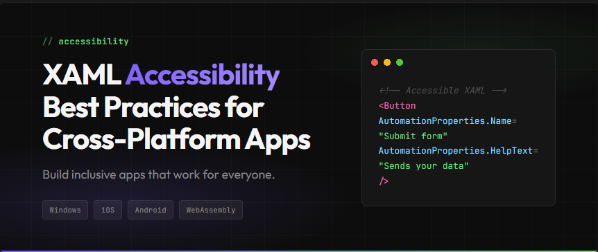
As explained in Microsoft Learn’s accessibility guidance, the Name property “is most frequently accessed and reported by assistive technology when users interact with an app in an accessibility scenario.” This property sets the human-readable identifier that screen readers announce.
Use AutomationProperties.Name when an element lacks visible text or when the visible text does not adequately describe the element’s purpose:
<Image Source="product.png"
       AutomationProperties.Name="Product photo showing the item in use"/>

<Button AutomationProperties.Name="Search">
    <SymbolIcon Symbol="Find"/>
</Button>
Do not include the control type in your Name value. Screen readers automatically append the LocalizedControlType (like “button” or “text box”), so naming a button “Submit button” results in “Submit button button” being announced.
AutomationProperties.LabeledBy
For form fields, LabeledBy creates an association between an input control and its label. This approach is preferred because it uses existing visible text rather than duplicating content:
<StackPanel Orientation="Horizontal">
    <TextBlock x:Name="lblEmail">Email address</TextBlock>
    <TextBox AutomationProperties.LabeledBy="{Binding ElementName=lblEmail}"/>
</StackPanel>
When the screen reader focuses the TextBox, it announces “Email address, text box” by reading the referenced TextBlock’s content.
AutomationProperties.AccessibilityView
This property controls whether an element appears in the accessibility tree. Set it to “Raw” to hide decorative elements that would only create noise for screen reader users:
<Border AutomationProperties.AccessibilityView="Raw">
    <!-- Decorative separator line -->
</Border>| Property | Purpose | When to Use |
|---|---|---|
Name
|
Human-readable identifier | Images, icon-only buttons, elements without text |
LabeledBy
|
Associates input with label | Form fields with visible labels |
AccessibilityView
|
Controls tree visibility | Decorative elements, layout containers |
AutomationId
|
Unique identifier for testing | UI test automation scenarios |
Cross-Platform Accessibility with Uno Platform
The official Uno Platform accessibility guide confirms that “Uno.UI implements a subset of WinUI’s UI Automation APIs to make your applications work with each platform’s built-in screen reader or accessibility support.”
This means the same XAML code works with native screen readers on every target platform:
| Platform | Screen Reader | How It Works |
|---|---|---|
Windows
|
Narrator | Native UI Automation |
Android
|
TalkBack |
Mapped to ContentDescription
|
iOS
|
VoiceOver |
Mapped to accessibilityLabel
|
macOS
|
VoiceOver | Native accessibility APIs |
WebAssembly
|
Browser/OS | Mapped to ARIA attributes |
SimpleAccessibility Mode
iOS handles accessible element focus differently than other platforms. It does not allow nested accessible elements to receive individual focus. Instead, iOS reads all accessible children together when the parent receives focus.
The Uno Platform SimpleAccessibility documentation states: “We highly recommend using this mode, as iOS still won’t let you focus nested accessible elements even if you don’t.”
Enable SimpleAccessibility in your app’s constructor:
// App.cs or App.xaml.cs constructor
#if __IOS__ || __ANDROID__ || __WASM__
FeatureConfiguration.AutomationPeer.UseSimpleAccessibility = true;
#endif
This mode brings consistent behavior across iOS, Android, and WebAssembly, simplifying your accessibility implementation. Learn more about Uno Platform’s cross-platform architecture.
Common Pitfalls and How to Fix Them
The Uno Platform accessibility tips document several common mistakes. Here are the most impactful ones to avoid:
Pitfall 1: Using Opacity="0" Instead of Visibility="Collapsed"
The documentation warns: “Avoid using Opacity=’0′ and IsHitTestVisible=’False’ when you can use Visibility=’Collapsed’. The screen reader can still focus the former, but not the latter.”
When you hide an element with Opacity=”0″, screen readers still find it in the accessibility tree. Users encounter invisible elements they cannot understand or interact with meaningfully.
Fix: Use Visibility="Collapsed" to remove elements from both the visual tree and the accessibility tree.
Pitfall 2: Stacking TextBlocks in a Panel
When you place multiple TextBlocks inside a StackPanel, screen reader users must navigate to each one separately. This fragments information that should be presented together.
Fix: Use Inlines inside a single TextBlock with LineBreak for multi-line content:
<!-- Instead of stacked TextBlocks -->
<TextBlock>
    <Run Text="Product Name"/>
    <LineBreak/>
    <Run Text="$29.99"/>
</TextBlock>
Pitfall 3: Hardcoding AutomationProperties.Name
Hardcoded strings break localization. Users in different locales receive accessibility information in the wrong language.
Fix: Use x:Uid with resource files. The resource key pattern is:MyButton.[using:Windows.UI.Xaml.Automation]AutomationProperties.Name
Pitfall 4: Forgetting AppBarButton.Label
On Android and iOS, AppBarButton may display only an icon. However, the Label property provides the accessible name that screen readers announce.
Fix: Always set AppBarButton.Label, even when it is not visually displayed.
Pitfall 5: Including Control Type in Name
Naming a button “Submit Button” causes the screen reader to announce “Submit Button button” because the system appends the control type automatically.
Fix: Name elements by their action or purpose only: “Submit” not “Submit Button”.
Getting Started with Accessible XAML
Building accessible applications benefits all users while meeting legal and business requirements. Start by enabling SimpleAccessibility mode for consistent cross-platform behavior. Then audit your existing UI for elements missing AutomationProperties, paying special attention to images, icon-only buttons, and form fields.
For comprehensive guidance, explore the Uno Platform accessibility documentation and review Microsoft Learn’s accessibility patterns.
Ready to build accessible cross-platform apps? Get started with Uno Platform today and explore Uno Platform Studio for enhanced developer productivity.
Frequently Asked Questions
AutomationProperties.AccessibilityView="Raw"
to hide them from screen readers. If an image has a visible caption, use
AutomationProperties.LabeledBy
to reference the caption TextBlock instead of duplicating the text.
 Subscribe to Our Blog
 Subscribe via RSS
 Back to Top