Overcoming WASDK’s XAML Limitation with Uno Platform’s C# Markup:
🕓 7 MINThe Story Behind WindowSill’s Extensibility If you’re a .NET dev building desktop apps with the Windows App SDK, you’ve probably hit that point where “just
🕓 7 MINThe Story Behind WindowSill’s Extensibility If you’re a .NET dev building desktop apps with the Windows App SDK, you’ve probably hit that point where “just

🕓 5 MINHot Design is here, bringing a streamlined and intuitive interface for developers to design, build, and refine their apps more efficiently. In this article, we’ll

🕓 10 MINToday’s release is a significant step towards creating the most productive platform for building single codebase .NET applications that run on mobile, desktop, and web.

🕓 5 MINThis article will review the essential steps of replicating a user interface using Uno Platform XAML elements. We’ve also incorporated some refinements to the original

🕓 5 MINWe are thrilled to showcase the latest features of Preview 6 of our Figma plugin. One of the most significant additions is the View Hierarchy,

🕓 8 MINIf you want to streamline your workflow, improving the design-to-code process can help you focus on the code behind and get you to production quicker
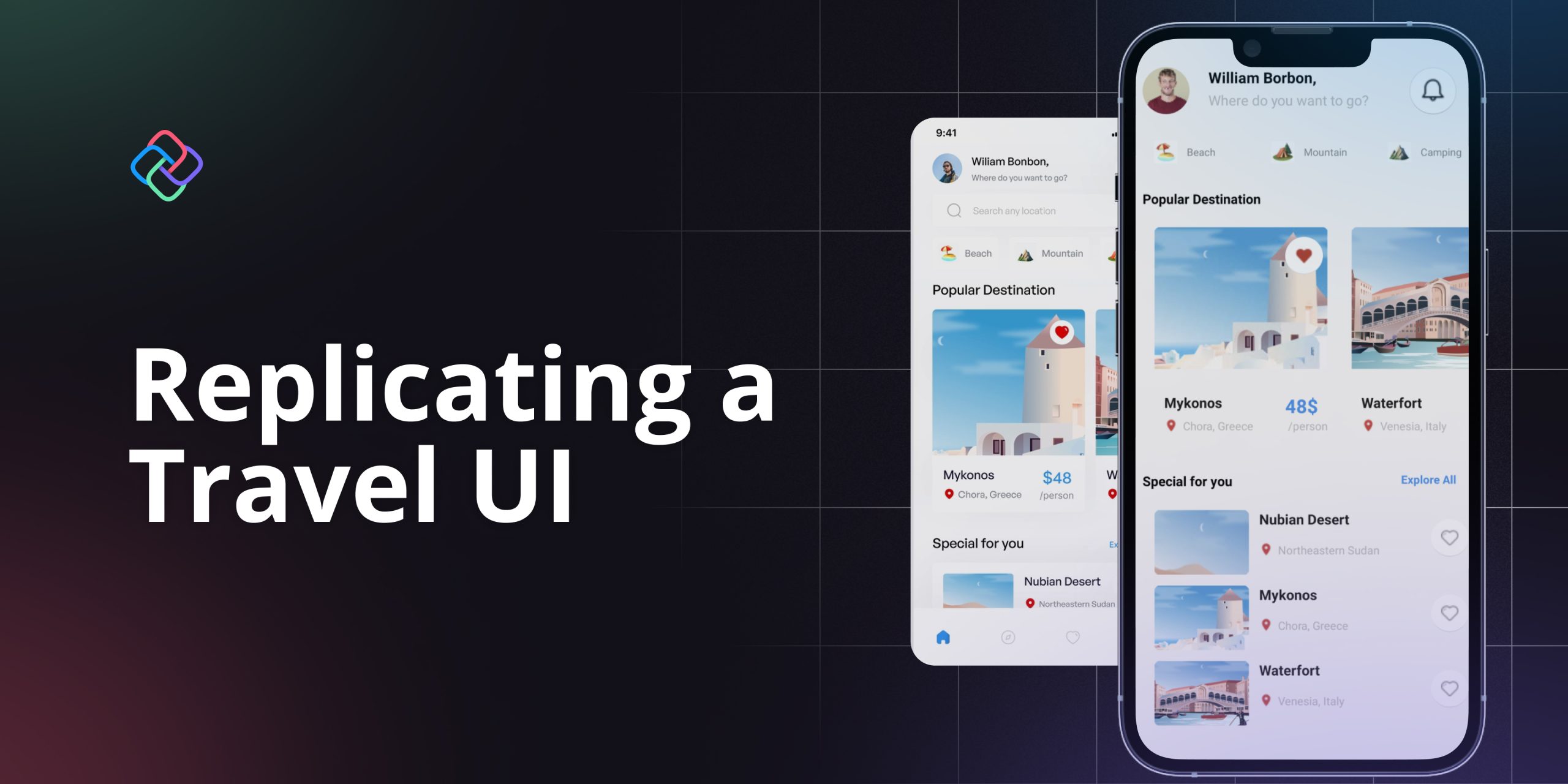
🕓 3 MINWelcome👋 ! In this article, I will guide you through the process of developing a travel user interface using Uno Platform XAML. This type of

🕓 4 MINNick Randolph’s earlier post in this blog series covered the basics of sorting and grouping. The CollectionViewSource provides a wrapper around a data source that can

🕓 4 MINWinUI contains classes for menus belonging to a Window and context menus attached to other controls. Users will be familiar with menus in traditional desktop