
🕓 4 MINAn exploration of how software Documentation is evolving - how it is written & consumed by AI armed with contextual MCP tools.


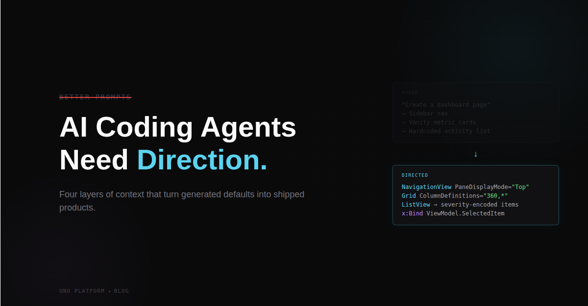
🕓 5 MINBetter prompts help, but they only go so far. The real skill is giving coding agents the product, UX, and architectural context they can’t infer on their own
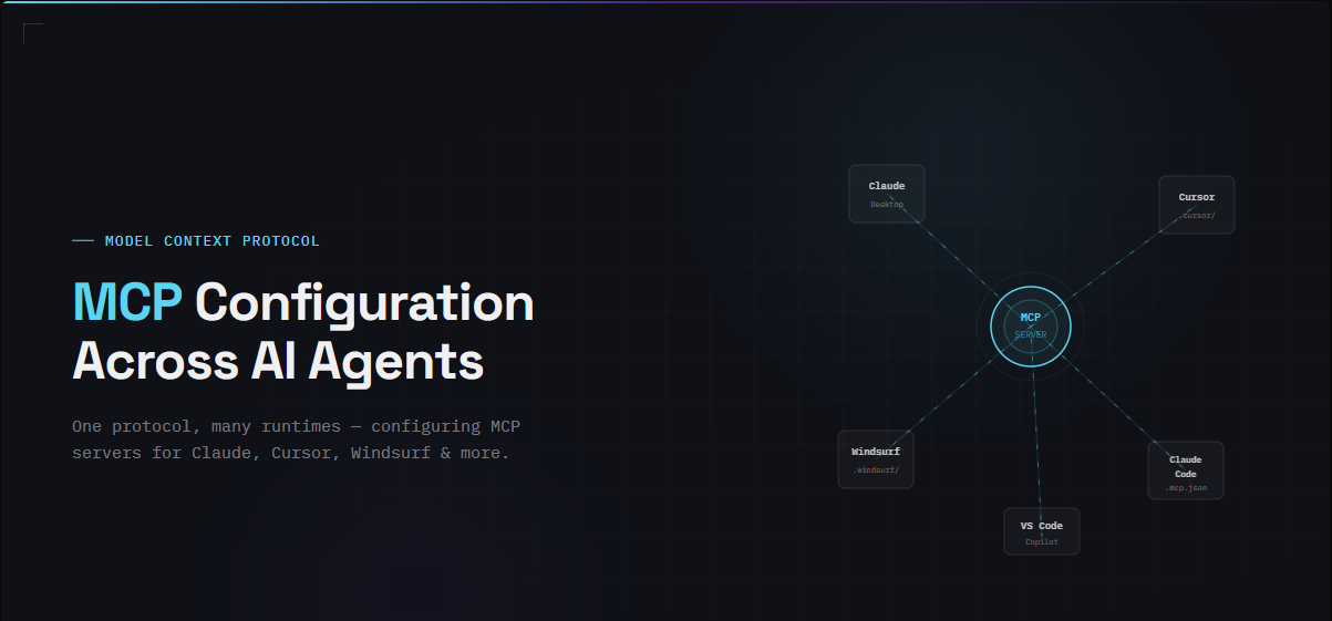
🕓 5 MINAn exploration of how various AI Agents read MCP tool configurations