
Attached properties are XAML properties defined by one class but attachable to any element, enabling clean MVVM patterns without code-behind. The Uno PlatformToolkit provides powerful attached property extensions like CommandExtensions and InputExtensions that add command support, focus management, and selection capabilities to controls that lack these features natively.
Key Takeaways:
- Attached properties enable adding behavior to any XAML element without modifying the element’s class
- Uno Toolkit provides CommandExtensions to add Command support to controls like TextBox, ItemsRepeater, and ToggleSwitch
- InputExtensions simplifies form handling with automatic focus navigation and keyboard dismissal
- ItemsRepeaterExtensions adds selection support to ItemsRepeater, which lacks it natively
- Using attached properties keeps your MVVM architecture clean by eliminating code-behind event handlers
Who this is for: .NET developers building cross-platform XAML applications who want to maintain clean MVVM separation while adding behaviors to standard controls.
What Are Attached Properties?
An attached property is a XAML property defined by one class that can be set on any DependencyObject, enabling extensibility without inheritance. Unlike regular properties that belong to a specific control, attached properties can be “attached” to any element in the visual tree.
As stated in the Uno Platform documentation on attached properties, “Attached Properties are often something that you simply need as a quick way to access and set the value for. For example, you may want to set the Grid.Row or Column of an element.”
You encounter attached properties constantly in XAML development:
<Grid>
    <Grid.RowDefinitions>
        <RowDefinition Height="Auto" />
        <RowDefinition Height="*" />
    </Grid.RowDefinitions>

    <TextBlock Text="Header" Grid.Row="0" />
    <ListView Grid.Row="1" />
</Grid>
In this example, Grid.Row is an attached property. The TextBlock and ListView classes do not define a `Row` property themselves. The Grid class defines it, but any element can use it.
A XAML property defined by one class that can be set on any DependencyObject, enabling extensibility without inheritance..
Attached properties let you extend any XAML element with new capabilities without modifying its source code.
Attached Properties vs Dependency Properties
Understanding the distinction between attached and dependency properties prevents common confusion. For deeper technical details, see the WinUI development documentation on data binding and dependency properties.
| Aspect | Dependency Property | Attached Property |
|---|---|---|
| Ownership | Belongs to the declaring class | Defined by one class, used by any |
| Registration | DependencyProperty.Register() |
DependencyProperty.RegisterAttached() |
| Usage | Set directly on owning type | Set on any DependencyObject |
| Examples | Button.Content, TextBox.Text | Grid.Row, Canvas.Left |
Dependency properties belong to a class. Attached properties extend any class. When you need to add a property that affects layout or behavior across different control types, attached properties are your tool.
The Behaviors Pattern Explained
In MVVM architecture, the View should contain minimal code-behind. Data binding connects UI elements to ViewModel properties, serving as what Microsoft Learn describes as “the glue between the view and viewmodel.”
But what happens when you need to respond to events that do not have built-in Command support? Traditionally, developers wrote code-behind event handlers:
Before (Code-Behind Approach):
// In MainPage.xaml.cs
private void SearchBox_KeyDown(object sender, KeyRoutedEventArgs e)
{
    if (e.Key == VirtualKey.Enter)
    {
        var vm = (MainViewModel)DataContext;
        vm.SearchCommand.Execute(((TextBox)sender).Text);
    }
}
This breaks MVVM separation. The View now has logic and direct ViewModel references.
After (Attached Property Approach):
<!-- In MainPage.xaml -->
<TextBox Text="{Binding SearchQuery, Mode=TwoWay}"
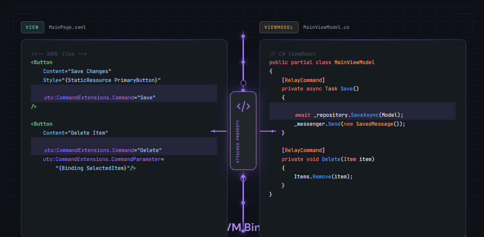
utu:CommandExtensions.Command="{Binding SearchCommand}" />The attached property handles the event wiring internally. Your XAML remains declarative, and your code-behind stays clean. This is the “binding glue” pattern: attached properties bridge gaps where standard binding cannot reach.
Uno Toolkit Attached Property Extensions
The Uno Toolkit provides a comprehensive set of attached property helpers that solve common MVVM challenges. These extensions work identically across iOS, Android, WebAssembly, Windows, macOS, and Linux.
| Extension | Purpose |
|---|---|
| CommandExtensions | Add Command/CommandParameter to any control |
| InputExtensions | Focus management, keyboard handling for forms |
| ItemsRepeaterExtensions | Selection and incremental loading for ItemsRepeater |
| FlipViewExtensions | External navigation control for FlipView |
| SelectorExtensions | Connect PipsPager to any Selector |
| ProgressExtensions | Tree-wide progress indicator control |
| ResourceExtensions | Lightweight styling with attached ResourceDictionary |
| VisualStateManagerExtensions | Bind visual states declaratively |
| StatusBarExtensions | Control mobile status bar appearance |
Uno Toolkit provides pre-built attached properties that solve the most common MVVM pain points across all platforms.
CommandExtensions Deep Dive
The CommandExtensions documentation states that it “provides Command/CommandParameter attached properties for common scenarios.”
CommandExtensions automatically wires up the appropriate event based on the control type. According to the documentation, “Command is executed on: ListViewBase.ItemClick, Selector.SelectionChanged, NavigationView.ItemInvoked, ItemsRepeater item tapped, TextBox and PasswordBox when the Enter key is pressed, ToggleSwitch toggled, any UIElement tapped.”
Example: Search Box with Command
xmlns:utu="using:Uno.Toolkit.UI"

<TextBox x:Name="SearchBox"
         PlaceholderText="Search..."
         utu:CommandExtensions.Command="{Binding SearchCommand}" />
The command receives the TextBox.Text as its parameter. The documentation notes: “Command on TextBox/PasswordBox: Having this set will also cause the keyboard to dismiss on enter.”
Example: ListView with Item Command
<ListView ItemsSource="{Binding Items}"
          IsItemClickEnabled="True"
          utu:CommandExtensions.Command="{Binding ItemSelectedCommand}">
    <ListView.ItemTemplate>
        <DataTemplate>
            <TextBlock Text="{Binding Name}" />
        </DataTemplate>
    </ListView.ItemTemplate>
</ListView>
Note: IsItemClickEnabled must be set to True for CommandExtensions to work with ListView.
ViewModel
public partial class MainViewModel : ObservableObject
{
    [RelayCommand]
    private void Search(string query)
    {
        // Handle search
    }

    [RelayCommand]
    private void ItemSelected(ItemModel item)
    {
        // Handle item selection
    }
}
InputExtensions for Form Handling
Building forms on mobile requires careful focus management. The InputExtensions documentation explains: “AutoFocusNext and AutoFocusNextElement: Having either or both of the two properties set will enable the focus next behavior.”
Login Form Example:
xmlns:utu="using:Uno.Toolkit.UI"

<StackPanel Spacing="16">
    <TextBox x:Name="UsernameBox"
             PlaceholderText="Username"
             utu:InputExtensions.AutoFocusNext="True"
             utu:InputExtensions.ReturnType="Next" />

    <PasswordBox x:Name="PasswordBox"
                 PlaceholderText="Password"
                 utu:InputExtensions.AutoFocusNextElement="{Binding ElementName=LoginButton}"
                 utu:InputExtensions.ReturnType="Done" />

    <Button x:Name="LoginButton"
            Content="Sign In"
            Command="{Binding LoginCommand}" />
</StackPanel>
The documentation clarifies the difference: “AutoFocusNext is determined by FocusManager.FindNextFocusableElement. AutoFocusNextElement is provided by the value.” When both are set, AutoFocusNextElement takes precedence.
InputExtensions eliminates the need for focus management code-behind in form scenarios.
ItemsRepeaterExtensions for Selection
ItemsRepeater provides flexible layouts but lacks built-in selection support. The ItemsRepeaterExtensions documentation states: “Provides selection and incremental loading support for ItemsRepeater.”
Single Selection Example:
xmlns:utu="using:Uno.Toolkit.UI"
xmlns:muxc="using:Microsoft.UI.Xaml.Controls"

<muxc:ItemsRepeater ItemsSource="{Binding Categories}"
                    utu:ItemsRepeaterExtensions.SelectionMode="Single"
                    utu:ItemsRepeaterExtensions.SelectedItem="{Binding SelectedCategory, Mode=TwoWay}">
    <muxc:ItemsRepeater.ItemTemplate>
        <DataTemplate>
            <RadioButton Content="{Binding Name}" />
        </DataTemplate>
    </muxc:ItemsRepeater.ItemTemplate>
</muxc:ItemsRepeater>
The documentation specifies selection modes: “None: Selection is disabled. SingleOrNone: Up to one item can be selected at a time. The current item can be deselected. Single: One item is selected at any time. The current item cannot be deselected. Multiple: The current item cannot be deselected.”
According to the documentation, "The selection feature from this extension supports ItemTemplate whose root element is a SelectorItem or ToggleButton (which includes Chip)."
When to Use Attached Properties vs Alternatives
While attached properties are powerful, they are not always the right choice. Consider these alternatives:
| Scenario | Best Approach | Why |
|---|---|---|
| Add command to any control | CommandExtensions | Built-in, tested, cross-platform |
| Transform data for display | Value converter | Simpler, no behavior needed |
| Complex multi-step event handling | Custom attached property | Full control over logic |
| Visual state changes | VisualStateManager | Proper separation of concerns |
| One-off event handler | Code-behind (acceptable) | Over-engineering otherwise |
Common Pitfalls and Fixes
Using them when a simple converter would suffice increases complexity. If you only need to transform data (format a date, convert bool to visibility), use a converter instead.
ItemsRepeaterExtensions
selection only works when the ItemTemplate
root is a SelectorItem
or ToggleButton.
If selection visuals do not work, check your template structure.
CommandExtensions
on ListView
requires IsItemClickEnabled="True".
Without it, the command never fires. Always set this property when using CommandExtensions
with ListView.
Getting Started with Attached Properties
Attached properties are essential tools for clean MVVM architecture in XAML applications. They let you add behaviors to any control without code-behind, maintaining separation between your View and ViewModel.
The Uno Toolkit provides battle-tested attached property extensions that solve real problems: adding commands to controls that lack them, managing form focus, and enabling selection in ItemsRepeater. These work across all platforms Uno Platform supports.
Start with CommandExtensions to add command support where you need it. Then explore InputExtensions for form scenarios and ItemsRepeaterExtensions when building custom lists. The Uno Toolkit documentation provides detailed guidance for each extension.
For a complete development experience with live preview and visual editing, explore Uno Platform Studio.
Get started with Uno Platform to build cross-platform .NET applications with clean MVVM architecture.
Frequently Asked Questions
Button.Content
or
TextBox.Text.
An attached property is defined by one class but can be set on any
DependencyObject,
like
Grid.Row
or
Canvas.Left.
The key difference is ownership: dependency properties belong to their declaring class, while attached properties extend any element without inheritance.
CommandExtensions
from the Uno Toolkit. Add the namespace
xmlns:utu="using:Uno.Toolkit.UI"
and set
utu:CommandExtensions.Command="{Binding YourCommand}"
on controls like
TextBox,
PasswordBox,
ItemsRepeater,
or
ToggleSwitch.
The extension automatically wires up the appropriate event and passes the relevant parameter to your command.
CommandExtensions,
InputExtensions,
or
ItemsRepeaterExtensions
works identically on iOS, Android, WebAssembly, Windows, macOS, and Linux. This consistency is a core design principle of Uno Platform.
 Subscribe to Our Blog
 Subscribe via RSS
 Back to Top