
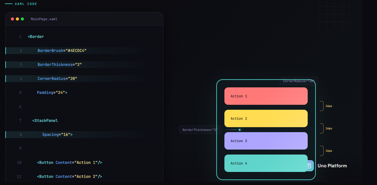
StackPanel styling in XAML involves setting visual properties like Background, BorderBrush, BorderThickness, CornerRadius, Padding, and Spacing directly on the panel. Modern XAML frameworks, including Uno Platform and WinUI, support built-in border styling on StackPanel without requiring a wrapper Border element, improving performance and reducing XAML complexity.
Key Takeaways:
- StackPanel has built-in border properties that eliminate the need for wrapper Border elements
- The Spacing property provides uniform gaps between child elements without individual Margins
- Reusable styles can be defined with TargetType=”StackPanel” for consistent appearance
- Theme-aware styling with ThemeDictionaries supports light and dark modes automatically
- Uno Platform implements all StackPanel styling properties across Windows, iOS, Android, and WebAssembly.
Who this is for:
.NET developers building cross-platform applications with Uno Platform or WinUI who want to style StackPanel containers consistently and efficiently.
According to the Uno Platform StackPanel documentation, StackPanel is fully implemented across WASM, Skia, and Mobile platforms with all modern styling properties. This guide covers the essential properties, reusable style patterns, theme support, and common pitfalls to avoid.
Essential StackPanel Styling Properties
StackPanel in modern XAML frameworks provides a comprehensive set of styling properties that make visual customization straightforward. The official Microsoft documentation notes that “StackPanel defines border properties that let you draw a border around the StackPanel without using an additional Border element.”
A double value that specifies uniform space between child elements. This modern property eliminates the need to set individual Margins on each child.
Here are the key styling properties available on StackPanel:
| Property | Description | Example Value |
|---|---|---|
| Background | Brush that fills the panel area | {ThemeResource SystemControlBackgroundAltHighBrush} |
| BorderBrush | Brush for the border color | Gray or {ThemeResource SystemControlForegroundBaseMediumBrush} |
| BorderThickness | Thickness of the border | 1 or 1,2,1,2 |
| CornerRadius | Rounded corner radius | 4 or 8,8,0,0 |
| Padding | Internal space from border to content | 16 or 16,8,16,8 |
| Spacing | Uniform gap between children | 8 |
The following example demonstrates a fully-styled StackPanel:
<StackPanel
    Orientation="Vertical"
    Spacing="12"
    Padding="16"
    Background="{ThemeResource CardBackgroundFillColorDefaultBrush}"
    BorderBrush="{ThemeResource CardStrokeColorDefaultBrush}"
    BorderThickness="1"
    CornerRadius="8">

    <TextBlock Text="First Item" Style="{StaticResource BodyTextBlockStyle}" />
    <TextBlock Text="Second Item" Style="{StaticResource BodyTextBlockStyle}" />
    <TextBlock Text="Third Item" Style="{StaticResource BodyTextBlockStyle}" />

</StackPanel>
As Microsoft Learn explains, “Using the built-in border properties reduces the XAML element count, which can improve the UI performance of your app.” StackPanel’s built-in styling properties eliminate the need for wrapper elements.
Creating Reusable StackPanel Styles
While official documentation covers basic XAML styles, it rarely shows patterns specifically for StackPanel. Creating reusable styles ensures consistent appearance across your application and reduces repetitive XAML code.
According to Microsoft’s XAML styles guide, “Styles let you set control properties and reuse those settings for a consistent appearance across multiple controls.”
A style without an x:Key that automatically applies to all matching controls in scope. Explicit Style: A style with an x:Key that must be referenced explicitly using StaticResource.
Here is a complete reusable style for StackPanel defined in your App.xaml or a ResourceDictionary:
<!-- Define in App.xaml or ResourceDictionary -->
<Style x:Key="CardStackPanelStyle" TargetType="StackPanel">
    <Setter Property="Spacing" Value="8" />
    <Setter Property="Padding" Value="16" />
    <Setter Property="Background" Value="{ThemeResource CardBackgroundFillColorDefaultBrush}" />
    <Setter Property="BorderBrush" Value="{ThemeResource CardStrokeColorDefaultBrush}" />
    <Setter Property="BorderThickness" Value="1" />
    <Setter Property="CornerRadius" Value="8" />
</Style>

<!-- Usage -->
<StackPanel Style="{StaticResource CardStackPanelStyle}">
    <TextBlock Text="Styled content" />
    <Button Content="Action" />
</StackPanel>
You can also create a base style and extend it for variations:
<Style x:Key="BaseStackPanelStyle" TargetType="StackPanel">
    <Setter Property="Spacing" Value="8" />
    <Setter Property="Padding" Value="12" />
</Style>

<Style x:Key="HighlightedStackPanelStyle" TargetType="StackPanel"
       BasedOn="{StaticResource BaseStackPanelStyle}">
    <Setter Property="Background" Value="{ThemeResource SystemAccentColorLight2}" />
    <Setter Property="CornerRadius" Value="4" />
</Style>
For lightweight styling with Uno Themes, you can override specific resources at the control level without redefining the entire style.
Theme-Aware StackPanel Styling
Building applications that support light and dark themes requires theme-aware resource definitions. The XAML theme resources documentation recommends that “you should specify theme dictionaries for both ‘Light’ and ‘Dark’ in addition to your ‘HighContrast’ dictionary.”
A markup extension that retrieves a resource value based on the current system theme, automatically updating when the theme changes.
Define theme-specific brushes in your ResourceDictionary:
<Page.Resources>
    <ResourceDictionary>
        <ResourceDictionary.ThemeDictionaries>
            <ResourceDictionary x:Key="Light">
                <SolidColorBrush x:Key="PanelBackgroundBrush" Color="#F5F5F5" />
                <SolidColorBrush x:Key="PanelBorderBrush" Color="#E0E0E0" />
            </ResourceDictionary>
            <ResourceDictionary x:Key="Default">
                <SolidColorBrush x:Key="PanelBackgroundBrush" Color="#2D2D2D" />
                <SolidColorBrush x:Key="PanelBorderBrush" Color="#404040" />
            </ResourceDictionary>
        </ResourceDictionary.ThemeDictionaries>
    </ResourceDictionary>
</Page.Resources>

<!-- Usage with ThemeResource -->
<StackPanel
    Background="{ThemeResource PanelBackgroundBrush}"
    BorderBrush="{ThemeResource PanelBorderBrush}"
    BorderThickness="1"
    CornerRadius="8"
    Padding="16">
    <!-- Content -->
</StackPanel>
The StackPanel will automatically update its appearance when the user switches between light and dark modes. For more details on implementing theme switching with ThemeService, see the Uno Platform extensions documentation.
Common Pitfalls When Styling StackPanel
While official documentation covers the basics, these practical pitfalls come from real-world development experience. Avoiding them will save you debugging time and improve your application’s performance.
| Pitfall | Wrong Approach | Right Approach |
|---|---|---|
| Unnecessary Border wrapper | Wrapping StackPanel in Border for styling | Use built-in BorderBrush, BorderThickness, CornerRadius |
| Individual child Margins | Setting Margin="0,0,0,8" on each child | Set Spacing="8" on the StackPanel |
| Margin vs Padding confusion | Using Margin for internal space | Margin = external space; Padding = internal space |
| Deep nesting | Multiple nested StackPanels for layout | Consider Grid for complex arrangements |
Pitfall 1: Wrapping in Border
Many developers create unnecessary element overhead:
<!-- Avoid this pattern -->
<Border Background="Gray" BorderBrush="Black" BorderThickness="1" CornerRadius="4">
    <StackPanel Padding="16">
        <!-- Content -->
    </StackPanel>
</Border>

<!-- Prefer this approach -->
<StackPanel
    Background="Gray"
    BorderBrush="Black"
    BorderThickness="1"
    CornerRadius="4"
    Padding="16">
    <!-- Content -->
</StackPanel>
Pitfall 2: Spacing vs Margin
The Spacing property creates uniform gaps between children, which is cleaner than setting individual Margins:
<!-- Avoid individual margins -->
<StackPanel>
    <TextBlock Text="One" Margin="0,0,0,8" />
    <TextBlock Text="Two" Margin="0,0,0,8" />
    <TextBlock Text="Three" />
</StackPanel>

<!-- Prefer Spacing -->
<StackPanel Spacing="8">
    <TextBlock Text="One" />
    <TextBlock Text="Two" />
    <TextBlock Text="Three" />
</StackPanel>
For more information on layout best practices with WinUI panels, see the Uno Platform documentation.
Next Steps
StackPanel styling in XAML is straightforward once you understand the built-in properties and pattern options. Use the Spacing property for uniform gaps, take advantage of built-in border properties instead of wrapper elements, and create reusable styles for consistency across your application.
For cross-platform applications, all these styling features work identically on Windows, iOS, Android, macOS, Linux, and WebAssembly when using Uno Platform. Explore the Uno Themes library for pre-built Material design system styles.
Ready to build cross-platform apps with consistent styling? Get started with Uno Platform and explore the samples and tutorials for comprehensive guidance on layout, styling, and more.
Frequently Asked Questions
Background="LightGray",
a hex value like
Background="#F0F0F0",
or a theme-aware resource like
Background="{ThemeResource CardBackgroundFillColorDefaultBrush}".
Using ThemeResource ensures your background adapts to light and dark themes automatically.
BorderBrush
to define the color,
BorderThickness
to set the width, and
CornerRadius
for rounded corners. This reduces XAML element count and can be more efficient than wrapping the StackPanel in a separate Border.
 Subscribe to Our Blog
 Subscribe via RSS
 Back to Top