
Building user interfaces that look great on phones, tablets, desktops, and the web used to mean writing separate UI code for each platform. XAML UI design with Uno Platform changes that equation – one codebase, six platforms, no compromises.
XAML UI design is the process of creating user interfaces using eXtensible Application Markup Language (XAML), a declarative markup language for defining layouts, controls, and visual elements in .NET applications. With Uno Platform, XAML UI design enables developers to build cross-platform applications for Windows, iOS, Android, macOS, Linux, and WebAssembly from a single codebase.
This comprehensive guide covers everything you need to know about modern XAML UI design, from fundamental concepts to advanced responsive techniques, styling patterns, and the latest tooling innovations.
Quick Summary
- What: XAML UI design creates cross-platform user interfaces using declarative markup
- Why: Single codebase for Windows, iOS, Android, macOS, Linux, and WebAssembly
- Key Features: Layout panels, responsive extensions, lightweight styling, data binding
- Tools: Hot Design visual designer, Hot Reload, C# Markup alternative
Understanding XAML Fundamentals
Before diving into advanced techniques, let’s establish a solid foundation in XAML basics.
What is XAML?
According to the Uno Platform documentation on UI Markup, “XAML is an XML based UI definition declarative language, and Uno Platform uses the WinUI 3 flavor.” Elements such as Grid, StackPanel, and TextBlock can be used to define your user interface.
XAML provides a clean separation between your application’s visual presentation and its underlying logic. This declarative approach means you describe what your UI should look like, rather than writing imperative code to construct it step by step.
For detailed design principles, the WinUI documentation on design provides extensive guidance that applies directly to Uno Platform development.
XAML Syntax Basics
A typical XAML element follows this structure:
<ElementName Property="Value">
    <ElementName.ComplexProperty>
        <!-- Complex property content -->
    </ElementName.ComplexProperty>
    <!-- Child elements -->
</ElementName>
Here’s a practical example showing common XAML patterns:
<Page
    xmlns="http://schemas.microsoft.com/winfx/2006/xaml/presentation"
    xmlns:x="http://schemas.microsoft.com/winfx/2006/xaml">

    <StackPanel
        Padding="16"
        Spacing="8">

        <TextBlock
            Text="Welcome to XAML UI Design"
            Style="{StaticResource TitleTextBlockStyle}" />

        <Button
            Content="Get Started"
            HorizontalAlignment="Center" />

    </StackPanel>
</Page>
XAML or C# Markup - Your Choice
The Uno Platform documentation notes that “Uno Platform provides two ways for defining your UI: WinUI XAML or C# Markup. You can choose either one for developing your application, based on your preferences.”
For developers who prefer working entirely in C#, the C# Markup documentation provides a comprehensive guide to this fluent, strongly-typed alternative:
new StackPanel()
    .Padding(16)
    .Spacing(8)
    .Children(
        new TextBlock()
            .Text("Welcome to XAML UI Design")
            .Style(StaticResource.Get<Style>("TitleTextBlockStyle")),
        new Button()
            .Content("Get Started")
            .HorizontalAlignment(HorizontalAlignment.Center)
    )
Both approaches produce identical results and can be mixed within a project.
Mastering Layout Systems
Choosing the wrong layout panel is one of the most common XAML mistakes – and one of the easiest to fix once you understand each panel’s strengths.
Layout Panels Overview
XAML provides several layout panels, each designed for specific scenarios:
| Panel | Dimensions | Best For | Performance |
|---|---|---|---|
| Grid | 2D (rows/columns) | Complex layouts, forms | Good |
| StackPanel | 1D (linear) | Simple lists, toolbars | Excellent |
| AutoLayout | 1D (Figma-style) | Design system consistency | Good |
| Canvas | Absolute | Games, diagrams | Varies |
Choosing the Right Layout Control
From our analysis: When deciding between layout panels, consider this decision framework:
- Use Grid when: You need elements to overlap, occupy specific cells, or require precise two-dimensional positioning
- Use StackPanel when: Elements should flow in a single direction without complex positioning requirements
- Use AutoLayout when: Translating designs from Figma or maintaining consistent spacing behavior across your app
According to the Uno Platform Toolkit documentation on AutoLayout, “AutoLayout arranges child elements into a single row or column, depending on the Orientation property. The control is intended to reflect the same behaviors as the AutoLayout Frame component in Figma.”
Grid Deep Dive
Grid is the most versatile layout panel, supporting complex two-dimensional arrangements:
<Grid>
    <Grid.RowDefinitions>
        <RowDefinition Height="Auto" />      <!-- Header -->
        <RowDefinition Height="*" />         <!-- Content (fills remaining) -->
        <RowDefinition Height="Auto" />      <!-- Footer -->
    </Grid.RowDefinitions>

    <Grid.ColumnDefinitions>
        <ColumnDefinition Width="200" />     <!-- Sidebar -->
        <ColumnDefinition Width="*" />       <!-- Main content -->
    </Grid.ColumnDefinitions>

    <!-- Header spans both columns -->
    <Border Grid.Row="0" Grid.ColumnSpan="2" Background="Navy">
        <TextBlock Text="Header" Foreground="White" Padding="16" />
    </Border>

    <!-- Sidebar -->
    <Border Grid.Row="1" Grid.Column="0" Background="LightGray">
        <TextBlock Text="Sidebar" Padding="16" />
    </Border>

    <!-- Main content -->
    <Border Grid.Row="1" Grid.Column="1">
        <TextBlock Text="Main Content Area" Padding="16" />
    </Border>

    <!-- Footer spans both columns -->
    <Border Grid.Row="2" Grid.ColumnSpan="2" Background="DarkGray">
        <TextBlock Text="Footer" Padding="16" />
    </Border>
</Grid>
Key sizing concepts:
Auto– Size to content*(Star) – Proportional sizing (fills available space)2*– Two times the proportion of*- Fixed values (e.g.,
200) – Exact pixel size
AutoLayout for Modern Design
AutoLayout bridges the gap between design tools and code. Learn more about implementing it in the AutoLayout how-to guide:
<utu:AutoLayout
    xmlns:utu="using:Uno.Toolkit.UI"
    Orientation="Vertical"
    Spacing="12"
    Padding="16">

    <TextBlock Text="Card Title" />
    <TextBlock Text="Card description goes here" TextWrapping="Wrap" />
    <Button Content="Action" />

</utu:AutoLayout>
Building Responsive UIs
Forget complex media queries and duplicate layouts. Uno Platform’s ResponsiveExtension lets you define adaptive UIs with a single line of markup.
Understanding Screen Breakpoints
According to the Uno Platform Responsive Extensions documentation, “Responsive Extensions let you define different values for a property depending on the screen size.”
Uno Toolkit uses five logical breakpoints:
| Name | Typical Range | Purpose |
|---|---|---|
| Narrowest | Phones, smallest windows | Most compact UI |
| Narrow | Small tablets, split views | Slightly roomier spacing |
| Normal | Default, mid-size | Baseline design |
| Wide | Tablets, medium desktops | Expanded padding |
| Widest | Large monitors | Maximum comfort |
Using ResponsiveExtension
ResponsiveExtension provides property-level responsiveness directly in XAML:
<StackPanel
    xmlns:utu="using:Uno.Toolkit.UI"
    Spacing="{utu:Responsive
        Narrowest=4
        Narrow=6
        Normal=8
        Wide=10
        Widest=12}">

    <TextBlock
        Text="Responsive Title"
        FontSize="{utu:Responsive
            Narrowest=18
            Normal=24
            Wide=32}" />

    <Button
        Content="Action"
        Padding="{utu:Responsive
            Narrowest='8,4'
            Normal='16,8'
            Wide='24,12'}" />

</StackPanel>
You can also control visibility based on screen size:
<Border
    xmlns:utu="using:Uno.Toolkit.UI"
    Width="280"
    Visibility="{utu:Responsive
        Narrowest=Collapsed
        Narrow=Collapsed
        Normal=Visible}" />
AdaptiveTrigger and Visual States
For more complex responsive scenarios, use VisualStateManager with AdaptiveTrigger. The Uno Platform AdaptiveTrigger documentation provides detailed guidance:
<Grid>
    <VisualStateManager.VisualStateGroups>
        <VisualStateGroup>
            <VisualState x:Name="WideState">
                <VisualState.StateTriggers>
                    <AdaptiveTrigger MinWindowWidth="1000" />
                </VisualState.StateTriggers>
                <VisualState.Setters>
                    <Setter Target="MainPanel.Orientation" Value="Horizontal" />
                    <Setter Target="SidePanel.Visibility" Value="Visible" />
                </VisualState.Setters>
            </VisualState>

            <VisualState x:Name="NarrowState">
                <VisualState.StateTriggers>
                    <AdaptiveTrigger MinWindowWidth="0" />
                </VisualState.StateTriggers>
                <VisualState.Setters>
                    <Setter Target="MainPanel.Orientation" Value="Vertical" />
                    <Setter Target="SidePanel.Visibility" Value="Collapsed" />
                </VisualState.Setters>
            </VisualState>
        </VisualStateGroup>
    </VisualStateManager.VisualStateGroups>

    <StackPanel x:Name="MainPanel">
        <!-- Content -->
    </StackPanel>
    <Border x:Name="SidePanel" />
</Grid>The Uno Platform documentation on Adaptive Triggers notes: "In an Uno Platform application, the sequential order of the adaptive trigger does matter. In this instance, the VisualState will execute the Setters when it finds the first matching occurrence." Always order your AdaptiveTriggers from largest MinWindowWidth to smallest to ensure correct behavior.
ResponsiveView for Template Switching
When you need entirely different layouts for different screen sizes, ResponsiveView switches templates:
<utu:ResponsiveView xmlns:utu="using:Uno.Toolkit.UI">
    <utu:ResponsiveView.NarrowTemplate>
        <DataTemplate>
            <!-- Phone layout: single column -->
            <StackPanel>
                <TextBlock Text="Mobile View" />
                <!-- Compact controls -->
            </StackPanel>
        </DataTemplate>
    </utu:ResponsiveView.NarrowTemplate>

    <utu:ResponsiveView.WideTemplate>
        <DataTemplate>
            <!-- Desktop layout: multi-column -->
            <Grid>
                <Grid.ColumnDefinitions>
                    <ColumnDefinition Width="*" />
                    <ColumnDefinition Width="2*" />
                </Grid.ColumnDefinitions>
                <TextBlock Text="Desktop View" />
                <!-- Expanded controls -->
            </Grid>
        </DataTemplate>
    </utu:ResponsiveView.WideTemplate>
</utu:ResponsiveView>
Styling and Theming
Traditional XAML styling meant redefining entire styles to change one color. Lightweight styling lets you override just what you need.
Understanding Resources
XAML resources enable reuse and consistency:
<Page.Resources>
    <!-- Static resource -->
    <SolidColorBrush x:Key="BrandPrimaryBrush" Color="#0078D4" />

    <!-- Theme-aware resources -->
    <ResourceDictionary.ThemeDictionaries>
        <ResourceDictionary x:Key="Light">
            <SolidColorBrush x:Key="PageBackgroundBrush" Color="White" />
        </ResourceDictionary>
        <ResourceDictionary x:Key="Dark">
            <SolidColorBrush x:Key="PageBackgroundBrush" Color="#1E1E1E" />
        </ResourceDictionary>
    </ResourceDictionary.ThemeDictionaries>
</Page.Resources>
Lightweight Styling
The Uno Platform documentation on Lightweight Styling explains that “Lightweight styling is a way to customize the appearance of XAML controls by overriding their default brushes, fonts, and numeric properties.”
All Uno Material styles support customization through resource overrides without redefining the style:
<!-- App-level override -->
<ResourceDictionary.MergedDictionaries>
    <MaterialTheme xmlns="using:Uno.Material" />

    <ResourceDictionary>
        <ResourceDictionary.ThemeDictionaries>
            <ResourceDictionary x:Key="Light">
                <SolidColorBrush x:Key="FilledButtonForeground" Color="DarkGreen" />
                <SolidColorBrush x:Key="FilledButtonBackground" Color="LightGreen" />
            </ResourceDictionary>
        </ResourceDictionary.ThemeDictionaries>
    </ResourceDictionary>
</ResourceDictionary.MergedDictionaries>
For per-control customization:
<Button
    Content="Custom Button"
    Style="{StaticResource FilledButtonStyle}">
    <Button.Resources>
        <SolidColorBrush x:Key="FilledButtonForeground" Color="DarkGreen" />
        <SolidColorBrush x:Key="FilledButtonBackground" Color="LightGreen" />
        <SolidColorBrush x:Key="FilledButtonBorderBrush" Color="DarkGreen" />
    </Button.Resources>
</Button>
Visual State Styling
Lightweight styling extends to visual states. Override state-specific resources using the pattern {PropertyName}{StateName}:
<Button Content="Hover Effect" Style="{StaticResource FilledButtonStyle}">
    <Button.Resources>
        <!-- Normal state -->
        <SolidColorBrush x:Key="FilledButtonBackground" Color="Blue" />

        <!-- PointerOver (hover) state -->
        <SolidColorBrush x:Key="FilledButtonBackgroundPointerOver" Color="DarkBlue" />

        <!-- Pressed state -->
        <SolidColorBrush x:Key="FilledButtonBackgroundPressed" Color="Navy" />
    </Button.Resources>
</Button>
Connecting UI with Data
The real power of XAML isn’t in the markup – it’s in how seamlessly your UI can react to data changes without writing update logic.
Data Binding Fundamentals
Data binding connects UI elements to data sources:
<TextBlock Text="{Binding UserName}" />
<TextBox Text="{Binding SearchQuery, Mode=TwoWay}" />
<Button Command="{Binding SaveCommand}" />
Binding modes:
| Mode | Direction | Use Case |
|---|---|---|
| OneWay | Source to Target | Display values |
| TwoWay | Bidirectional | Form inputs |
| OneTime | Initial only | Static data |
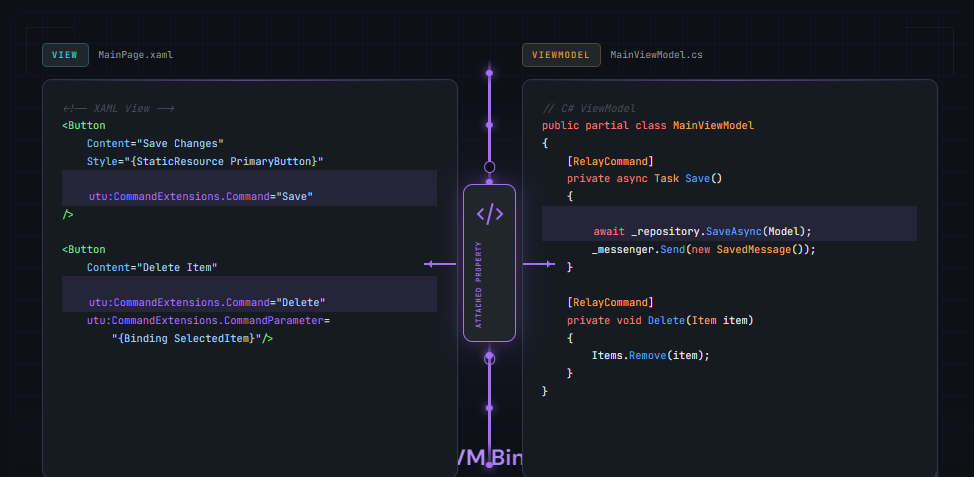
MVVM Pattern
The Model-View-ViewModel pattern separates concerns:
public class MainViewModel : INotifyPropertyChanged
{
    private string _userName;

    public string UserName
    {
        get => _userName;
        set
        {
            _userName = value;
            PropertyChanged?.Invoke(this, new PropertyChangedEventArgs(nameof(UserName)));
        }
    }

    public ICommand SaveCommand { get; }

    public event PropertyChangedEventHandler PropertyChanged;
}
MVUX - Modern Reactive Pattern
The MVUX documentation describes MVUX (Model, View, Update, eXtended) as a modern alternative to MVVM with immutable data flow and built-in async support:
public partial record MainModel
{
    public IFeed<UserProfile> Profile => Feed.Async(async ct =>
        await _userService.GetProfileAsync(ct));

    public IState<string> SearchQuery => State.Value(this, () => string.Empty);
}
MVUX automatically generates ViewModels that support data binding while maintaining immutability principles. Feeds provide loading states, error handling, and refresh capabilities out of the box.
Design Tooling
Modern XAML development goes beyond text editors. Uno Platform provides industry-leading tools for UI design.
Hot Design - Runtime Visual Designer
Hot Design transforms your live, running app into a real-time visual designer that works with any IDE on any OS. This runtime approach means you design with actual data, actual styling, and actual behavior.
Key capabilities:
- Live editing without rebuild
- Cross-IDE and cross-OS support
- Real-time XAML synchronization
- Actual data integration
Hot Reload
Hot Reload enables XAML changes without restarting your application:
- Preserves application state
- Instant visual feedback
- Works across all target platforms
C# Markup Workflow
For developers who prefer code over markup, C# Markup provides:
- IntelliSense for all properties
- Compile-time validation
- Refactoring support
- Same capabilities as XAML
XAML UI Design Best Practices
- XAML provides declarative UI definition with WinUI 3 syntax supported by Uno Platform
- Choose Grid for complex layouts, StackPanel for simple stacking, AutoLayout for Figma compatibility
- ResponsiveExtension simplifies adaptive design with five logical breakpoints
- Lightweight styling enables customization without redefining entire styles
- MVUX offers a modern reactive alternative to traditional MVVM
- Hot Design provides runtime visual editing across all platforms and IDEs
Conclusion
XAML UI design with Uno Platform combines the proven power of WinUI XAML with true cross-platform reach. Whether you’re building for Windows, iOS, Android, macOS, Linux, or WebAssembly, the techniques covered in this guide apply across all targets.
The key to successful XAML UI design lies in understanding your layout options, embracing responsive design from the start, leveraging lightweight styling for maintainable theming, and connecting your UI to data with appropriate patterns.
Ready to put these concepts into practice? Start with the Uno Platform Getting Started guide and explore Hot Design for a visual approach to XAML UI design.
 Subscribe to Our Blog
 Subscribe via RSS
 Back to Top