
Modern .NET with Uno Platform & AI
🕓 9 MINThis post is a part of 2025 C# Advent Calendar – a month long showcase of .NET developer goodness. Uno Platform is the most flexible
🕓 9 MINThis post is a part of 2025 C# Advent Calendar – a month long showcase of .NET developer goodness. Uno Platform is the most flexible
🕓 3 MINPartnership Announcement A major multi-year agreement that deepens our long-standing partnership and expands Kahua’s investment in the future of cross-platform .NET development. We are pleased
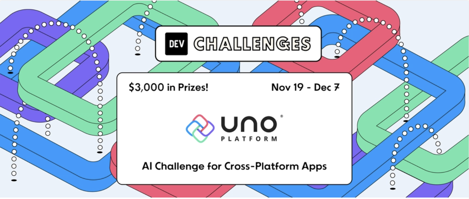
🕓 3 MINThis one’s for the builders who’ve been itching to put AI and cross-platform .NET to work on something real. We’re teaming up with DEV to
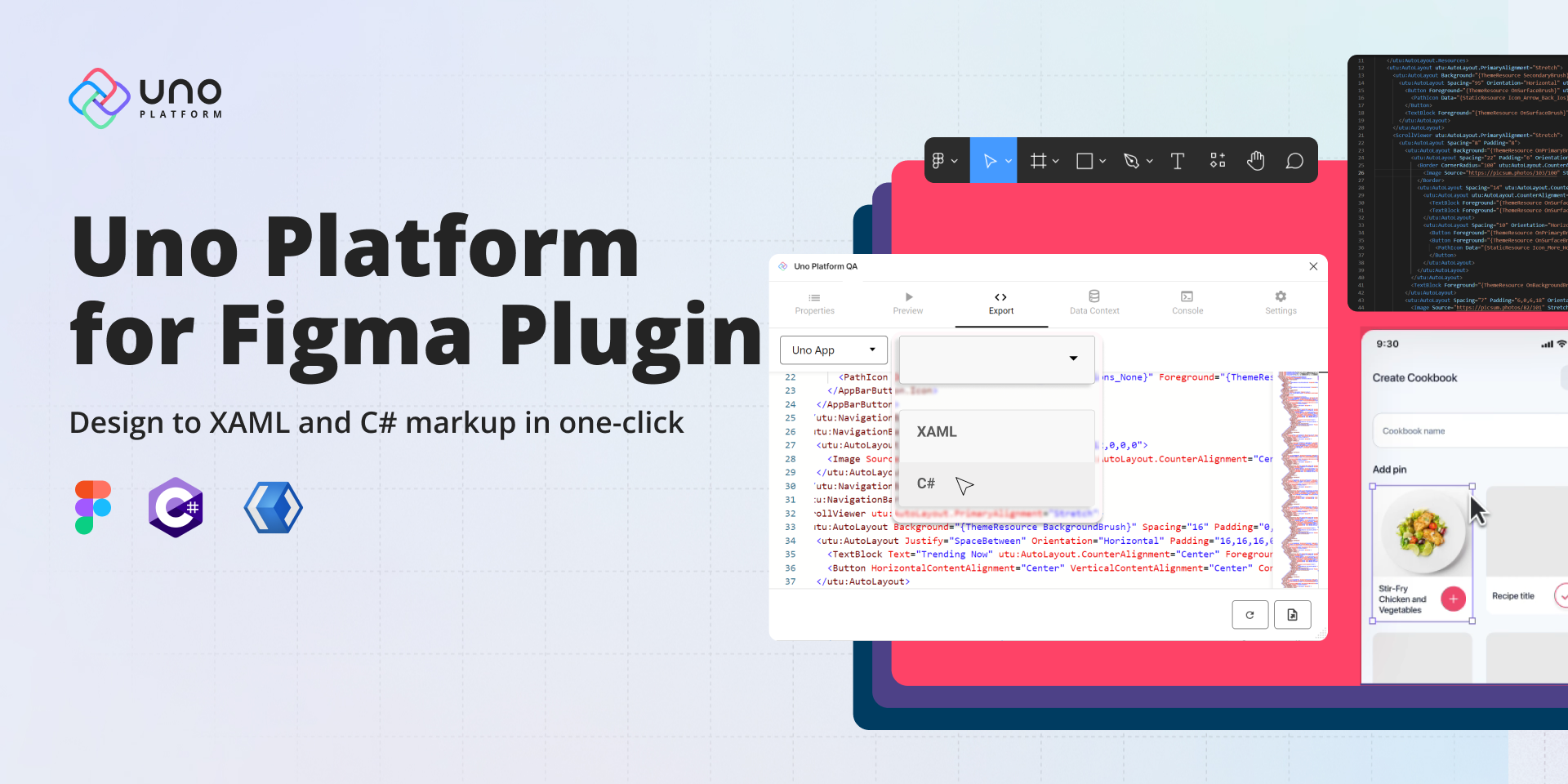
🕓 6 MINTwo years ago, we introduced the first preview of our Uno Platform for Figma plugin. After 8 subsequent previews, nearly 10,000 plugin downloads, and months

🕓 3 MINIn the spirit of the holidays, we are happy to gift a minor update to our Uno Figma plugin. To continue giving you greater flexibility

🕓 10 MINToday’s release is a significant step towards creating the most productive platform for building single codebase .NET applications that run on mobile, desktop, and web.

🕓 5 MINWe are thrilled to showcase the latest features of Preview 6 of our Figma plugin. One of the most significant additions is the View Hierarchy,

🕓 8 MINIf you want to streamline your workflow, improving the design-to-code process can help you focus on the code behind and get you to production quicker

🕓 5 MINWe’re happy to announce the release of Preview 5 of Uno Platform’s Figma plugin. Our latest version of the plugin offers enhanced features to benefit