
Building a Fibonacci Sphere Visualizer with AI in the Loop
🕓 5 MINHow we used MCPs, prompts, and agentic workflows to go from concept to cross-platform 3D visualization in hours, not days. Start with a sentence. End
🕓 5 MINHow we used MCPs, prompts, and agentic workflows to go from concept to cross-platform 3D visualization in hours, not days. Start with a sentence. End
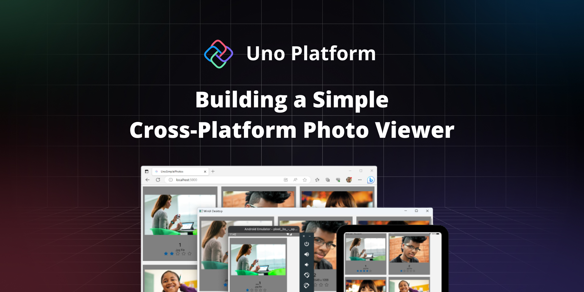
🕓 3 MIN If you’ve created a simple photo viewer app using WinUI 3 and want to reach more users without rewriting your app, this new tutorial

🕓 3 MINMicrosoft Docs recently received a valuable addition from our own Nick Randolph—a step-by-step tutorial that demonstrates the creation of a cloud-based backend service for an

🕓 4 MINIn this blog, we delve into the fascinating realm of AI and embedding ChatGPT APIs into .NET applications. We start by laying the foundation with
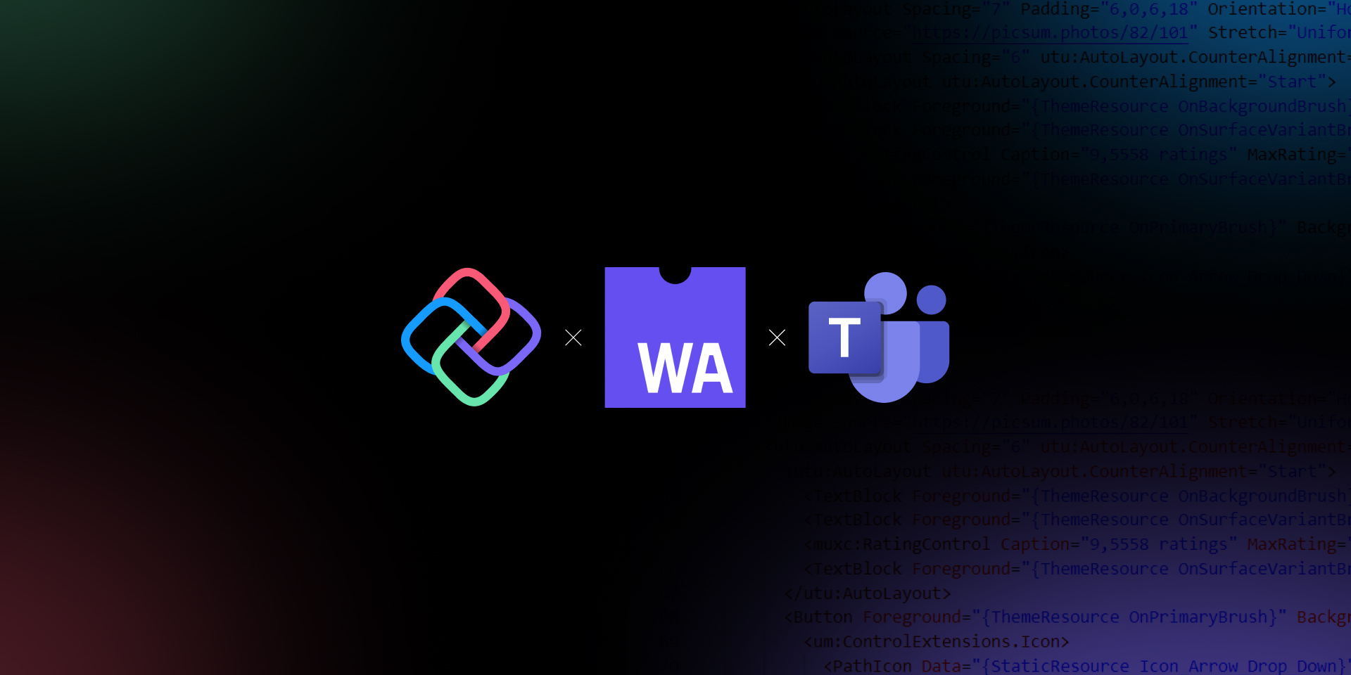
🕓 5 MINIn this blog, we’ll explore how Uno Platform and WebAssembly make it possible to develop apps for Microsoft Teams using C# and XAML. And how

🕓 7 MINFigma is notably regarded as a design tool. However, it is also easy for developers to learn and use, even with limited design experience. Furthermore,

🕓 4 MINNick Randolph’s earlier post in this blog series covered the basics of sorting and grouping. The CollectionViewSource provides a wrapper around a data source that can

🕓 6 MINIn this tutorial, we’ll build a completely functional Profile Page using Figma and Uno Platform for Figma plugin to generate responsive XAML code that can

🕓 4 MINWinUI contains classes for menus belonging to a Window and context menus attached to other controls. Users will be familiar with menus in traditional desktop