
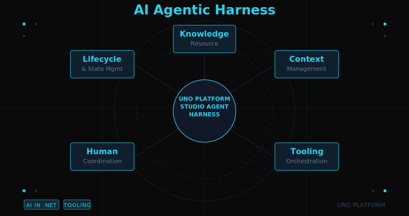
🕓 5 MINAn exploration of the benefits of AI Agentic Harness and how the Uno Platform Studio Agent Harness helps build cross-platform .NET apps.
🕓 6 MINAI-native productivity platform for enterprise .NET applications, launching at Microsoft Build
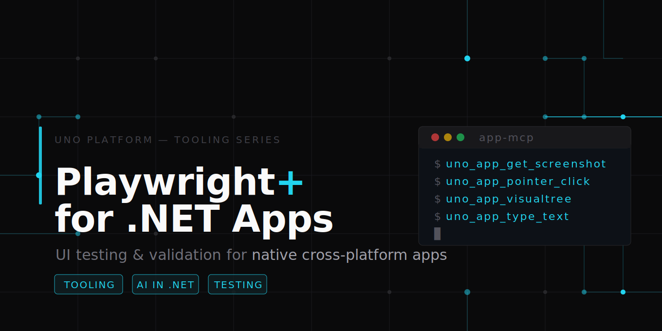
🕓 4 MINUno Platform MCP Servers/Tools bring Playwright-style UI testing automation to native .NET apps