
XAML UI components are the building blocks for creating user interfaces in WinUI and Uno Platform applications. These components include layout panels like Grid and StackPanel for arranging content, plus interactive controls like Button and TextBox for user input. With Uno Platform, these same components work across Windows, iOS, Android, macOS, Linux, and WebAssembly from a single codebase.
Key Takeaways:
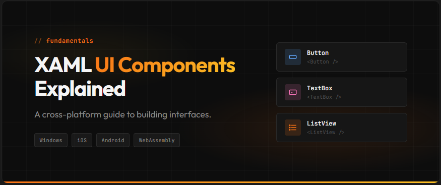
- XAML UI components consist of layout panels (Grid, StackPanel, RelativePanel, Canvas) and interactive controls (Button, TextBox, ListView)
- Layout panels control how child elements are arranged and sized within the UI
- The same XAML controls work across Windows, iOS, Android, macOS, Linux, and WebAssembly with Uno Platform
- Grid is best for complex layouts; StackPanel excels at simple linear arrangements
- Avoiding common pitfalls like nested panels and Canvas overuse improves app performance
Who this is for: .NET developers building cross-platform applications who need to understand XAML UI components for layout and user interaction.
What Are XAML UI Components?
According to the Uno Platform XAML documentation, “XAML is an XML based UI definition declarative language, and Uno Platform uses the WinUI 3 flavor. Elements such as Grid, StackPanel and TextBlock can be used to define your user interface.”
A reusable element in a XAML-based application that either displays content (like TextBlock), accepts user input (like Button), or arranges other elements (like Grid).
XAML UI components fall into two main categories: layout panels and controls. Layout panels determine how elements are positioned and sized on screen. Controls handle specific functions like displaying text, accepting input, or showing data collections.
The WinUI controls documentation confirms that Uno Platform provides support for a large number of WinUI controls, panels, and visual primitives. This means your XAML knowledge transfers directly to cross-platform development.
Here is a basic example showing a Button inside a StackPanel:
<StackPanel Padding="20">
    <TextBlock Text="Welcome to my app" FontSize="24" />
    <Button Content="Click Me" Margin="0,10,0,0" />
</StackPanel>
XAML UI components form the foundation of your application’s visual layer, whether you target a single platform or deploy everywhere.
Understanding Layout Panels
The Microsoft Learn documentation defines layout panels as “containers that allow you to arrange and group UI elements in your app. The built-in XAML layout panels include RelativePanel, StackPanel, Grid, VariableSizedWrapGrid, and Canvas.”
Grid
Grid is the most versatile layout panel, supporting multiple rows and columns with flexible sizing options. You can use Auto sizing (fits content), fixed pixel values, or star sizing (*) for proportional distribution.
<Grid>
    <Grid.RowDefinitions>
        <RowDefinition Height="Auto" />
        <RowDefinition Height="*" />
    </Grid.RowDefinitions>
    <Grid.ColumnDefinitions>
        <ColumnDefinition Width="200" />
        <ColumnDefinition Width="*" />
    </Grid.ColumnDefinitions>

    <TextBlock Text="Header" Grid.ColumnSpan="2" />
    <TextBlock Text="Sidebar" Grid.Row="1" />
    <TextBlock Text="Content" Grid.Row="1" Grid.Column="1" />
</Grid>
StackPanel
StackPanel arranges child elements in a single line, either vertically (default) or horizontally. As explained in the official Microsoft documentation, “StackPanel is a layout panel that arranges child elements into a single line that can be oriented horizontally or vertically.”
<StackPanel Orientation="Vertical" Spacing="8">
    <Button Content="First" />
    <Button Content="Second" />
    <Button Content="Third" />
</StackPanel>
RelativePanel
RelativePanel positions elements relative to each other or the panel edges. This panel excels in adaptive layouts where elements need to reposition based on available space.
Canvas
Canvas provides absolute positioning using coordinates. While useful for drawing applications or game overlays, it does not adapt to window resizing.
Layout Panel Comparison:
| Panel | Best For | Key Property |
|---|---|---|
| Grid | Complex multi-row/column layouts | RowDefinitions, ColumnDefinitions |
| StackPanel | Simple linear lists | Orientation (Vertical/Horizontal) |
| RelativePanel | Adaptive layouts | AlignTopWith, RightOf, Below |
| Canvas | Fixed positioning (games, drawing) | Canvas.Left, Canvas.Top |
Essential Control Categories
According to Microsoft Learn, the Windows UI framework provides 45+ controls as part of the Fluent Design System, designed to create bold, scalable UIs that work across devices and screen sizes.
Input Controls:
Display Controls:
- TextBlock, RichTextBlock
- Image, Shapes
- ProgressBar, ProgressRing
Navigation Controls:
- NavigationView
- Pivot, TabView
- BreadcrumbBar, MenuBar
Data Controls:
- ListView, GridView
- TreeView
- ItemsRepeater
Each of these controls works consistently across all platforms supported by Uno Platform.
Choosing the Right Layout Panel
While official documentation covers individual panel features, it does not provide direct guidance on which panel to choose for specific scenarios. Based on practical usage patterns and community experience, here is a decision framework:
| Scenario | Recommended Panel | Why |
|---|---|---|
| Form with labels and inputs | Grid | Precise column alignment for labels and fields |
| Vertical list of buttons or items | StackPanel | Simple linear arrangement with consistent spacing |
| UI that adapts to screen size | RelativePanel | Elements reposition relative to each other |
| Drawing app or game overlay | Canvas | Precise pixel positioning required |
| Gallery or tile layout | VariableSizedWrapGrid | Auto-wrapping grid with variable sizes |
Start with Grid as your page root, then use StackPanel for smaller sections within Grid cells. This approach keeps your layout hierarchy flat while maintaining flexibility.
Common Pitfalls to Avoid
While the official documentation recommends using Canvas “with discretion,” several other common mistakes can impact your application’s layout behavior and performance.
1. Using Canvas for responsive layouts
Canvas uses fixed positioning and does not adapt to window resizing. Your UI elements stay at their specified coordinates regardless of screen size.
Fix: Use Grid or RelativePanel with adaptive properties instead. Reserve Canvas for drawing applications or fixed overlays.
2. Deeply nested layout panels
Each nested panel adds layout computation overhead. A StackPanel inside a StackPanel inside a Grid creates unnecessary complexity.
Fix: Flatten your hierarchy by using Grid with multiple rows and columns instead of nested StackPanels.
3. Forgetting size constraints on Canvas children
Canvas children require explicit Width and Height values. Without them, elements may not render as expected.
Fix: Always set dimensions on Canvas children, or use layout panels that handle sizing automatically.
4. Hardcoding pixel values in Grid
Fixed pixel widths prevent responsive behavior and break layouts on different screen sizes.
Fix: Use star sizing (*) for proportional layouts and Auto for content-based sizing. Reserve fixed pixels for specific design requirements only.
Frequently Asked Questions
Next Steps
XAML UI components provide the foundation for building cross-platform .NET applications. Understanding layout panels and choosing the right controls ensures your UI works well across all target platforms.
For detailed control documentation and implementation specifics, explore the Uno Platform documentation. When you are ready to start building, the official templates include examples of common layout patterns.
 Subscribe to Our Blog
 Subscribe via RSS
 Back to Top