Uno Platform 6.7 extends where your .NET applications can run while strengthening how their UI is styled, rendered, and experienced across platforms. The release expands our Android support into new device categories while making cross-platform UI more consistent without hiding the capabilities of the underlying platform.
What's new
- Android form factors. Opt into Android TV, Android Auto, or Wear OS from your existing Android project.
- Semantic styles. Use the same style aliases across Material and Simple without rewriting style references each time you switch themes.
- Damage regions. Skia renderers repaint only the regions of the screen that changed.
- Text scaling. Apps follow system text-size settings on Windows, Android, iOS, macOS, and Linux.
New to Uno Platform? Open Uno Platform Studio in your browser and describe the app you want to build. Studio scaffolds a working cross-platform .NET application you can run before installing anything locally.
Android TV, Android Auto, and Wear OS
TVs, cars, and watches need more than a different screen size. Each has its own launcher behavior, input model, and Android configuration. Uno Platform 6.7 makes those platform-specific configurations available through opt-in UnoFeatures on the existing Android head.
Select a form factor in the project wizard or add its UnoFeature to an existing project. Uno Platform configures the required AndroidX libraries, manifest entries, intent filters, and resources. You still provide the form-factor-specific UI and behavior described below.
| Form factor | What Uno Platform configures | What you still do |
|---|---|---|
Android TVAndroidTV | Xamarin.AndroidX.Leanback, leanback launcher intent filter, banner asset, and focus highlight override | Enable remote navigation on your pages by setting XYFocusKeyboardNavigation to Enabled. |
Android AutoAndroidAuto | Xamarin.AndroidX.Car.App.App, automotive_app_desc.xml, and manifest metadata | Implement a CarAppService, its Session, and a root Screen using the AndroidX Car App Library. |
Wear OSAndroidWear | Xamarin.AndroidX.Wear, Xamarin.AndroidX.Wear.Tiles, a watch uses-feature declaration, and minimum SDK 26 | Build the watch-specific UI, plus Tiles if your app uses them. |
The Android TV and Android Auto opt-ins produce a single APK for mobile and the selected form factor, while production Wear OS apps are usually shipped as a separate watch-only app. See the Android TV, Android Auto, and Wear OS docs for setup requirements and how to create a separate app targeting only that form factor.
Semantic styles: one set of keys, either theme
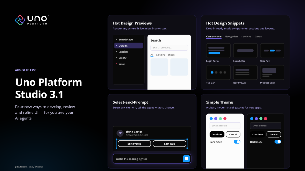
Studio 3.1 introduced Simple as the default design system. Uno Platform 6.7 supplies the framework layer that lets the same style references work across Simple and Material.
Semantic styles separate a control's intent from its theme-specific appearance. Instead of MaterialFilledButtonStyle, reference FilledButtonStyle. The active theme maps that alias to its own style at runtime.
For an existing Material app, adopting semantic styles is largely a rename: replace each supported theme-prefixed key with its unprefixed alias. Once those aliases are in place, switching between Material and Simple no longer requires changing the references again.
<!-- Resolves to MaterialFilledButtonStyle or
     SimpleFilledButtonStyle, depending on the active theme. -->
<Button Style="{StaticResource FilledButtonStyle}"
        Content="Save" />
The aliases cover common controls across both themes, including buttons, dialogs, pickers, lists, and flyouts. Typography follows the same model: semantic keys from DisplayLarge to CaptionSmall resolve under both Material and Simple.
Lightweight styling overrides continue to work across both themes because their templates read the same unprefixed resource keys. A FilledButtonForeground override written for Material, for example, also applies under Simple.
The semantic styles documentation includes the full alias table.
The theming foundation also gains four supporting updates:
- Design tokens. Set spacing, shape, and density centrally.
- Seed-color generation. Give the theme a single seed color to derive full light and dark palettes.
- Inter. Simple ships with Inter as its default font.
- Static control styles. Material and Simple gain static control styles in Uno.Toolkit.UI, reducing the runtime cost of resolving a control's style without requiring application changes.
Enable Simple in an existing project with the SimpleTheme UnoFeature, or start a new project with:
dotnet new unoapp -theme simpleSee the Simple Theme documentation for setup and the Figma Community file for the design system.
Rendering
Rendering updates reduce work in the default pipeline and expand the APIs available to apps that render or inspect content themselves.
Damage regions on every Skia renderer
Skia renderers now repaint only the regions that changed on Win32, X11, macOS, Android, iOS, and WebAssembly. A blinking caret, a spinner, or an updated list row no longer requires repainting the entire surface.
There's nothing to enable or configure.
Dedicated render thread on Win32
On Win32, frames are now drawn on a dedicated render thread paced by the display's VSync, where they were previously drawn on the UI thread behind a timer. Frame drawing is separated from UI-thread work such as layout and pointer input.
GPU-accelerated RenderTargetBitmap
RenderTargetBitmap now renders on the GPU without changing the API. Call RenderAsync(element) on a live element and read the pixels as before. Workloads such as thumbnail generation, share sheets, image export, and screenshot-based UI tests can benefit while using the same API.
GLCanvasElement on WebAssembly
GLCanvasElement provides an OpenGL surface inside the XAML tree for 3D viewports, custom visualizations, or existing rendering engines.
In 6.7, it also runs in the browser through an offscreen WebGL 2.0 context with a WebGL 1.0 fallback. A rendering path shared across the supported desktop targets can now run in WebAssembly from the same source.
| Target | Graphics API |
|---|---|
| Windows, Linux, WinAppSDK | OpenGL 3.0+ |
| macOS and iOS | OpenGL ES 3.0 through ANGLE |
| WebAssembly | WebGL 2.0, with a WebGL 1.0 fallback |
| Android | OpenGL 3.0+ |
Enable it with the GLCanvas UnoFeature. The API surface comes from Silk.NET. See the GLCanvasElement reference for runnable samples and details.
Accessibility
Text scaling from the operating system
Your app now follows the operating system's text-size setting on supported platforms. That includes Windows display settings, Android font settings, and the iOS Dynamic Type slider. On Android, iOS, macOS, and Linux, your app updates without restarting; on Windows, the setting is applied when the app starts.
Scaling follows the same logarithmic curve as WinUI: smaller text grows proportionally more than larger text, keeping headings and body copy balanced as the scale increases.
Uno Platform 6.6 introduced screen-reader support on Skia targets; 6.7 extends that accessibility work with system-aware text scaling. System text scaling helps apps meet WCAG 1.4.4 (Resize Text), and compliance still depends on the rest of your app.
| Platform | Text scale source |
|---|---|
| Windows | Accessibility text scale setting |
| Android | System font size |
| iOS | Dynamic Type |
| Linux | GNOME text scaling factor |
| macOS | Accessibility Text Size setting (macOS 14 and later) |
Check fixed-height layouts. Rows, toolbars, and cards with an explicit Height are the first places to check for clipped text at larger sizes.
Where explicit scaling controls are needed, set IsTextScaleFactorEnabled="False" on an element to opt that element and its subtree out of text scaling. At the application level, FeatureConfiguration.Font.MaximumTextScaleFactor caps the maximum scale, while IgnoreTextScaleFactor disables it entirely. The accessibility documentation covers these options.
WebAssembly screen readers
For canvas-rendered WebAssembly apps, the visual output alone does not expose the controls to a screen reader. In 6.7, automation peers project an ARIA semantic DOM alongside the canvas, giving browser screen readers and accessibility auditing tools access to the app's buttons, lists, and headings, including their names and states.
This work was contributed by jbourque-kahua at Kahua for their Uno Platform WebAssembly application.
Win32 automation patterns
Win32 now exposes UI Automation control pattern providers and a wider set of automation peers for buttons, combo boxes, date pickers, flyouts, hyperlinks, list and grid view items, media transport controls, and the title bar.
This gives UI test frameworks and agents more controls they can discover and interact with through the same UI Automation API exposed by WinUI applications.
WinUI coverage
Uno Platform 6.7 closes more gaps with WinUI, from animated controls and native window materials to zoom, collection transitions, and touch selection.
AnimatedIcon and AnimatedVisualPlayer
AnimatedIcon plays short animations as a control moves between states such as pointer over, pressed, and selected. Set its State directly, or let a control such as NavigationViewItem set it for you. Lottie animations compiled with LottieGen can use the same state transitions across Uno Platform targets.
The stock WinUI animated visual sources are included, so common icons such as back, accept, settings, and global navigation work without authoring animations. FallbackIconSource provides a fallback where animation is unavailable. When a user disables system animations, the icon holds the transition's final frame instead.
SystemBackdrop on Win32
Win32 apps running on Windows 11 (build 22621 or later) can now use MicaBackdrop and DesktopAcrylicBackdrop, joining the macOS backdrop support introduced in 6.6. The same desktop application can use native window materials on both Windows and macOS.
The API is the same as WinUI:
window.SystemBackdrop = new MicaBackdrop();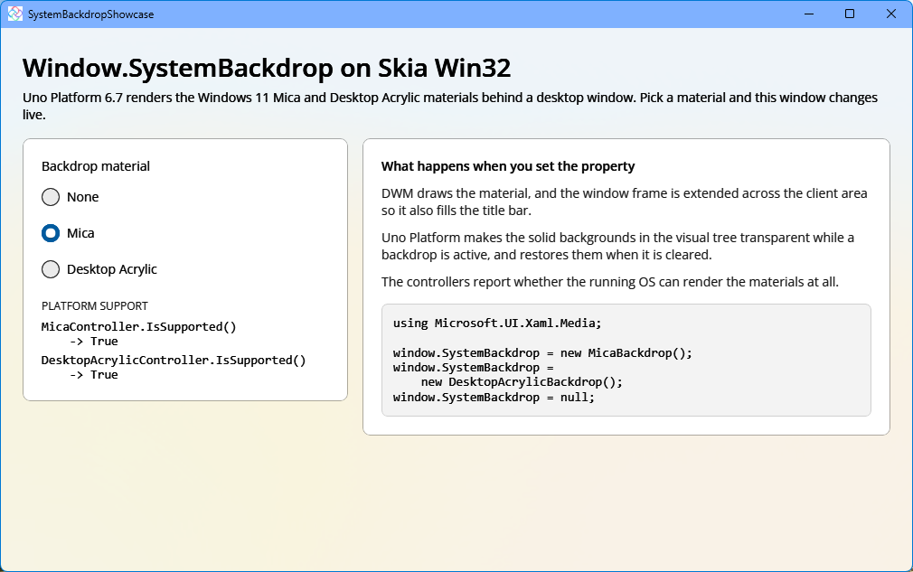
The remaining control updates are summarized below.
| Control | What's new | Developer impact |
|---|---|---|
| NavigationView | Updated to the latest WinUI sources | Advanced scenarios are now fully supported, and display mode behavior matches WinUI more closely. The hamburger button is now animated. |
| ScrollViewer | Zoom on Skia targets | Use ZoomMode and ZoomFactor to make content zoomable. |
| ItemsRepeater | Collection transitions through ItemCollectionTransitionProvider and ItemCollectionTransition | Animate items as the bound collection adds, removes, or reorders them. |
| Hyperlink | Hand cursor and UnderlineStyle | Control the underline without restyling the element, including UnderlineStyle="None". |
| TextBlock | Touch selection | Text is selectable on touch devices. |
| ListView | Container reuse for Move operations | Reorder items without rebuilding their containers. |
More platform capabilities
- WebView2 with Native AOT on Windows. Windows applications using WebView2 can now publish with Native AOT.
- WebView2 single sign-on and browser arguments. On Windows desktop (Win32), WebView2 can sign in with the user's Windows account without prompting again, and pass additional launch arguments to the underlying browser. Both work with the regular and the Native AOT WebView2 backends.
- macOS. Drag and drop, including to and from other apps, and speech recognition are now available.
WebAssembly
The WebAssembly updates add tools for investigating execution time and memory use.
dotnet-trace now works with WebAssembly applications through Mono sample-point instrumentation, giving you trace data from a running app. Native memory profiling shows where WebAssembly memory is being consumed, so you can investigate out-of-memory problems directly instead of by elimination.
The release also adds WebWorker shell mode for running .NET code headless in a Web Worker, and fixes WebGL rendering corruption in apps configured to use more than 2 GB of memory.
SDK and developer experience
Uno Platform 6.7 also includes smaller improvements to day-to-day development.
- Faster Hot Reload startup.
- Packaged WinUI apps from the command line. Start packaged Windows apps with
dotnet runthrough the WinApp build tools. - Windows App SDK package control. Set
DisableImplicitUnoWinAppSdkPackageswhen your project needs to pin its own Windows App SDK package versions. - Attached properties under Native AOT. A trimming gap that could cause attached properties to silently stop applying under Native AOT has been fixed.
- Templates. Shell and ExtendedSplashScreen are now opt-in, and Android TV, Android Auto, and Wear OS are available as form-factor options.
- Solution-less projects. Base support is available for opening and building projects without a
.sln. A known VS Code issue remains with.slnxand solution-less projects.
Uno.Extensions
- Test MVUX models without loading the UI. The new MVUX test harness lets you exercise a model's feeds, states, and commands directly from a unit test, without loading the application UI.
- Navigation Hot Reload. Apply changes to navigation configuration while the app is running.
Breaking changes
Uno Platform 6.7 includes breaking changes across WPF targets, theming, Hot Reload, and UWP package support. Review the affected areas before upgrading.
| Change | Who or what is affected | Required action |
|---|---|---|
| WPF targets and WPF Islands are removed | Uno Platform applications using the removed WPF targets no longer build on 6.7. | Switch to the Win32 desktop head. |
| Custom app-theme axis removed | Applications defining theme axes beyond Light and Dark. | Move custom palettes into merged ResourceDictionaries and use RequestedTheme to switch between Light and Dark. |
IHotReloadHandler.SendAsync becomes OnHotReloadAsync and runs for every Hot Reload outcome | Custom IHotReloadHandler implementations. | Rename the method and update handlers that assumed they ran only after a successful Hot Reload. |
| UWP support removed from Uno.Themes and Uno.Toolkit.UI | UWP projects consuming either package. | Migrate to WinUI and Uno.Sdk, then follow the Uno.Themes v7 and Uno.Toolkit v9 upgrade guides. |
Getting 6.7
Before updating an existing project, review the breaking changes and migration guide.
Then update your IDE extension and the Uno.Sdk version in your SDK configuration, and rebuild:
{
  "msbuild-sdks": {
    "Uno.Sdk": "6.7.30"
  }
}
Thanks
Thank you to everyone who contributed to this release. Join the 6.7 community standup on Thurs Oct 1st 11 AM - 12 PM, and share what you're building on GitHub or Discord.