Hot Design Previews let you see and edit any Page, UserControl, Control, DataTemplate, or style in any data state, theme, or form factor – without navigating your running app to find it.
Every XAML/.NET developer knows the dance. Tweak a margin, run the app, sign in, tap through three screens, open the flyout – and squint. Not quite right? Do it all again.
That loop is the tax we pay for building UI inside a live app. The component we care about is buried behind navigation, authentication, and real data that never seems to be in the state we need. The empty list only shows up when the account is brand new. The error banner only appears when the network cooperates by failing.
What if you could pull any piece of your UI out onto its own stage and look at it directly? That is exactly what Previews in Uno Platform Studio's Hot Design do. Let's unpack ..
A Quick Frame: The Rehearsal Room
Think of your running app as opening night. Everything is live, the whole cast is on stage, and one flubbed line happens in front of everyone.
Previews are the rehearsal room. You can run a single scene, swap the props, try a different costume, change the lighting, or rehearse the scene where everything goes wrong – all without raising the curtain on the whole show. This picture maps well onto everything Previews do and how .NET developers benefit.
PS: Sound familiar to things you may have seen or heard across other non .NET ecosystems - like Storybook or Jetpack Compose? We didn't invent this idea - we just think .NET and XAML developers have gone without it for long enough. See how Previews stack up against other similar players.
What Are Previews?
Hot Design Previews allow you to visualize any component of your app, in any state, at design time – without having to navigate into your running app to see it in action.
A preview captures a Page, UserControl, Control, DataTemplate, or styled variant in a specific data state. You can check how it looks and behaves, select elements inside it, and edit them exactly as you would on the application canvas.
And the best part is – you get a head start for free. Hot Design automatically creates an Implicit preview for your Pages, UserControls, and Controls, and surfaces your DataTemplates and styles in the Previews tree. Add a new page to your project and it shows up, ready to look at, without you writing a single line of code.
When Hot Design is active, a navigation bar on the left edge lets you flip between two modes:
- 🖥️ Application – design the live, running app
- 🎭 Previews – design components on their own, on the same canvas
Each mode remembers its own open editors, canvas size, zoom, and selection, so hopping back and forth never loses your place.
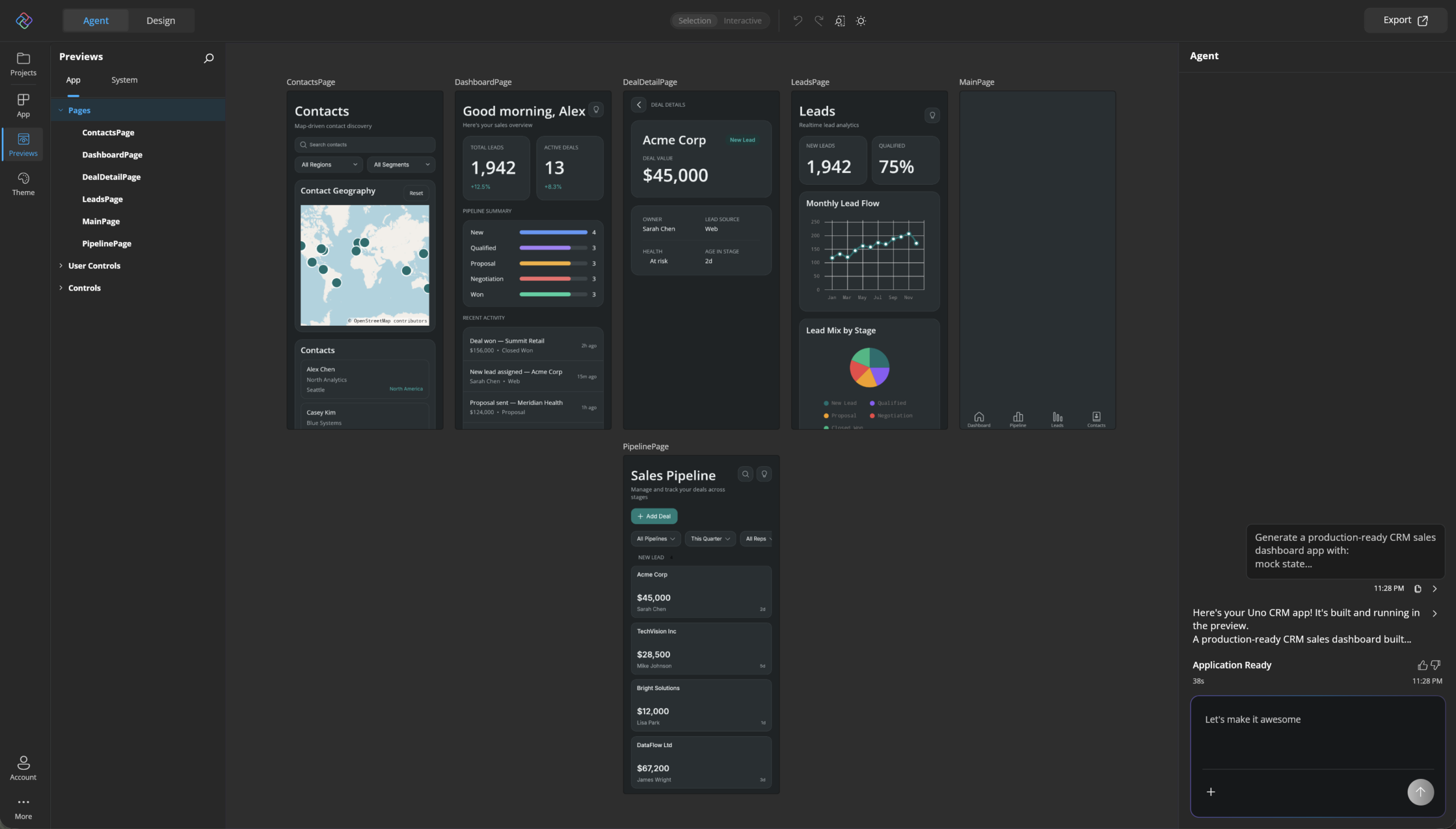
Inside Previews mode, the Previews panel splits into two tabs:
- App – previews from your own application and the projects in your solution, grouped into Pages, Data Templates, User Controls, and Controls
- System – read-only previews from the framework, installed themes like Material, and referenced third-party libraries
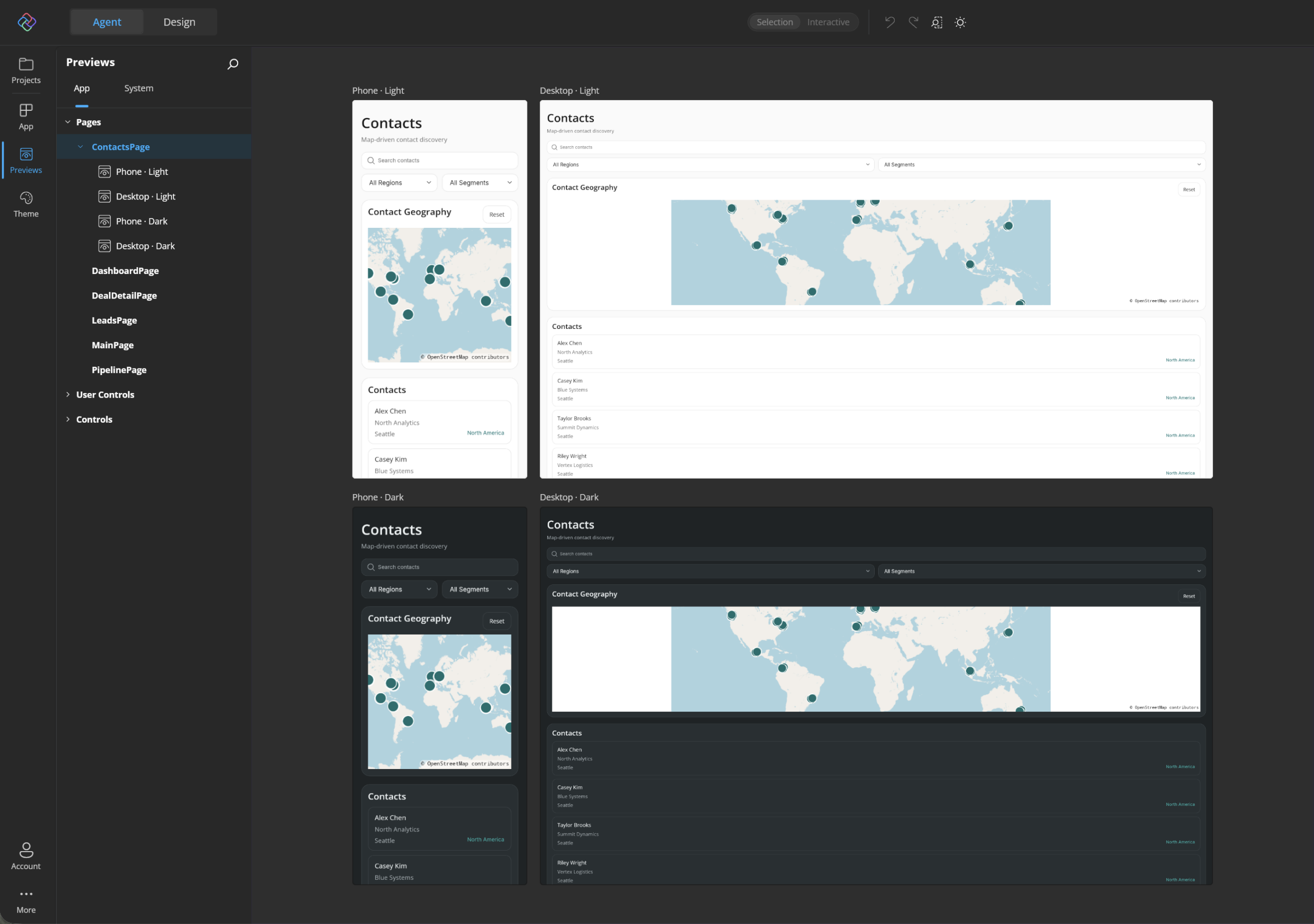
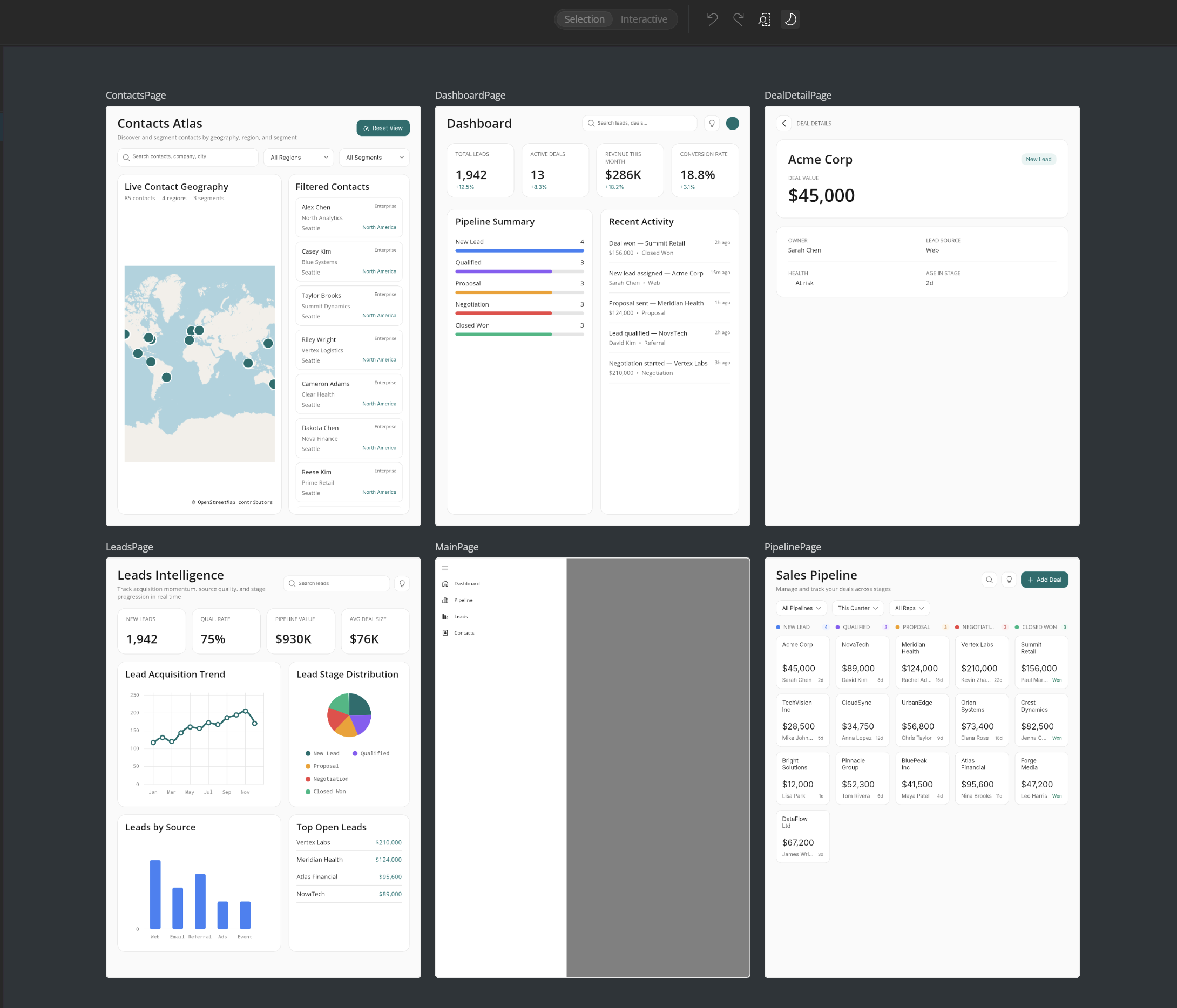
Select a category, type, or style and the canvas shows a summary – a live card for every child. Pages get device-shaped cards scaled to the current form factor, so you can scan every screen of your app at a glance - this is a great way to quickly visualize all pages together and foresee any broad styling/layout changes needed.
How to Create Previews
The Implicit previews are a great starting point – but the real power shows up when you author your own named previews. There are three ways in.
1. The Add button
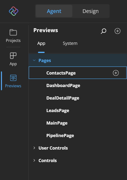
Hover over a type or style row in the Previews tree and an inline Add preview button appears. Click it and Hot Design creates a new explicit preview for that type (and style, if you are on a style row), then selects and opens it once Hot Reload completes. This works on System rows too. Want an editable take on the framework's default Button rendering? Hit Add on it and you get a copy that lives in your project. And of course, you can add Previews for any default pages in your app - simply use the + button.
2. Duplicate an existing preview
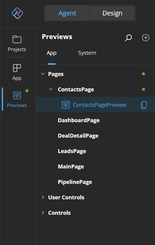
Already have a preview you like? Hover over it and click Duplicate preview. Hot Design copies the XAML verbatim – every attribute, every bit of authored content – into the same file, with an incremental name (Sample → Sample_1 → Sample_2).
This is the fastest way to build variations. One preview for the happy path, duplicate it, tweak it – done.
3. Write it in XAML
Previews are just XAML in your project, which means they travel with your code, show up in source control, and stay in step with the components they describe. They live in the Previews/ folder by default (configurable with the HotDesignPreviewsFolder MSBuild property).
Each hand-authored preview is a XAML file with <hd:Preview> as its root, plus a code-behind decorated with the [Preview] attribute:
<hd:Preview x:Class="MyApp.Previews.MyPagePreview"
            xmlns="http://schemas.microsoft.com/winfx/2006/xaml/presentation"
            xmlns:x="http://schemas.microsoft.com/winfx/2006/xaml"
            xmlns:local="using:MyApp.Views"
            xmlns:hd="using:Uno.UI.HotDesign">

    <local:MyPage />
</hd:Preview>
As soon as you author an Explicit preview for a type, the automatic Implicit for it steps aside – no duplicate clutter in the tree.
Made a mess? Adding and deleting previews go through the same pipeline as every other designer edit, so they land in your undo history as Adding preview 'X' and Deleting preview 'X'.
How to Inject Data into Previews
A page with no data is a stage with no props. It technically works – but it tells you very little about the real show.
DataBinding UI in Studio
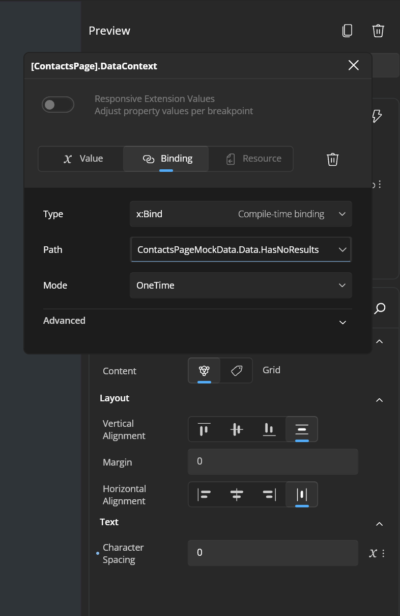
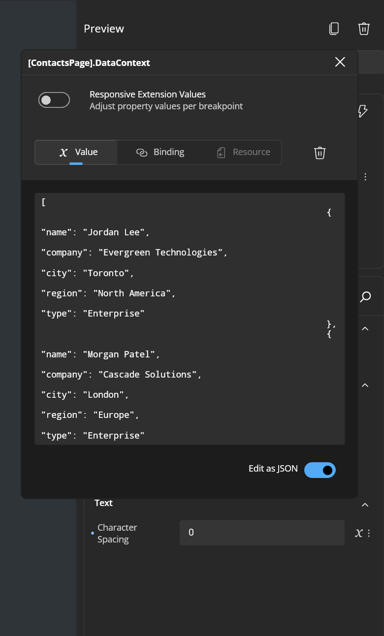
In Uno Platform Studio, you get two options to bind Previews to data:
- Binding to ViewModels – picking an existing view model type as the Preview's data context
- Binding to a JSON payload – bringing in custom JSON as data context
In code and XAML
For full control, override LoadDataContext() in your Preview's code-behind. Return a primitive for a simple {Binding}, or a fully populated view model for a page:
[Preview("With Mock Data", typeof(MyPage))]
public sealed partial class MyPageMockPreview : Preview
{
    public MyPageMockPreview() => this.InitializeComponent();

    protected override object? LoadDataContext()
        => new MyPageViewModel
        {
            Title = "Preview – Mock Title",
            Items = ["Item A", "Item B", "Item C"],
        };
}
DataTemplates get the same treatment. Pass dataTemplateKey to the [Preview] attribute, set ContentTemplate on a ContentControl in the XAML, and return the template's item from LoadDataContext():
<hd:Preview x:Class="MyApp.Previews.ProductCardPreview"
            xmlns="http://schemas.microsoft.com/winfx/2006/xaml/presentation"
            xmlns:x="http://schemas.microsoft.com/winfx/2006/xaml"
            xmlns:hd="using:Uno.UI.HotDesign">

    <ContentControl ContentTemplate="{StaticResource ProductCardTemplate}" />
</hd:Preview>[Preview("Product Card", typeof(ContentControl), dataTemplateKey: "ProductCardTemplate")]
public sealed partial class ProductCardPreview : Preview
{
public ProductCardPreview() => this.InitializeComponent();
protected override object? LoadDataContext()
=> new Product { Name = "Espresso Machine", Price = 249.99m };
}The Preview then appears directly under Data Templates in the tree.
How to Style Previews
Same scene, different costume. You define a preview with a given style the same way you'd set a Style on a Control.
In the UI
On the System tab, find a control's style – say a Material button variant – and click Add preview. You get an editable preview pinned to that exact style, grouped under the style's name in the tree.
In XAML
Pass styleKey to the [Preview] attribute and apply the same style in the XAML:
<hd:Preview x:Class="MyApp.Previews.PrimaryButtonPreview"
            xmlns="http://schemas.microsoft.com/winfx/2006/xaml/presentation"
            xmlns:x="http://schemas.microsoft.com/winfx/2006/xaml"
            xmlns:hd="using:Uno.UI.HotDesign">

    <Button Content="Get Started"
            Style="{StaticResource PrimaryButtonStyle}" />
</hd:Preview>[Preview("Primary Button", typeof(Button), styleKey: "PrimaryButtonStyle")]
public sealed partial class PrimaryButtonPreview : Preview
{
public PrimaryButtonPreview() => this.InitializeComponent();
}In the tree, Previews with no named style gather under an Implicit Style node, and every named style gets its own group – so a design system's full range of button variants sits side by side in one summary.
Previews Across Device Form Factors
A scene has to work in the intimate black-box theater and the thousand-seat hall. Your app UI has to work on a phone and a 4K desktop monitor.
In the UI
Page Previews open at the current app size, with auto-fit on. Open the Form factor and Zoom flyout and switch devices – the preview re-lays-out live. Do it from a Pages summary and every device-shaped card re-lays-out and re-crops at once, so you can see all your pages on a phone in one glance.
Controls, UserControls, and DataTemplates render at their natural size by default, centered at 100% zoom, so you judge the component itself rather than the space around it.
In XAML
Need a preview pinned to a specific size? Set Width or Height on the <hd:Preview> element (or its root child) and the canvas respects it. Each dimension resolves independently – declare only a width and the height follows the default rule.
<hd:Preview x:Class="MyApp.Previews.SidebarPreview"
            Width="320"
            ...>
    <local:Sidebar />
</hd:Preview>Previews Across App/Device Themes
Same scene, different lighting. Light mode and dark mode are where so many 'it looked fine on my machine' bugs hide – a hard-coded color here, a missing theme resource there.
In the UI
Inside Uno Platform Studio, simply look up - there is a theme switcher up top that will show Previews across light and dark modes.
In XAML
Simply set RequestedTheme="Light"/RequestedTheme="Dark" on <hd:Preview> (or its root child) - Previews honor the theme.
Previews Across Page States
This is the scene the understudy rehearses at midnight – the one where everything goes wrong.
Modern apps live in many states. A page might show a list of things most of the time, but it also needs to handle an empty list, a loading state, and an error. In a running app, reproducing each of those means faking a new account, throttling the network, or temporarily breaking your own backend. 😅
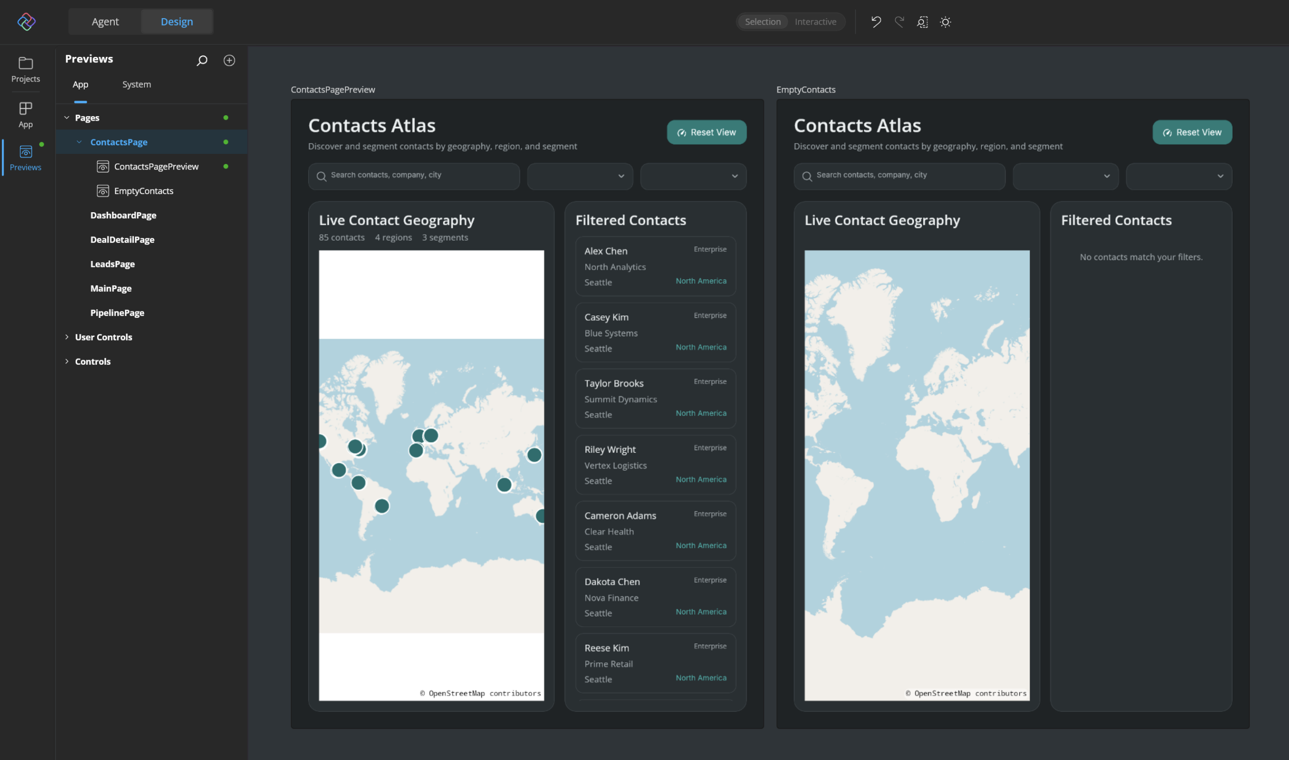
With Previews, each state is simply another Preview bound to a different ViewModel. Duplicate your happy-path preview, swap the data context, and you have a new scene:
[Preview("Empty State", typeof(OrdersPage))]
public sealed partial class OrdersEmptyPreview : Preview
{
    public OrdersEmptyPreview() => this.InitializeComponent();

    protected override object? LoadDataContext()
        => new OrdersViewModel { Orders = [] };
}

[Preview("Error State", typeof(OrdersPage))]
public sealed partial class OrdersErrorPreview : Preview
{
    public OrdersErrorPreview() => this.InitializeComponent();

    protected override object? LoadDataContext()
        => new OrdersViewModel
        {
            Orders = [],
            ErrorMessage = "We couldn't load your orders. Check your connection and try again.",
        };
}
Select OrdersPage in the tree and the summary shows every state side by side. Spot a problem in the error state? Hit Edit and your changes are written straight back to the page's own XAML – not to the Preview – and flow into the running app.
If you have ViewModels that support specific states for any UI, Uno Platform Studio can load them up and offer visual way to databind Previews - simply set Data Context in UI and see your Preview rendered across states.
Good to Know
A few honest notes from the trenches:
- System previews are read-only. They show you the framework or theme rendering. Use Add Preview to create an editable copy.
- Previews mode needs the tools in-app. Moving the tool panels to the external tool window switches you back to Application mode.
- Previews with an x:Name can't be duplicated yet. Hot Design tells you and writes nothing, rather than creating a file with duplicate names.
- Hot Reload keeps you in place. Updated Previews get an indicator that bubbles up the tree, and your scroll position, expansion, selection, and search filter all survive the reload.
- Check your SDK. If the build emits warning HDSG002, update your Uno.Sdk version to use Previews.
Curtain Call
Rehearse every scene, in every costume, under every light, on every stage – and only raise the curtain when it's ready. That is what Previews bring to your inner developer loop.
Pull up Hot Design, flip to Previews, and start with the state you've been avoiding. We can't wait to see what you build. Cheers developers!