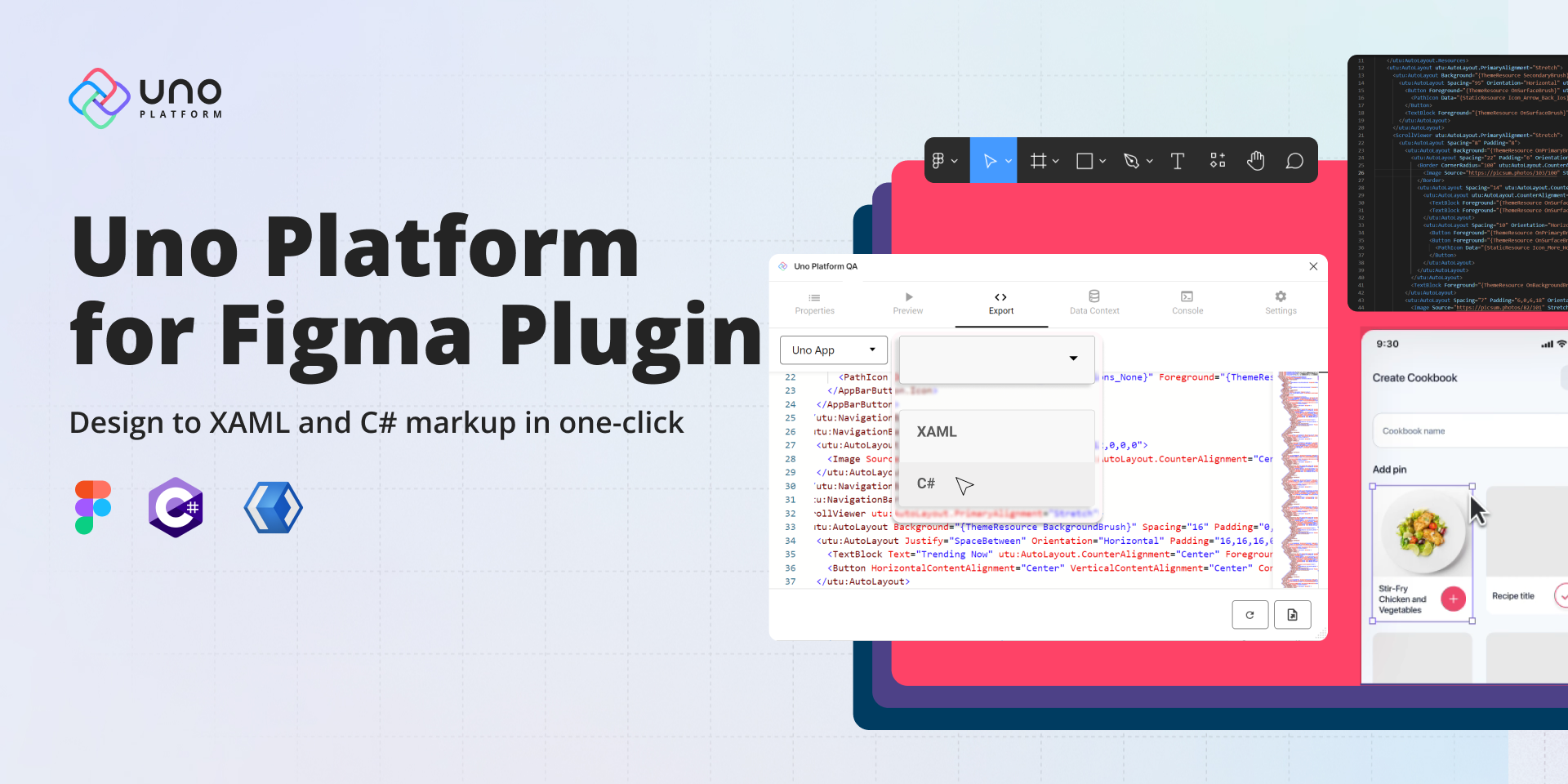
Uno Platform for Figma plugin RTM!
🕓 6 MIN Two years ago, we introduced the first preview of our Uno Platform for Figma plugin. After 8 subsequent previews, nearly 10,000 plugin downloads, and months
🕓 6 MIN Two years ago, we introduced the first preview of our Uno Platform for Figma plugin. After 8 subsequent previews, nearly 10,000 plugin downloads, and months

🕓 3 MIN In the spirit of the holidays, we are happy to gift a minor update to our Uno Figma plugin. To continue giving you greater flexibility

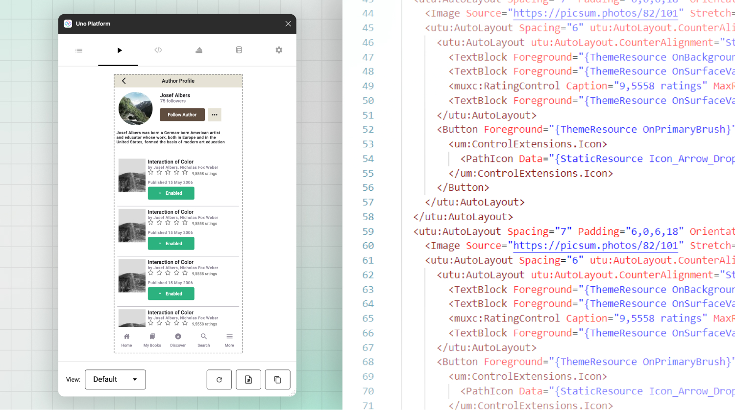
🕓 5 MIN We are thrilled to showcase the latest features of Preview 6 of our Figma plugin. One of the most significant additions is the View Hierarchy,

🕓 8 MIN If you want to streamline your workflow, improving the design-to-code process can help you focus on the code behind and get you to production quicker

🕓 5 MIN We’re happy to announce the release of Preview 5 of Uno Platform’s Figma plugin. Our latest version of the plugin offers enhanced features to benefit

🕓 7 MIN Figma is notably regarded as a design tool. However, it is also easy for developers to learn and use, even with limited design experience. Furthermore,

🕓 6 MIN In this tutorial, we’ll build a completely functional Profile Page using Figma and Uno Platform for Figma plugin to generate responsive XAML code that can

🕓 4 MIN Today we’re releasing Preview 4 of our plugin to continue helping front-end engineers and designers deliver apps faster by improving the design to code handoff.
🕓 5 MIN Now that we have three working views from our previous articles (Part 1, Part 2, Part 3), we can consume them in an Uno Platform