🕓 7 MINSkiaSharp fills the cross-platform rendering gap in .NET - a brief look at evolution, rich ecosystem and bright future of SkiaSharp.
Implementing a Skeleton Loader in Uno Platform
- Paula Aliu
- Published
In this blog post, I will show you how to create a simple skeleton loader for your Uno Platform applications. The Skeleton loader is a method of loading content in mobile apps that utilizes a visual placeholder user interface resembling the shape of the loaded content. This approach significantly contributes to enhancing the user experience by reducing perceived load times.
In this tutorial, we will guide you through the process of incorporating a Pulsing Placeholder. This involves smoothly transitioning the opacity of the skeleton objects, creating a pulsating effect as they fade in and out.

ColorAnimation and Storyboard Classes
To create a skeleton loader, we will use the ColorAnimation and Storyboard classes from the WinUI library, which are available on all platforms supported by Uno Platform. These classes allow us to animate the color of a UI element over time, creating a pulsing effect that simulates the loading process.
The first step is to create an Uno Platform User Control XAML file that defines the layout of our skeleton loader. For this example, we will create a simple LoaderControl.xaml that consists of a rectangle, and in the code behind, we will call the Animation begin method.
Here is the XAML code:
					<UserControl x:Class="SkeletonLoaderAnimation.Presentation.LoaderControl"
			 xmlns="http://schemas.microsoft.com/winfx/2006/xaml/presentation"
			 xmlns:x="http://schemas.microsoft.com/winfx/2006/xaml"
			 xmlns:local="using:SkeletonLoaderAnimation.Presentation"
			 xmlns:d="http://schemas.microsoft.com/expression/blend/2008"
			 xmlns:mc="http://schemas.openxmlformats.org/markup-compatibility/2006"
			 mc:Ignorable="d"
			 d:DesignHeight="300"
			 d:DesignWidth="400"
			 Loaded="UserControl_Loaded">

	<UserControl.Resources>
		<Storyboard x:Name="LoaderAnimation">

			<ColorAnimationUsingKeyFrames Storyboard.TargetName="RectItemBrush"
										  Storyboard.TargetProperty="Color"
										  AutoReverse="True"
										  RepeatBehavior="Forever"
										  Duration="0:0:2">

				<LinearColorKeyFrame Value="DarkGray"
									 KeyTime="00:00:02" />

				<DiscreteColorKeyFrame Value="#7f7f7f7f"
									   KeyTime="00:00:2.5" />

				<SplineColorKeyFrame Value="DarkGray"
									 KeyTime="00:00:4.5"
									 KeySpline="0.6,0.0 0.9,0.00" />
				<EasingColorKeyFrame>
					<EasingColorKeyFrame.EasingFunction>
						<ExponentialEase EasingMode="EaseIn" />
					</EasingColorKeyFrame.EasingFunction>
				</EasingColorKeyFrame>
			</ColorAnimationUsingKeyFrames>
		</Storyboard>
	</UserControl.Resources>

	<Border CornerRadius="10">
		<Rectangle x:Name="RectItem"
				   Height="70"
				   Width="350">
			<Rectangle.Fill>

				<SolidColorBrush Color="DarkGray"
								 x:Name="RectItemBrush" />
			</Rectangle.Fill>
		</Rectangle>
	</Border>
</UserControl>
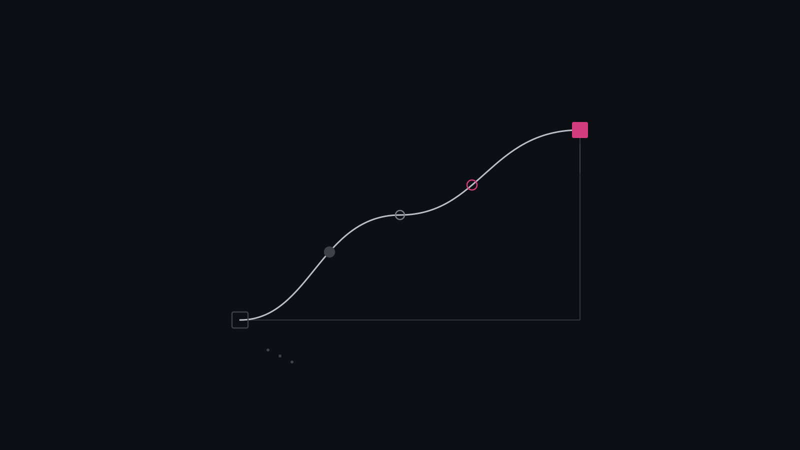
The XAML code above creates a Color Animation that will change the rectangle’s color to Dark-Gray within the first 2 seconds, leveraging the LinearColorKeyFrame, creating a smooth linear animation between values. The next 0.5 seconds will have the rectangle’s color jump from the Dark-Gray starting color to #7f7f7f7f, and this is achieved via the use of the DiscreteColorKeyFrame. Finally, the last 2 seconds will have the animation leverage the SplineColorKeyFrame to create a variable transition between #7f7f7f7f and Dark-Gray.
In this example, the animation starts slow but speeds up exponentially toward the end of the time segment. We will set the Duration property to 2 seconds and the AutoReverse property to true so that the animation will repeat indefinitely. We will also set the EnableDependentAnimation property to true, which some platforms need to run color animations.
And the code behind is shown below:
					public sealed partial class LoaderControl : UserControl
    {
        public LoaderControl()
        {
            this.InitializeComponent();
        }

        private void UserControl_Loaded(object sender, RoutedEventArgs e)
        {
            LoaderAnimation.Begin();
        }
    }
The next step is to create a ColorAnimation that will change the fill color of the ImageRect and the foreground color of the text blocks from light gray (#EEEEEE) to dark gray (#CCCCCC) and back. We will set the Duration property to 2 seconds and the AutoReverse property to true so that the animation will repeat indefinitely. We will also set the EnableDependentAnimation property to true, which some platforms need to run color animations. Here is the code:
The final step is to create 2 data templates; Loading and Loaded Templates which will serve as the Item Template based on the boolean isLoading Property from the view model.
Here is the code:
					<Page x:Class="SkeletonLoaderAnimation.Presentation.MainPage"
	  xmlns="http://schemas.microsoft.com/winfx/2006/xaml/presentation"
	  xmlns:x="http://schemas.microsoft.com/winfx/2006/xaml"
	  xmlns:local="using:SkeletonLoaderAnimation.Presentation"
	  xmlns:d="http://schemas.microsoft.com/expression/blend/2008"
	  xmlns:mc="http://schemas.openxmlformats.org/markup-compatibility/2006"
	  mc:Ignorable="d"
	  xmlns:uen="using:Uno.Extensions.Navigation.UI"
	  xmlns:utu="using:Uno.Toolkit.UI"
	  NavigationCacheMode="Required"
	  Background="{ThemeResource BackgroundBrush}">

	<Page.Resources>
		<DataTemplate x:Key="LoadingTemplate">
			<local:LoaderControl Margin="5, 10" />
		</DataTemplate>

		<DataTemplate x:Key="LoadedTemplate">
			<StackPanel Padding="10"
						HorizontalAlignment="Center">
				<TextBlock Text="{Binding Text}"
						   TextWrapping="NoWrap"
						   FontSize="20" />
				<TextBlock Text="{Binding Description}"
						   TextWrapping="NoWrap"
						   FontSize="16" />
			</StackPanel>
		</DataTemplate>
	</Page.Resources>

	<Grid utu:SafeArea.Insets="All">
		<ListView  x:Name="itemsListView"
				   ItemsSource="{Binding MainItems}"
				   SelectionMode="None"
				   Tapped="itemsListView_Tapped"
				   HorizontalAlignment="Center"
				   HorizontalContentAlignment="Center"
				   ItemTemplate="{StaticResource LoadingTemplate}" />
	</Grid>
</Page>
And the code behind is shown below:
					public sealed partial class MainPage : Page
    {
        public MainPage()
        {
            this.InitializeComponent();
        }

        private void itemsListView_Tapped(object sender, Microsoft.UI.Xaml.Input.TappedRoutedEventArgs e)
        {
            var listView = sender as ListView;
            var viewModel = listView?.DataContext as BindableMainModel;

            if (viewModel != null)
            {

                if (viewModel.IsLoading)
                {
                    listView.ItemTemplate = (DataTemplate)Resources["LoadingTemplate"];
                }
                else
                {
                    listView.ItemTemplate = (DataTemplate)Resources["LoadedTemplate"];
                }

                viewModel.IsLoading = !viewModel.IsLoading;
            }
        }
    }
That’s all there is to it! We’ve successfully developed a basic skeleton loader for Uno Platform apps using WinUI. Take a look at the video below to see the end result running on Windows and WebAssembly.
I hope you enjoyed this blog post and learned something new. If you have any questions or feedback, please let us know.
Thank you for reading!
About Uno Platform
For those new to the Uno Platform, it allows for creating pixel-perfect, single-source C# and XAML apps that run natively on Windows, iOS, Android, macOS, Linux and Web via WebAssembly. In addition, it offers Figma integration for design-development handoff and a set of extensions to bootstrap your projects. Uno Platform is free, open-source (Apache 2.0), and available on GitHub.
Next Steps
To upgrade to the latest release of Uno Platform, please update your packages to 4.9 via your Visual Studio NuGet package manager! If you are new to Uno Platform, following our official getting started guide is the best way to get started. (5 min to complete)
Tags:
Related Posts
🕓 6 MINSkiaSharp is graduating to 4.0 - let's unpack what it means for cross-platform .NET apps with Uno Platform.
•
June 29, 2026