


Neumorphism is one of those design trends that looks simple until you try to implement it. Two shadows. Light one top-left, dark one bottom-right. How hard could it be?
Actually, quite hard, if you want it to render consistently across platforms.
The Unit of Difficulty
Here’s the thing about neumorphic design that nobody tells you upfront: the effect depends entirely on paired shadows with precise offsets. Not one shadow. Two. And they need to be pixel-perfect opposites.
| Shadow | Offset | Blur | Color |
|---|---|---|---|
| Light shadow | (-8, -8) |
16px |
#FFFFFF |
| Dark shadow | (8, 8) |
16px |
#A3B1C6 |
This creates the illusion of a surface pushing out of the background. Flip the offsets inward and you get the “pressed in” effect.
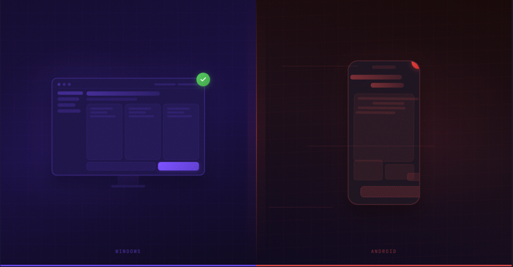
Simple enough in CSS. But what happens when you need this on iOS? Android? Windows? macOS? WebAssembly?
Each platform has its own shadow API. Each renders slightly differently. And “slightly” matters a lot when the whole effect depends on subtle gradients.
The Cross-Platform Shadow Problem
I wanted to test whether AI could generate a neumorphic UI that actually works cross-platform. Not “works” as in “compiles.” Works as in “looks identical everywhere.”
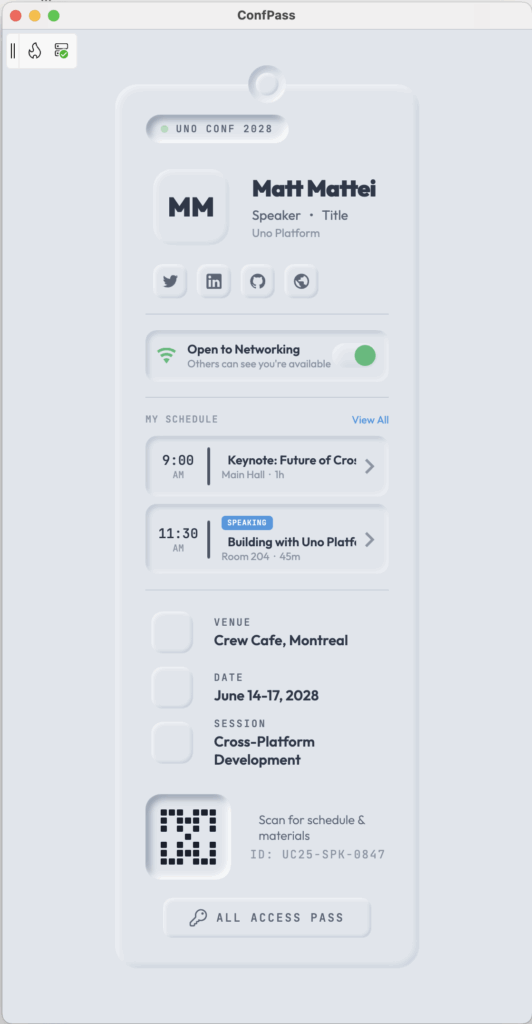
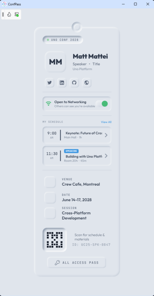
The app: a conference badge with soft shadows, interactive press states, and a networking toggle. The kind of thing you’d see on Dribbble and think “that’s pretty” and then realize you have no idea how to build it for six platforms.
Here’s what I prompted:
Create a distinctive neumorphic monochromatic conference pass that mimics a physical badge with soft shadows and depth and a refined, tactile aesthetic. Include attendee info, social links, schedule, QR code, and networking toggle. Use Uno Toolkit ShadowContainer for shadow effects.
45 minutes later, I had this:
Running on Windows, macOS, Linux, iOS, Android, and WebAssembly. Same shadows. Same colors. Same press feedback.
Cross-Platform Shadow Consistency
The key insight: Uno Platform’s Skia renderer bypasses platform-native shadow APIs entirely. It draws everything itself. Which means shadows render identically because they’re literally the same drawing code running everywhere.
The implementation uses ShadowContainer from Uno Toolkit:
<utu:ShadowContainer
    Shadows="{ThemeResource NeuroRaisedXl}"
    Background="{ThemeResource NeumorphicBgBrush}">
    <Grid Width="340" Padding="40" CornerRadius="24">
        <!-- Your content here -->
    </Grid>
</utu:ShadowContainer>
The shadow definition is where the magic happens:
<ShadowCollection x:Key="NeuroRaisedXl">
    <Shadow OffsetX="-8" OffsetY="-8" BlurRadius="16"
            Color="{ThemeResource NeumorphicLightShadowColor}" />  <!-- Light, top-left -->
    <Shadow OffsetX="8" OffsetY="8" BlurRadius="16"
            Color="{ThemeResource NeumorphicDarkShadowColor}" />   <!-- Dark, bottom-right -->
</ShadowCollection>
Two shadows. Opposite offsets. Same blur. That’s the entire neumorphic formula.
The Press State Trick
Neumorphism really shines with interactive feedback. Press a button and it should look like it’s pressing into the surface.
The naive approach: animate the shadow properties.
The better approach: use VisualStateManager.
Layer two ShadowContainer elements – one raised, one inset – and use VSM to toggle their opacity:
<Grid x:Name="AvatarRoot" PointerPressed="Avatar_PointerPressed"
      PointerReleased="Avatar_PointerReleased">
    <VisualStateManager.VisualStateGroups>
        <VisualStateGroup x:Name="AvatarStates">
            <VisualState x:Name="AvatarNormal" />
            <VisualState x:Name="AvatarPressed">
                <VisualState.Setters>
                    <Setter Target="AvatarRaised.Opacity" Value="0" />
                    <Setter Target="AvatarInset.Opacity" Value="1" />
                </VisualState.Setters>
            </VisualState>
        </VisualStateGroup>
    </VisualStateManager.VisualStateGroups>

    <utu:ShadowContainer x:Name="AvatarRaised" ... />
    <utu:ShadowContainer x:Name="AvatarInset" Opacity="0" ... />
</Grid>private void Avatar_PointerPressed(object sender, PointerRoutedEventArgs e)
{
VisualStateManager.GoToState(this, "AvatarPressed", true);
}Instant. Declarative. No animation jank. No interpolation weirdness. And it works perfectly on every platform.
Why VSM instead of direct property manipulation? Maintainability. When you have 5 different pressable elements, defining states in XAML is cleaner than scattering opacity toggles through code-behind.
Reusable Components
Once you establish the neumorphic pattern, you see it repeating everywhere. That’s a sign you need UserControls.
ConfPass extracts three reusable components:
NeumorphicIconButton – The press state pattern encapsulated:
<controls:NeumorphicIconButton Command="{Binding OpenMapCommand}">
<controls:NeumorphicIconButton.IconContent>
<FontIcon Glyph="" />
</controls:NeumorphicIconButton.IconContent>
</controls:NeumorphicIconButton>DetailItem – Icon button + label + value in one control:
<controls:DetailItem Glyph=""
Label="DATE"
Value="{Binding Pass.Date}" />NeumorphicToggle – Full toggle with animated knob:
<controls:NeumorphicToggle IsOn="{Binding IsNetworkingAvailable, Mode=TwoWay}"
                           Command="{Binding ToggleNetworkingCommand}" />
This reduced the main page XAML by ~150 lines. More importantly, the pattern is now portable to other projects.
Data Binding, Not Hardcoding
Social links and schedule items are bound via ItemsRepeater:
<ItemsRepeater ItemsSource="{Binding SocialLinks}">
    <ItemsRepeater.Layout>
        <StackLayout Orientation="Horizontal" Spacing="10" />
    </ItemsRepeater.Layout>
    <ItemsRepeater.ItemTemplate>
        <DataTemplate>
            <utu:ShadowContainer Shadows="{ThemeResource NeuroRaisedMd}">
                <Path Data="{Binding IconPath}" />
            </utu:ShadowContainer>
        </DataTemplate>
    </ItemsRepeater.ItemTemplate>
</ItemsRepeater>
Want to add a Bluesky link? Add it to the ViewModel collection. No XAML changes.
The Accessibility Elephant
I’d be doing you a disservice if I didn’t mention this: neumorphism has accessibility problems.
The soft shadows and monochromatic palette mean low contrast. The subtle state changes can be hard to perceive. For users with visual impairments, a neumorphic UI can be genuinely difficult to use.
ConfPass addresses this with:
- High-contrast text – dark text against the soft gray, not gray-on-gray
- Obvious press feedback – the state change is dramatic, not subtle
- Accent colors – the green “active” indicator and purple accents stand out
- AutomationProperties – screen readers can identify interactive elements:
<controls:NeumorphicToggle AutomationProperties.Name="Networking toggle" />
<controls:DetailItem AutomationProperties.Name="Venue" />
But honestly? For a production app, you’d want a high-contrast theme option. Neumorphism is a stylistic choice that trades accessibility for aesthetics. Know what you’re choosing.
What AI Got Right (And Wrong)
The AI-generated code was surprisingly complete:
- Architecture (VSM, UserControls, data binding, MVVM)
- Shadow pairing concept (light/dark, opposite offsets)
- Accessibility structure (AutomationProperties, x:Uid)
- Custom style resources for consistency
What Needed Human Refinement:
- Visual tuning (blur ratios, opacity levels, sizing)
- Text contrast was too low (darkened the text color)
- Press state implementation needed the dual-container approach
- Proportional relationships (main card vs nested elements)
The pattern I’m seeing: AI gets the architecture right. It knows what patterns to use – VSM, UserControls, data binding, accessibility properties. What it doesn’t know is what looks good. The tuning is still human work.
Hot Design changes this equation. Instead of rebuild cycles to test visual tweaks, you just… tweak. The 45-minute timeline isn’t only because AI is fast. It’s because Hot Design makes refinement fast.
The Actual Takeaway
Cross-platform UI development has a reputation for “lowest common denominator” results. Generic-looking apps that don’t match any platform’s aesthetic because they can’t commit to any platform’s capabilities.
ConfPass is evidence that this doesn’t have to be true. A design-forward visual style – one that depends on precise shadow rendering – can work identically across six platforms.
The enabling factor isn’t AI (though AI helped). It’s Skia rendering. When you control the drawing layer, platform differences stop mattering.
Is neumorphism the right choice for your app? Probably not. The accessibility tradeoffs are real. But if you want it, the tooling exists to actually ship it cross-platform.
That’s more than you could say a few years ago.
Ready to Build Cross-Platform UI?
Here's how to get started with pixel-perfect shadow rendering across all platforms.
 Subscribe to Our Blog
 Subscribe via RSS
 Back to Top