

🕓 5 MINAn exploration of how various AI Agents read MCP tool configurations
Building Cross-Platform Media Applications in .NET with MediaPlayerElement
If you’ve ever built an app that needed to play video or audio across different devices, you know the struggle. The promise of rich media experiences is great, but the reality often involves wrestling with platform-specific APIs, struggling to maintain a consistent UI, and burning countless hours on asset management.
For developers using Uno Platform, the key to this is mastering the MediaPlayerElement. This control offers a flexible way to embed video and audio into your apps for all targets. While it works well out of the box, you’ll often need to tailor its appearance and functionality to match your app’s unique design.
This article provides a look at how to style the MediaPlayerElement and its companion, the MediaTransportControls, specifically for Uno Platform applications. We’ll explore everything from simple tweaks to a complete visual overhaul.
Getting Started: Adding MediaPlayerElement
Before you can use the MediaPlayerElement, you need to enable the feature in your project. This adds the required platform-specific dependencies.
- For a new solution: Check the Media Element option in the Uno Platform Solution Wizard when creating your project.

- For an existing project: Add the feature directly to your shared project’s
.csprojfile:
<UnoFeatures>MediaElement</UnoFeatures>
💡Supported Formats & Features
For a complete list of supported media formats, and platform-specific features, please refer to our official documentation.
Default MediaPlayerElement Style
Out of the box, the MediaPlayerElement provides a standard set of controls for media playback, which are part of the MediaTransportControls. Here’s the basic XAML to get one running:
					<MediaPlayerElement x:Name="mediaPlayerElement"
                    AreTransportControlsEnabled="True"
                    Source="Assets//Getting-Started-v2-Source-Web.mp4"
                    AutoPlay="True" />
This code block creates a media player with default controls like a play/pause button, volume control, and a progress slider. For an even faster workflow, you can also use Hot Design to simply drag the MediaPlayerElement from the toolbox onto your UI, which generates this same code for you. This default setup is functional, but often you’ll need to adjust it to align with specific design requirements.
Customizing the MediaTransportControls
You’ll often need to modify the default transport controls to fit your app’s design. You can achieve this by accessing the MediaTransportControls within the MediaPlayerElement. This approach allows for targeted changes without redefining the entire template.
Toggling Visibility for Default Buttons
A common customization is to hide some of the default buttons. You can do this by setting their corresponding Is…ButtonVisible properties to False. This is useful for simplifying the interface and removing functionality that isn’t relevant to your app’s context.
In this example, using Hot Design, the fast forward, fast rewind, playback rate, and zoom buttons are hidden from the user, resulting in a cleaner player interface.
					<MediaPlayerElement AreTransportControlsEnabled="True"
                    Source="ms-appx:///Assets/Media/MPEdemo.mp4"
                    AutoPlay="True">
    <MediaPlayerElement.TransportControls>
        <MediaTransportControls IsFastForwardButtonVisible="False"
                                IsFastRewindButtonVisible="False"
                                IsPlaybackRateButtonVisible="False"
                                IsZoomButtonVisible="False" />
    </MediaPlayerElement.TransportControls>
</MediaPlayerElement>
Customizing MediaTransportControls
For a complete redesign, such as changing colors, layout, or adding new buttons—you need to provide a custom ControlTemplate for the MediaTransportControls.
How it works
You’ll start by copying the default style and then modifying it. The connection between the visual XAML and the player’s logic is made through specific x:Name attributes (e.g., x:Name="PlayPauseButton"). You must keep these names intact for the controls to function.
Get the Default Style
You can find the generic.xaml file included with the Windows App SDK or copy the code below.
Add to your Application
Place the following <ResourceDictionary> in your App.xaml or in a separate dictionary file. From here, you can modify colors, sizes, and the arrangement of elements to match your brand.
					<ResourceDictionary
    xmlns="http://schemas.microsoft.com/winfx/2006/xaml/presentation"
    xmlns:x="http://schemas.microsoft.com/winfx/2006/xaml"
    xmlns:controls="using:Microsoft.UI.Xaml.Controls"
    xmlns:media="using:Microsoft.UI.Xaml.Media">

    <FontFamily x:Key="MTCMediaFontFamily">XamlAutoFontFamily</FontFamily>
    <FontFamily x:Key="SymbolThemeFontFamily">Segoe Fluent Icons,Segoe MDL2 Assets</FontFamily>

    <SolidColorBrush x:Key="MediaTransportControlsPanelBackground" Color="#CC1F1F1F" />
    <SolidColorBrush x:Key="MediaTransportControlsFlyoutBackground" Color="{ThemeResource SystemChromeAltHighColor}" />
    <SolidColorBrush x:Key="ToggleButtonBackground" Color="#0FFFFFFF" />
    <SolidColorBrush x:Key="ToggleButtonForeground" Color="#FFFFFF" />
    <SolidColorBrush x:Key="ToggleButtonBorderBrush" Color="#12FFFFFF" />
    <SolidColorBrush x:Key="ToggleButtonBackgroundPointerOver" Color="#15FFFFFF" />
    <SolidColorBrush x:Key="ToggleButtonForegroundPointerOver" Color="#FFFFFF" />
    <SolidColorBrush x:Key="ToggleButtonBorderBrushPointerOver" Color="#12FFFFFF" />
    <SolidColorBrush x:Key="ToggleButtonBackgroundPressed" Color="#08FFFFFF" />
    <SolidColorBrush x:Key="ToggleButtonForegroundPressed" Color="#C5FFFFFF" />
    <SolidColorBrush x:Key="ToggleButtonBorderBrushPressed" Color="#12FFFFFF" />
    <SolidColorBrush x:Key="ToggleButtonBackgroundDisabled" Color="#0BFFFFFF" />
    <SolidColorBrush x:Key="ToggleButtonForegroundDisabled" Color="#5DFFFFFF" />
    <SolidColorBrush x:Key="ToggleButtonBorderBrushDisabled" Color="#12FFFFFF" />
    <SolidColorBrush x:Key="ToggleButtonBackgroundChecked" Color="{ThemeResource SystemAccentColorLight2}" />
    <SolidColorBrush x:Key="ToggleButtonForegroundChecked" Color="#000000" />
    <SolidColorBrush x:Key="ToggleButtonBorderBrushChecked" Color="{ThemeResource SystemAccentColorLight2}" Opacity="0" />
    <SolidColorBrush x:Key="ToggleButtonBackgroundCheckedPointerOver" Color="{ThemeResource SystemAccentColorLight2}" Opacity="0.9" />
    <SolidColorBrush x:Key="ToggleButtonForegroundCheckedPointerOver" Color="#000000" />
    <SolidColorBrush x:Key="ToggleButtonBorderBrushCheckedPointerOver" Color="{ThemeResource SystemAccentColorLight2}" Opacity="0" />
    <SolidColorBrush x:Key="ToggleButtonBackgroundCheckedPressed" Color="{ThemeResource SystemAccentColorLight2}" Opacity="0.8" />
    <SolidColorBrush x:Key="ToggleButtonForegroundCheckedPressed" Color="#80000000" />
    <SolidColorBrush x:Key="ToggleButtonBorderBrushCheckedPressed" Color="Transparent" />
    <SolidColorBrush x:Key="ToggleButtonBackgroundCheckedDisabled" Color="#28FFFFFF" />
    <SolidColorBrush x:Key="ToggleButtonForegroundCheckedDisabled" Color="#87FFFFFF" />
    <SolidColorBrush x:Key="ToggleButtonBorderBrushCheckedDisabled" Color="Transparent" />
    <SolidColorBrush x:Key="SliderTrackValueFill" Color="{ThemeResource SystemAccentColorLight2}" />
    <SolidColorBrush x:Key="SliderTrackFill" Color="#8BFFFFFF" />
    <SolidColorBrush x:Key="MediaTransportControlsThumbBorderBackground" Color="#8BFFFFFF" />
    <SolidColorBrush x:Key="MediaTransportControlsFillTimeElapsedText" Color="#C5FFFFFF" />
    <SolidColorBrush x:Key="MediaTransportControlsFillMediaText" Color="#FFFFFF" />
    <SolidColorBrush x:Key="SystemControlTransparentBrush" Color="Transparent"/>

    <x:Double x:Key="MTCMediaFontSize">12</x:Double>
    <x:Double x:Key="ControlContentThemeFontSize">14</x:Double>
    <x:Double x:Key="MediaTransportControlsAppBarButtonHeight">40</x:Double>
    <x:Double x:Key="MediaTransportControlsAppBarButtonWidth">40</x:Double>
    <x:Double x:Key="MediaTransportControlsSliderThumbWidth">16</x:Double>
    <x:Double x:Key="MediaTransportControlsSliderThumbHeight">16</x:Double>
    <CornerRadius x:Key="ControlCornerRadius">4</CornerRadius>
    <Thickness x:Key="MediaTransportControlsProgressSliderMargin">7,2,7,1</Thickness>
    <Thickness x:Key="MediaTransportControlsProgressSliderCompactMargin">12,-1,8,1</Thickness>


    <Style TargetType="MediaTransportControls" x:Key="DefaultMediaTransportControlsStyle">
        <Setter Property="Background" Value="{ThemeResource MediaTransportControlsPanelBackground}" />
        <Setter Property="IsTabStop" Value="False" />
        <Setter Property="VerticalAlignment" Value="Bottom" />
        <Setter Property="Template">
            <Setter.Value>
                <ControlTemplate TargetType="MediaTransportControls">
                    <Grid x:Name="RootGrid" Background="Transparent">
                        <VisualStateManager.VisualStateGroups>
                            <VisualStateGroup x:Name="WindowStates">
                                <VisualState x:Name="Normal" />
                                <VisualState x:Name="Compact">
                                    <VisualState.Setters>
                                        <Setter Target="ControlPanelGrid.Margin" Value="0" />
                                    </VisualState.Setters>
                                </VisualState>
                            </VisualStateGroup>
                        </VisualStateManager.VisualStateGroups>
                        <Grid x:Name="ControlPanelGrid" VerticalAlignment="Bottom" Background="{TemplateBinding Background}" RenderTransformOrigin="0.5,0.5">
                            <Grid.ColumnDefinitions>
                                <ColumnDefinition Width="Auto" />
                                <ColumnDefinition Width="*" />
                                <ColumnDefinition Width="Auto" />
                            </Grid.ColumnDefinitions>
                            <Grid.RenderTransform>
                                <TranslateTransform x:Name="ControlPanel_ControlPanelGrid_TranslateY" />
                            </Grid.RenderTransform>
                            <HorizontalMediaTransportControlsPanel x:Name="MediaTransportControlsPanel" Grid.Column="1" HorizontalAlignment="Stretch" VerticalAlignment="Stretch">
                                <AppBarButton x:Name="PlayPauseButton" Style="{StaticResource AppBarButtonStyle}" media:MediaTransportControlsHelper.DropoutOrder="1" Tag="Play" />
                                <AppBarButton x:Name="StopButton" Style="{StaticResource AppBarButtonStyle}" Visibility="Collapsed" media:MediaTransportControlsHelper.DropoutOrder="16" Tag="Stop" />
                                <AppBarButton x:Name="RewindButton" Style="{StaticResource AppBarButtonStyle}" Visibility="Collapsed" media:MediaTransportControlsHelper.DropoutOrder="6" Tag="Rewind" />
                                <AppBarButton x:Name="FastForwardButton" Style="{StaticResource AppBarButtonStyle}" Visibility="Collapsed" media:MediaTransportControlsHelper.DropoutOrder="7" Tag="FastForward" />
                                <AppBarButton x:Name="NextTrackButton" Style="{StaticResource AppBarButtonStyle}" Visibility="Collapsed" media:MediaTransportControlsHelper.DropoutOrder="12" Tag="Next" />
                                <AppBarButton x:Name="PreviousTrackButton" Style="{StaticResource AppBarButtonStyle}" Visibility="Collapsed" media:MediaTransportControlsHelper.DropoutOrder="11" Tag="Previous" />
                                <AppBarButton x:Name="RepeatButton" Style="{StaticResource AppBarToggleButtonStyle}" Visibility="Collapsed" media:MediaTransportControlsHelper.DropoutOrder="10" Tag="Repeat" />
                                <AppBarButton x:Name="PlaybackRateButton" Style="{StaticResource AppBarButtonStyle}" Visibility="Collapsed" media:MediaTransportControlsHelper.DropoutOrder="9" Tag="PlaybackRate" />
                                <AppBarButton x:Name="ShuffleButton" Style="{StaticResource AppBarToggleButtonStyle}" Visibility="Collapsed" media:MediaTransportControlsHelper.DropoutOrder="8" Tag="Shuffle" />
                                <AppBarButton x:Name="VolumeButton" Style="{StaticResource AppBarButtonStyle}" media:MediaTransportControlsHelper.DropoutOrder="2" Tag="Volume" />
                                <Slider x:Name="VolumeSlider" Style="{StaticResource VolumeSliderStyle}" Visibility="Collapsed" media:MediaTransportControlsHelper.DropoutOrder="3" />
                                <AppBarButton x:Name="ZoomButton" Style="{StaticResource AppBarButtonStyle}" media:MediaTransportControlsHelper.DropoutOrder="4" Tag="Zoom" />
                                <AppBarButton x:Name="FullScreenButton" Style="{StaticResource AppBarButtonStyle}" media:MediaTransportControlsHelper.DropoutOrder="14" Tag="FullScreen" />
                                <AppBarButton x:Name="CastButton" Style="{StaticResource AppBarButtonStyle}" Visibility="Collapsed" media:MediaTransportControlsHelper.DropoutOrder="15" Tag="Cast" />
                                <AppBarButton x:Name="CompactOverlayButton" Style="{StaticResource AppBarButtonStyle}" Visibility="Collapsed" media:MediaTransportControlsHelper.DropoutOrder="13" Tag="CompactOverlay" />
                                <AppBarSeparator x:Name="MediaControlsCommandBarSeparator" Style="{StaticResource AppBarSeparatorStyle}" Visibility="Collapsed" media:MediaTransportControlsHelper.DropoutOrder="5" />
                                <Slider x:Name="ProgressSlider" Style="{StaticResource ProgressSliderStyle}" media:MediaTransportControlsHelper.DropoutOrder="17" />
                                <TextBlock x:Name="TimeElapsedElement" Style="{StaticResource TimeTextBlockStyle}" Margin="12,0,0,0" media:MediaTransportControlsHelper.DropoutOrder="18" />
                                <TextBlock x:Name="TimeRemainingElement" Style="{StaticResource TimeTextBlockStyle}" Margin="12,0,12,0" media:MediaTransportControlsHelper.DropoutOrder="19" />
                            </HorizontalMediaTransportControlsPanel>
                        </Grid>
                    </Grid>
                </ControlTemplate>
            </Setter.Value>
        </Setter>
    </Style>

</ResourceDictionary>
Ultimately, the cross-platform MediaPlayerElement is more than just a single control, it’s allows you to build ambitious, media-rich applications with a single codebase and integrates into the vast library of UI components already available through the Uno Toolkit, Windows Community Toolkit, and 3rd paty libraries.
Practice with Uno Chefs
Get hands-on experience with the MediaPlayerElement using our Uno Chefs Recipe Book, where you’ll implement the video player, configure its source, and enable the transport controls. It’s the perfect way to see just how simple and powerful it is to create a rich media experience that runs everywhere.
Tags: XAML, WPF, Xamarin, UWP, Silverlight, .NET, Windows, C#, XAML
Related Posts
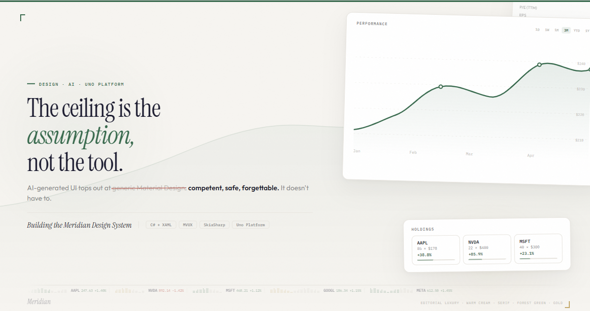
🕓 6 MIN11 interaction patterns, motion principles, and design decisions behind a financial dashboard built with Claude, C#, WinUI 3, and Uno Platform.
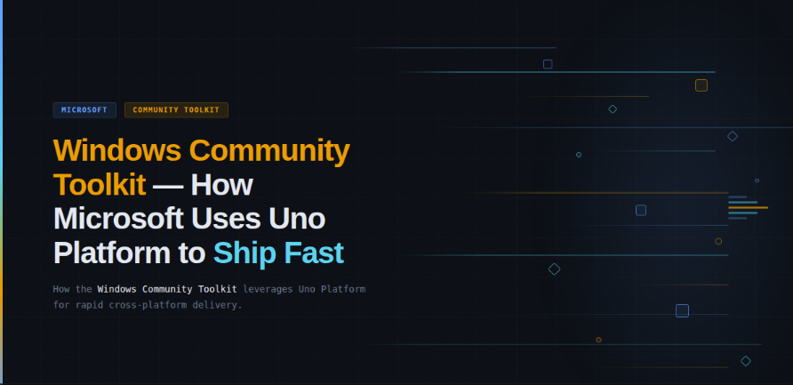
🕓 5 MINThe Windows Community Toolkit team on rebuilding for WinUI 3 with Uno Platform