🕓 6 MINIn the previous …

Figma is a great tool UX/UI designers use to create stunning interactive renders of UIs for a vast assortment of software applications. Uno Platform released a Figma plugin earlier this year to bridge the UI design to code handoff. This plugin allows users to convert their material-based UI designs to XAML code which can be consumed in an Uno Platform application.
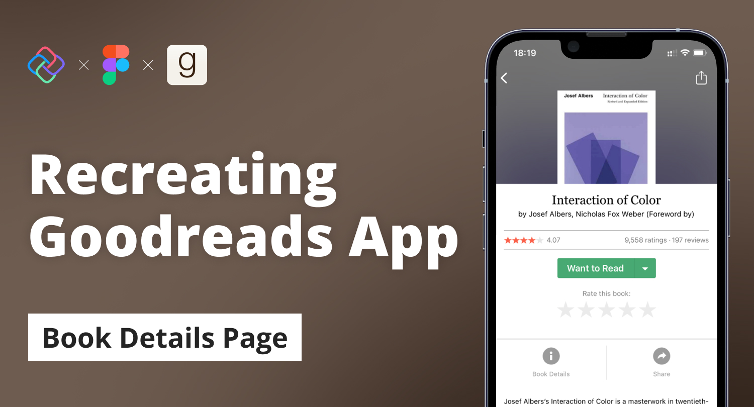
This series of articles will highlight how to recreate some of the UX in Amazon’s Goodreads app, even if you are just a developer tasked with creating a mobile design. Designers will, of course, be on familiar Figma turf. Specifically, the series will address the following:
Recreating the Goodreads Home page
Consuming Figma Generated code in an Uno Platform Application
To follow along, you can find a list of resources & tools used in the series at the end of the article.
Setting up Color Styles and Editing Colors
As one of the basic design elements, it’s best practice to set up your colors at the start of the project, but you can always edit them at any point in the project using the following method:
(Also detailed in the Getting Started Page of the Uno Platform Material Toolkit)
In the Styles Panel (right side of the screen when nothing is selected,) expand the Colors folder and subfolders to view all color roles used in the document. Select one that needs an update to follow your brand colors: Right-click and select Edit. From the Properties section of the Edit Style Pane, input the HEX code you want, and it will update throughout the entire document.

Recreating the Goodreads Homepage
The home page of the Goodreads app is characterized by a bottom-oriented tab view and a scrollable vertically oriented view which comprises of:
A vertically stacked card
A horizontally stacked book Info and image. Book info is a vertical stack of text labels (book info), buttons, and rating control.
A scrollable list view showcasing ranked books of different Genres.

Step 1: Setup the Page Template
Add a new page representing the home page you want to recreate. To do this, utilize the Standard Page Template the Uno Toolkit provides. The out-of-the-box template provides the proper layer structures to aid in previewing your designs and generating XAML via the Uno Platform plugin.
First, drag and drop the Standard Page Template into your Figma canvas from the components list or the assets tab on the left side pane of your Figma view.
Select the page by clicking on it; this results in an outline across the border of the page. Next, right-click on the page and select ‘Detach Instance’ from the menu. This aims to disconnect your page instance from the original component, thereby preventing the propagation of changes made on your page instance to the original component.


Once detached, you will see that the Standard Page Template has a Status Bar, bottom App Bar, and Body Layer. The Body layer contains top and bottom Navigation Bar pre-set components that come with the Standard Page Template and a section called Content.Scrollable, which will nest as the name suggests, all scrollable content.
*Note: You can hide the Top Navigation Bar as it will not be needed in this tutorial.

STEP 2: Header Bar for Search Input
The first part of our design will be adding the search bar to our Page layer. Wee will use a Text Box and two Icon buttons to frame together and nest inside our Page layer – not our Content.Scrollable.
Drag a Text Box from the component list and add it to your canvas.
Toggle on the leading icon and switch it to a search icon ().
Select the Label and change it to [Title, Author, ISBN]
Select the Input inside your TextBox and add a Fill color and a Stroke in the right pane.
In the frame properties, change Horizontal resizing to Fill
*Make sure to use a color from the Color Styles and NOT a color from Figmas color palette.
Fill Color: Light/Surface/SurfaceColor
Stroke: Light/On Surface
Add an IconButton to the canvas and place it next to your Select the Icon instance nested inside the IconButton, and in the right pane, swap the current icon for a camera icon. () – Repeat the same process for the notification icon. ()
3. Select both IconButtons and the TextBox (Shift + A) to frame all three components together.
Rename the newly created frame Header Bar
In the Auto Layout properties, select Centre Alignment and change the spacing between items to a value of 8.
Click the independent paddings icon and change the value of the Top, Bottom, and Left paddings to 16 and the right padding to 8.

Add a Fill Color (Light/Secondary)

Drag the Header Bar into your Page Layer above the Content.Scrollable.
The result of step 2 is illustrated below:

Step 3: Recreating the Book Card
The scrollable section of the Goodreads app holds the horizontally stacked text box and icon button and the list view of ranked Books. To achieve this, we will use Content.Srollable as our parent layer and nest our components in it.
To start, drag and drop the card component onto your canvas and similarly detach the instance as done with the Standard Page template.

For this exercise, what we will do is delete everything inside the card and keep the card itself. Then from your assets, you can drop in anything you like. To mimic the Goodreads app, we will need to add an image, formatted text, a button, and a rating control to our card.
Start by dragging and dropping an image component from the pre-set components into the card.
Next, select the text tool and on your canvas, type out Headline, then duplicate it to create a title and duplicate it again to create an author.
Then, add a button and a label for the rating control. You can duplicate one of the above texts and modify it to say, “Rate this book.”
(*The rating control component provided by Uno Toolkit does include a label, but that label is currently only supported to the right.)
Add the rating control and hide the label using the variant control panel.


Adding Auto Layout and stacking components correctly
Select the “Rate this book” label and rating control added and Shift + A to add an Auto Layout. This will create a frame number by default, so I recommend renaming it to Rating.
Select the rating, the button, and the text labels (excluding the headline), and again Shift + A to add to an Auto Layout and rename it Book Info. Grab the Book Info group and drag it inside your card below the image component.
Repeat the same with just the headline. Select it, Shift + A, to create the Auto Layout, and drag it into your card above the image.
Select your Book Info and Image and Shift + A to create another Auto Layout.
Then to stack the card and components correctly,
select the card and In the Auto Layout properties, select Vertical Direction.
Select your Headline and make sure Auto Layout properties are set to Horizontal Direction.
Select the Book and Image frame and ensure Auto Layout is set to Horizontal Direction.
Once our card is set, we can go into each item and make the necessary changes to match the Goodreads app.
For the Text labels, change the text to reflect the reference image, and then using the Color styles and the Text Styles provided by the Uno Material Toolkit found in the properties pane make the additional changes.

The result of your created card is illustrated below:

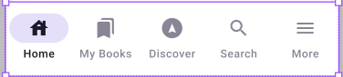
STEP 4: Modifying the Bottom TabBar
Select your Bottom TabBar, and you can change the number of items listed in its properties. For this TabBar, we will change it to 5 TabBar_Items.
Nested inside each TabBar Item is the icon represented; in the right-hand pane, you can change each icon by swapping its instance to its correct one.
The completed Bottom TabBar is illustrated below:
Step 5: Running Uno Platform Plugin
Once this was done, I selected the Parent layer, right-clicked, and from the menu, select
Plugins > Uno Platform. Then navigate to the Preview Tab and select Refresh (found at the bottom right of the plugin)
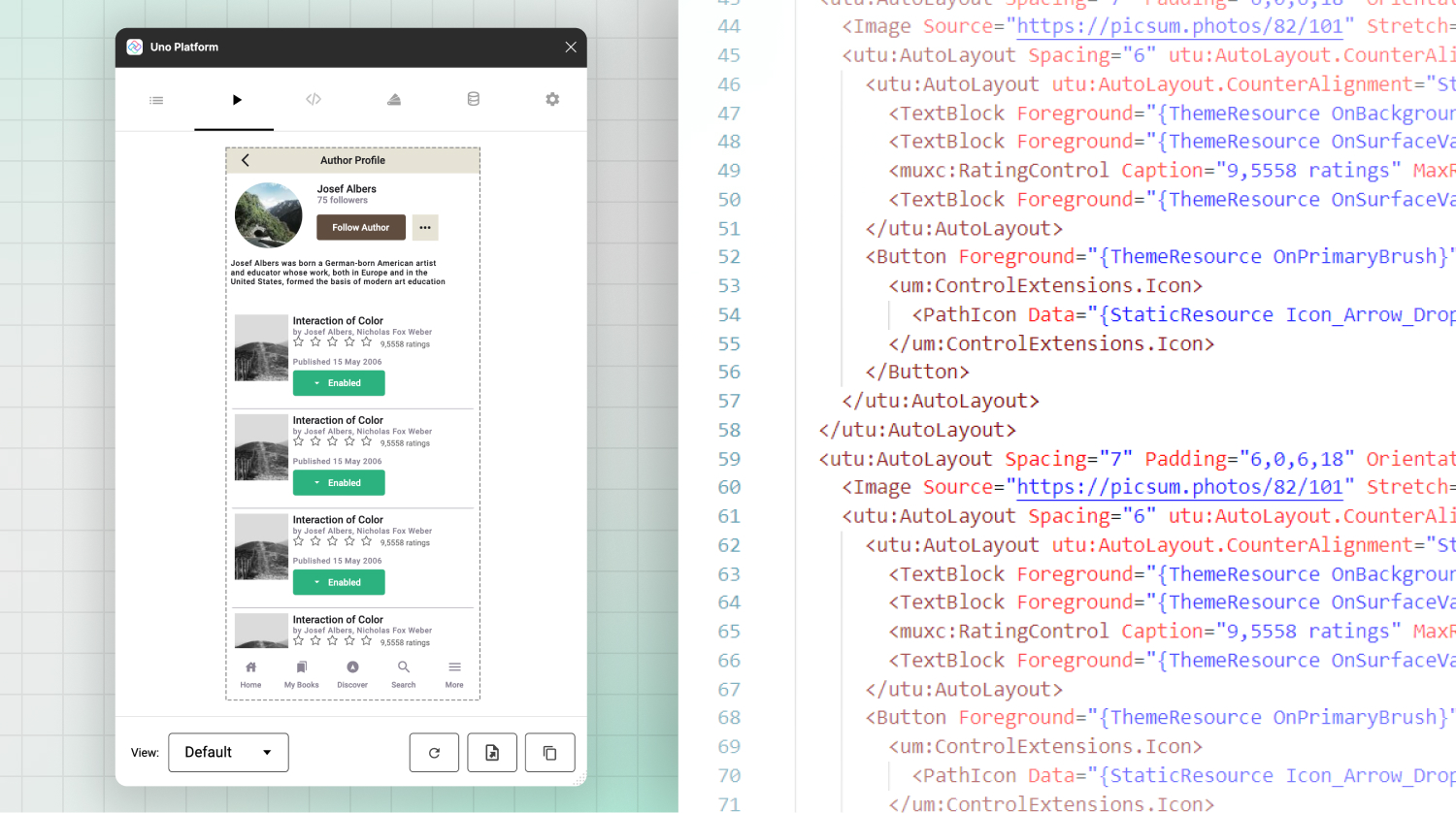
The result is illustrated below:

If you switch to the XAML Tab, you can see the screen’s auto-generated XAML code, which can be copied or exported to your preferred solution and built on.

					  <utu:AutoLayout Background="{ThemeResource BackgroundBrush}">
    <utu:AutoLayout.Resources>
      <x:String x:Key="Icon_Arrow_Drop_Down">F1 M 0 0 L 3.75 3.75 L 7.5 0 L 0 0 Z</x:String>
      <x:String x:Key="Icon_Assistant_Navigation">F1 M 11 0 C 4.929999828338623 0 0 4.929999828338623 0 11 C 0 17.070000171661377 4.929999828338623 22 11 22 C 17.070000171661377 22 22 17.070000171661377 22 11 C 22 4.929999828338623 17.070000171661377 0 11 0 Z M 14.569999694824219 16 L 11 14.420000076293945 L 7.430000305175781 16 L 7.060000419616699 15.629999160766602 L 11 6 L 14.949999809265137 15.629999160766602 L 14.569999694824219 16 L 14.569999694824219 16 Z</x:String>
      <x:String x:Key="Icon_Bookmarks">F1 M 16 17 L 18 18 L 18 2 C 18 0.8999999761581421 17.100000023841858 0 16 0 L 5.989999771118164 0 C 4.889999747276306 0 4 0.8999999761581421 4 2 L 14 2 C 15.100000023841858 2 16 2.899999976158142 16 4 L 16 17 Z M 12 4 L 2 4 C 0.8999999761581421 4 0 4.899999976158142 0 6 L 0 22 L 7 19 L 14 22 L 14 6 C 14 4.899999976158142 13.100000023841858 4 12 4 Z</x:String>
      <x:String x:Key="Icon_Camera_Alt">F1 M 10 13.199999809265137 C 11.767311096191406 13.199999809265137 13.199999809265137 11.767311096191406 13.199999809265137 10 C 13.199999809265137 8.232688784599304 11.767311096191406 6.800000190734863 10 6.800000190734863 C 8.232688784599304 6.800000190734863 6.800000190734863 8.232688784599304 6.800000190734863 10 C 6.800000190734863 11.767311096191406 8.232688784599304 13.199999809265137 10 13.199999809265137 Z M 7 0 L 5.170000076293945 2 L 2 2 C 0.8999999761581421 2 0 2.9000000953674316 0 4 L 0 16 C 0 17.100000381469727 0.8999999761581421 18 2 18 L 18 18 C 19.100000381469727 18 20 17.100000381469727 20 16 L 20 4 C 20 2.9000000953674316 19.100000381469727 2 18 2 L 14.829999923706055 2 L 13 0 L 7 0 Z M 10 15 C 7.239999771118164 15 5 12.760000228881836 5 10 C 5 7.239999771118164 7.239999771118164 5 10 5 C 12.760000228881836 5 15 7.239999771118164 15 10 C 15 12.760000228881836 12.760000228881836 15 10 15 Z</x:String>
      <x:String x:Key="Icon_House">F1 M 17 6.300000190734863 L 17 1 L 14 1 L 14 3.5999999046325684 L 10 0 L 0 9 L 3 9 L 3 17 L 8 17 L 8 11 L 12 11 L 12 17 L 17 17 L 17 9 L 20 9 L 17 6.300000190734863 Z M 8 7 C 8 5.899999976158142 8.899999976158142 5 10 5 C 11.100000023841858 5 12 5.899999976158142 12 7 L 8 7 Z</x:String>
      <x:String x:Key="Icon_Menu">F1 M 0 12 L 18 12 L 18 10 L 0 10 L 0 12 Z M 0 7 L 18 7 L 18 5 L 0 5 L 0 7 Z M 0 0 L 0 2 L 18 2 L 18 0 L 0 0 Z</x:String>
      <x:String x:Key="Icon_Notifications_None">F1 M 8 19.5 C 9.100000023841858 19.5 10 18.600000023841858 10 17.5 L 6 17.5 C 6 18.600000023841858 6.899999976158142 19.5 8 19.5 Z M 14 13.5 L 14 8.5 C 14 5.430000066757202 12.369999885559082 2.8599998354911804 9.5 2.179999828338623 L 9.5 1.5 C 9.5 0.6700000166893005 8.8299999833107 0 8 0 C 7.1700000166893005 0 6.5 0.6700000166893005 6.5 1.5 L 6.5 2.179999828338623 C 3.640000104904175 2.8599998354911804 2 5.420000076293945 2 8.5 L 2 13.5 L 0 15.5 L 0 16.5 L 16 16.5 L 16 15.5 L 14 13.5 Z M 12 14.5 L 4 14.5 L 4 8.5 C 4 6.019999980926514 5.509999990463257 4 8 4 C 10.490000009536743 4 12 6.019999980926514 12 8.5 L 12 14.5 Z</x:String>
      <x:String x:Key="Icon_Search">F1 M 12.5 11 L 11.710000038146973 11 L 11.430000305175781 10.729999542236328 C 12.410000324249268 9.589999556541443 13 8.110000014305115 13 6.5 C 13 2.9100000858306885 10.089999914169312 0 6.5 0 C 2.9100000858306885 0 0 2.9100000858306885 0 6.5 C 0 10.089999914169312 2.9100000858306885 13 6.5 13 C 8.110000014305115 13 9.589999556541443 12.410000324249268 10.729999542236328 11.430000305175781 L 11 11.710000038146973 L 11 12.5 L 16 17.489999771118164 L 17.489999771118164 16 L 12.5 11 L 12.5 11 Z M 6.5 11 C 4.009999990463257 11 2 8.990000009536743 2 6.5 C 2 4.009999990463257 4.009999990463257 2 6.5 2 C 8.990000009536743 2 11 4.009999990463257 11 6.5 C 11 8.990000009536743 8.990000009536743 11 6.5 11 Z</x:String>
    </utu:AutoLayout.Resources>
    <utu:AutoLayout utu:AutoLayout.PrimaryAlignment="Stretch">
      <utu:AutoLayout Background="{ThemeResource SecondaryBrush}" Spacing="8" Padding="16,16,8,16" PrimaryAxisAlignment="Center" Orientation="Horizontal">
        <TextBox Background="{ThemeResource SurfaceBrush}" PlaceholderText="Title, Author, ISBN" utu:AutoLayout.CounterAlignment="Center" utu:AutoLayout.PrimaryAlignment="Stretch" utu:AutoLayout.CounterLength="56" Style="{StaticResource OutlinedTextBoxStyle}">
          <um:ControlExtensions.Icon>
            <PathIcon Data="{StaticResource Icon_Search}" Foreground="{ThemeResource OnSurfaceVariantBrush}" />
          </um:ControlExtensions.Icon>
        </TextBox>
        <Button utu:AutoLayout.CounterAlignment="Center" Style="{StaticResource IconButtonStyle}">
          <PathIcon Data="{StaticResource Icon_Camera_Alt}" />
        </Button>
        <Button utu:AutoLayout.CounterAlignment="Center" Style="{StaticResource IconButtonStyle}">
          <PathIcon Data="{StaticResource Icon_Notifications_None}" />
        </Button>
      </utu:AutoLayout>
      <ScrollViewer utu:AutoLayout.PrimaryAlignment="Stretch">
        <utu:AutoLayout Spacing="4" Padding="8">
          <utu:CardContentControl Style="{StaticResource ElevatedCardContentControlStyle}">
            <utu:CardContentControl.ContentTemplate>
              <DataTemplate>
                <utu:AutoLayout Spacing="12" Padding="12,12,12,24">
                  <utu:AutoLayout Orientation="Horizontal" utu:AutoLayout.CounterAlignment="Start" utu:AutoLayout.CounterLength="317">
                    <TextBlock Foreground="{ThemeResource OnSurfaceBrush}" Text="Popular in Goodreads" utu:AutoLayout.CounterAlignment="Start" />
                    <TextBlock Foreground="{ThemeResource TertiaryBrush}" Text=" Art" utu:AutoLayout.CounterAlignment="Start" />
                  </utu:AutoLayout>
                  <utu:AutoLayout Spacing="12" Orientation="Horizontal" utu:AutoLayout.CounterAlignment="Start" utu:AutoLayout.CounterLength="317">
                    <Image Source="https://picsum.photos/72/124" Stretch="UniformToFill" utu:AutoLayout.CounterAlignment="Start" utu:AutoLayout.PrimaryLength="72" utu:AutoLayout.CounterLength="124" />
                    <utu:AutoLayout Spacing="8" PrimaryAxisAlignment="End" utu:AutoLayout.CounterAlignment="Start" utu:AutoLayout.PrimaryAlignment="Stretch">
                      <TextBlock Foreground="{ThemeResource OnSurfaceBrush}" Text="The Community" utu:AutoLayout.CounterAlignment="Start" />
                      <TextBlock Foreground="{ThemeResource OnSurfaceVariantBrush}" Text="by N. Jamiyla Chislolm" utu:AutoLayout.CounterAlignment="Start" Style="{StaticResource BodySmall}" />
                      <Button Foreground="{ThemeResource OnPrimaryBrush}" Background="{ThemeResource TertiaryBrush}" Content="Want to Read" utu:AutoLayout.CounterAlignment="Start" CornerRadius="4">
                        <um:ControlExtensions.Icon>
                          <PathIcon Data="{StaticResource Icon_Arrow_Drop_Down}" Foreground="{ThemeResource OnPrimaryBrush}" />
                        </um:ControlExtensions.Icon>
                      </Button>
                      <utu:AutoLayout Orientation="Horizontal" utu:AutoLayout.CounterAlignment="Start">
                        <TextBlock Foreground="{ThemeResource OnSurfaceVariantBrush}" Text="Rate this Book" utu:AutoLayout.PrimaryLength="80" Style="{StaticResource CaptionSmall}" />
                        <muxc:RatingControl MaxRating="5" utu:AutoLayout.CounterAlignment="End" Style="{StaticResource RatingControlStyle}" />
                      </utu:AutoLayout>
                    </utu:AutoLayout>
                  </utu:AutoLayout>
                </utu:AutoLayout>
              </DataTemplate>
            </utu:CardContentControl.ContentTemplate>
          </utu:CardContentControl>
        </utu:AutoLayout>
      </ScrollViewer>
    </utu:AutoLayout>
    <utu:Divider Style="{StaticResource DividerStyle}" />
    <utu:TabBar Style="{StaticResource BottomTabBarStyle}">
      <utu:TabBarItem IsSelectable="True" Content="Home" Style="{StaticResource BottomTabBarItemStyle}">
        <utu:TabBarItem.Icon>
          <PathIcon Data="{StaticResource Icon_House}" />
        </utu:TabBarItem.Icon>
      </utu:TabBarItem>
      <utu:TabBarItem IsSelectable="True" Content="My Books" Style="{StaticResource BottomTabBarItemStyle}">
        <utu:TabBarItem.Icon>
          <PathIcon Data="{StaticResource Icon_Bookmarks}" />
        </utu:TabBarItem.Icon>
      </utu:TabBarItem>
      <utu:TabBarItem IsSelectable="True" Content="Discover" Style="{StaticResource BottomTabBarItemStyle}">
        <utu:TabBarItem.Icon>
          <PathIcon Data="{StaticResource Icon_Assistant_Navigation}" />
        </utu:TabBarItem.Icon>
      </utu:TabBarItem>
      <utu:TabBarItem IsSelectable="True" Content="Search" Style="{StaticResource BottomTabBarItemStyle}">
        <utu:TabBarItem.Icon>
          <PathIcon Data="{StaticResource Icon_Search}" />
        </utu:TabBarItem.Icon>
      </utu:TabBarItem>
      <utu:TabBarItem IsSelectable="True" Content="More" Style="{StaticResource BottomTabBarItemStyle}">
        <utu:TabBarItem.Icon>
          <PathIcon Data="{StaticResource Icon_Menu}" />
        </utu:TabBarItem.Icon>
      </utu:TabBarItem>
    </utu:TabBar>
  </utu:AutoLayout>
Resources & Tools Used in the Series.
1. | Figma Application (Web based or Desktop) |
2. | |
3. | |
4. | Uno Platform Solution templates for visual studio 2022 |
5. |
To get right into recreating this UI and the two other UIs mentioned above, you need to have the following:
Figma is either installed on your system or running in a web browser.
Install the Uno Platform plugin for Figma.
Download the Uno Platform material toolkit from Figma’s community page
Duplicate the above-mentioned toolkit and rename it to avoid confusion.
Project created and authored by Paula Aliu
